-
Product Management
Software Testing
Technology Consulting
-
Multi-Vendor Marketplace
Online StoreCreate an online store with unique design and features at minimal cost using our MarketAge solutionCustom MarketplaceGet a unique, scalable, and cost-effective online marketplace with minimum time to marketTelemedicine SoftwareGet a cost-efficient, HIPAA-compliant telemedicine solution tailored to your facility's requirementsChat AppGet a customizable chat solution to connect users across multiple apps and platformsCustom Booking SystemImprove your business operations and expand to new markets with our appointment booking solutionVideo ConferencingAdjust our video conferencing solution for your business needsFor EnterpriseScale, automate, and improve business processes in your enterprise with our custom software solutionsFor StartupsTurn your startup ideas into viable, value-driven, and commercially successful software solutions -
-
- Case Studies
- Blog
How to Redesign a Product in 9 Steps
Even an initially perfect design can become irrelevant as customer tastes and preferences, fashion, technologies, and corporate philosophy change. You must keep your digital product competitive, deliver maximum value to customers, and effectively reach your business goals.
In this article, you will learn how to redesign a product at minimal cost, address customer needs, and validate changes before they go to production.
Product redesign vs. design refresh: which is better?
Often, the terms product redesign and design refresh are used interchangeably, which may confuse the design team and lead to misunderstanding. To be clear:
- A product design refresh means making visual changes that impact the product's appearance yet do not change the content or UX structure. Usually, a design refresh is needed for rebranding, changes in color or style, changing the location of individual UI elements, etc. A design refresh implies minor changes in the product's code, as the structure and functionality remain mostly the same.
- A product redesign goes far beyond minor visual updates. It is often aimed at simplifying the user experience or visualizing newly added features and involves changes in the UX structure and functions. A redesign also usually includes significant changes in the app or website code.
The line between refresh and redesign sometimes gets blurred because a goal to slightly update the appearance can easily grow into more massive changes. If your changes impact both how your digital product looks and works, that is considered a redesign.
Key reasons for a product design refresh and redesign
Understanding the purpose for implementing changes helps you optimize your effort and develop effective solutions. Many product teams practice continuous, incremental redesigns based on regular analytics and customer feedback. Here are the core reasons to conduct a product redesign:
- Outdated look and feel
- New branding
- New features or technological upgrades
- Changes in the product architecture
- UX optimization
- Low customer satisfaction and conversions
- Expanding to new markets
Using a comprehensive customer-centric UX audit is helpful in identifying optimal changes. Often, stakeholders or product owners have their vision of how to redesign a product. However, end users may feel differently. They are often more conservative than product owners. While most consumers like increased comfort and faster performance, they still want to use an app they're familiar with. A radically new product design may look cool, but by introducing a radically new design you risk losing your customers' loyalty. You need to have research-proven reasons for your product redesign to avoid potential risks.
Benefits of a product redesign
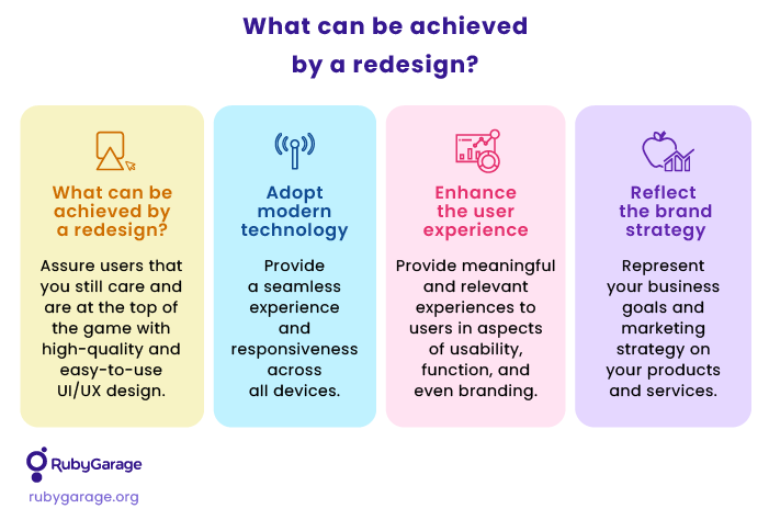
If done right, your redesign efforts may result in multiple benefits, including:
- Increased market competitiveness
- Greater product usability
- Higher customer satisfaction and engagement
- Increased conversion rate
- Larger customer base
Improving existing products builds a positive image among customers. They appreciate efforts to address their pains and to improve the quality of service. In addition, improvements increase customer loyalty and prevent customers from switching to alternative solutions.
How to redesign a product to deliver value fast
The workflow below will be effective for various scopes of a product redesign — from upgrading a single feature to completely revamping a solution. Change is not an event. It is a process. From the business point of view, you should aim to make it agile and quick to adopt. A double-diamond redesign process model would be a great fit:
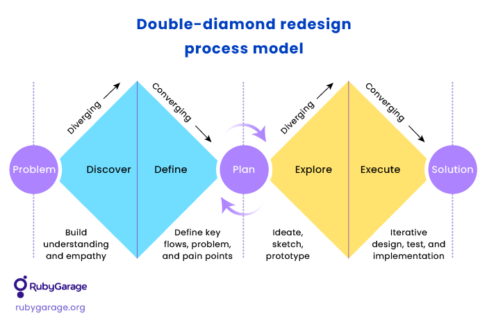
The scheme above consists of four phases that lead from the problem to the solution:
- Discovery: revealing and understanding the initial problem to be solved
- Definition: identifying the key challenges and pain points and defining the jobs-to-be-done
- Exploration: finding opportunities for improvement and ideating a suitable solution
- Execution: iterative solution design, validation, and implementation.
Step 1. Build a shared understanding
Stakeholders and existing and potential users have their own goals, problems, and vision regarding the product. Your role is to build a shared understanding of the goals and scope of the redesign. To outline the reasons for the product redesign from all points of view, we recommend:
- Interviewing stakeholders: Ask what they are interested in achieving and their expected timeframe for those changes. Also, discuss stakeholders' expectations for the product's look and feel, features, and target audience.
- Interviewing customers: Specifically ask why they chose your product over alternatives and what they love and hate most about it (features, flow, etc.).
- Researching target customers: If the stakeholders aim to conquer new markets or extend the customer base with new user categories, make sure to investigate and pay attention to their expectations, pains, and needsYou can use various mind mapping tools like Miro or XMind to structure your findings. Don't accept feedback from interviewees as absolute truth. What customers say and what they actually need and do is often distinctly different. Stakeholders' opinions also should be grouped and filtered to help you determine your focus.
Step 2. Review analytics
Learn from your product's analytics to evaluate the current design performance and detect issues without subjective judgments. You can track the actual design performance in a few ways:
- Traffic and pageviews analysis: Track how users enter and exit your website's pages, what browsers and screen sizes they use, where they come from, and transitions between pages. You can track the stage when most users leave the website and detect potential exit issues. You can use Google Analytics, Clicky, Adobe Analytics, or any other traffic tracking tool for this purpose.
- User behavior tracking: Heatmap tools like Hotjar or CrazyEgg can help you define where visitors click, tap, and scroll on website pages or app screens. You can also conduct session recordings to view how users navigate pages/screens.
- Performance and conversion analysis: In the case of websites, it's helpful to analyze page speed, user retention, conversion rate, ad clicks, and any other performance metrics that matter for your business. Mobile apps also allow for tracking sales, chunk, retention, etc. Mixpanel, Kissmetrics, and ChartMogul are tools to help you track and analyze those metrics.
Step 3. Define jobs to be done
If you have enough time and resources, you can conduct numerous activities to better understand your users' needs. Empathy mapping, customer personas, and user journeys are all useful in this aspect. However, implementing all of these activities may be too resource-consuming.
Based on user and stakeholder interviews and analytics results, you can list users' key jobs to be done.
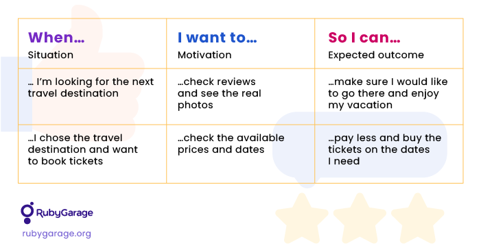
Through this process, you will understand what motivates customers to use your product and what their expectations are for the user experience.
Step 4. Define problem areas and opportunities for improvement
Jobs to be done, analytics, and user interviews help you reveal the problem areas of your existing design and understand what needs to be improved. For example, you can inspect your product screens or pages and identify elements that confuse users, work improperly, look outdated, or are not engaging enough. These are all problem areas that can be fixed in your product redesign.
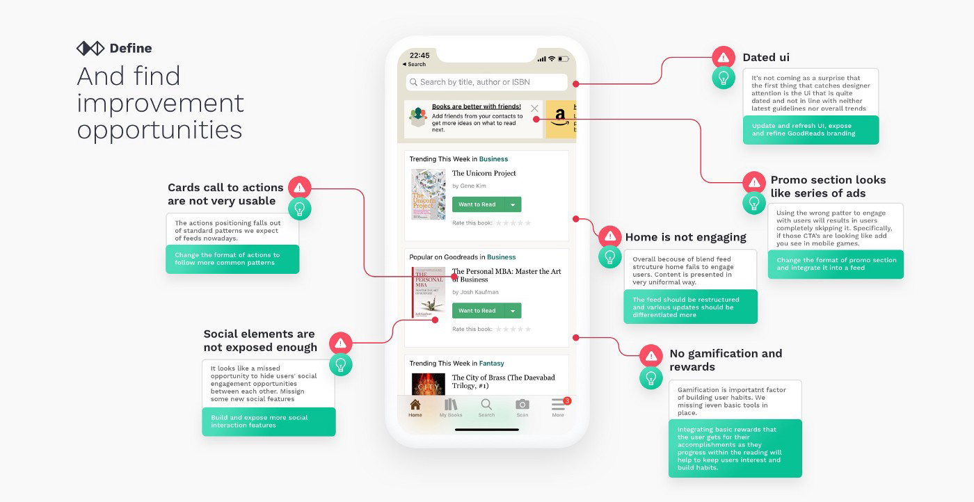
Discuss with your team what improvements you can make to fix the identified problems. You can generate numerous ideas during brainstorming sessions and then select the most appropriate ones.
Step 5. Define value vs. effort
After you've identified all issues and generated suggestions for improvements, you need to define the scope for the product redesign. One of the most effective ways to do that is by evaluating the customer value gained from the potential improvement versus the feasibility of that improvement.
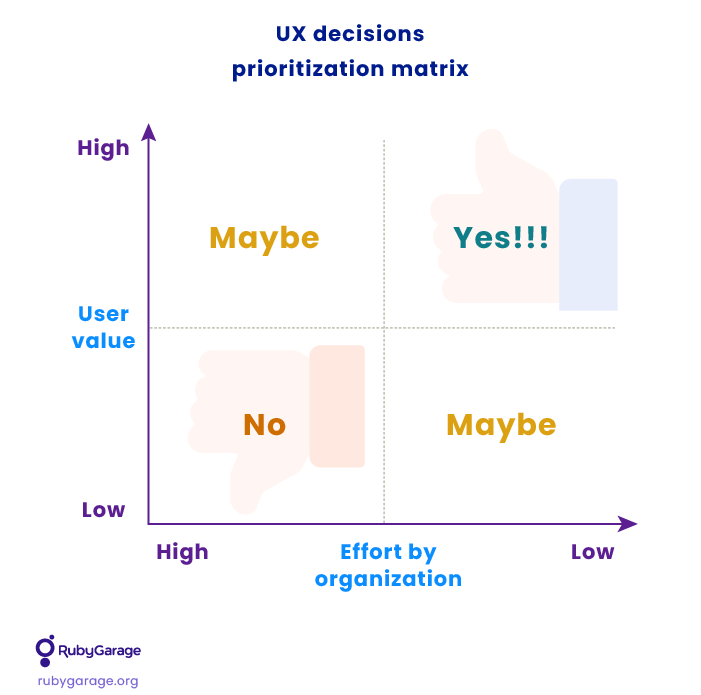
Such a prioritization matrix will help to define the scope of your redesign given budget and other resource limitations:
- Put all potential improvements on sticky notes (you can use either paper or a virtual board).
- Give each of your team members the same number of votes.
- Use dots with different colors for participants with diverse expertise. For instance, developers can have green dots to rank items by feasibility, while designers can have orange dots to rate the impact on users.
- Let participants vote on items.
- Arrange the sticky notes with improvement ideas on the chart based on the collected votes.
- Discuss the chart with participants to agree on the final placement of all items.
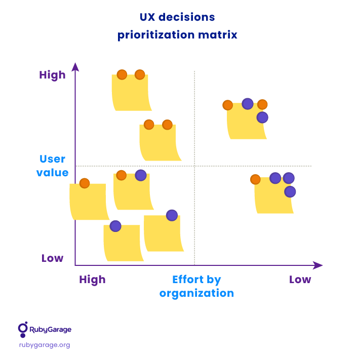
After the prioritization session, you can move to sketching the product redesign concept.
Step 6. Sketch the redesign concept
Low-fidelity sketches are great to roughly visualize ideas. There is no need to create detailed sketches at this time. Most likely, you'll need to rework your ideas anyways after validating them with stakeholders and users.
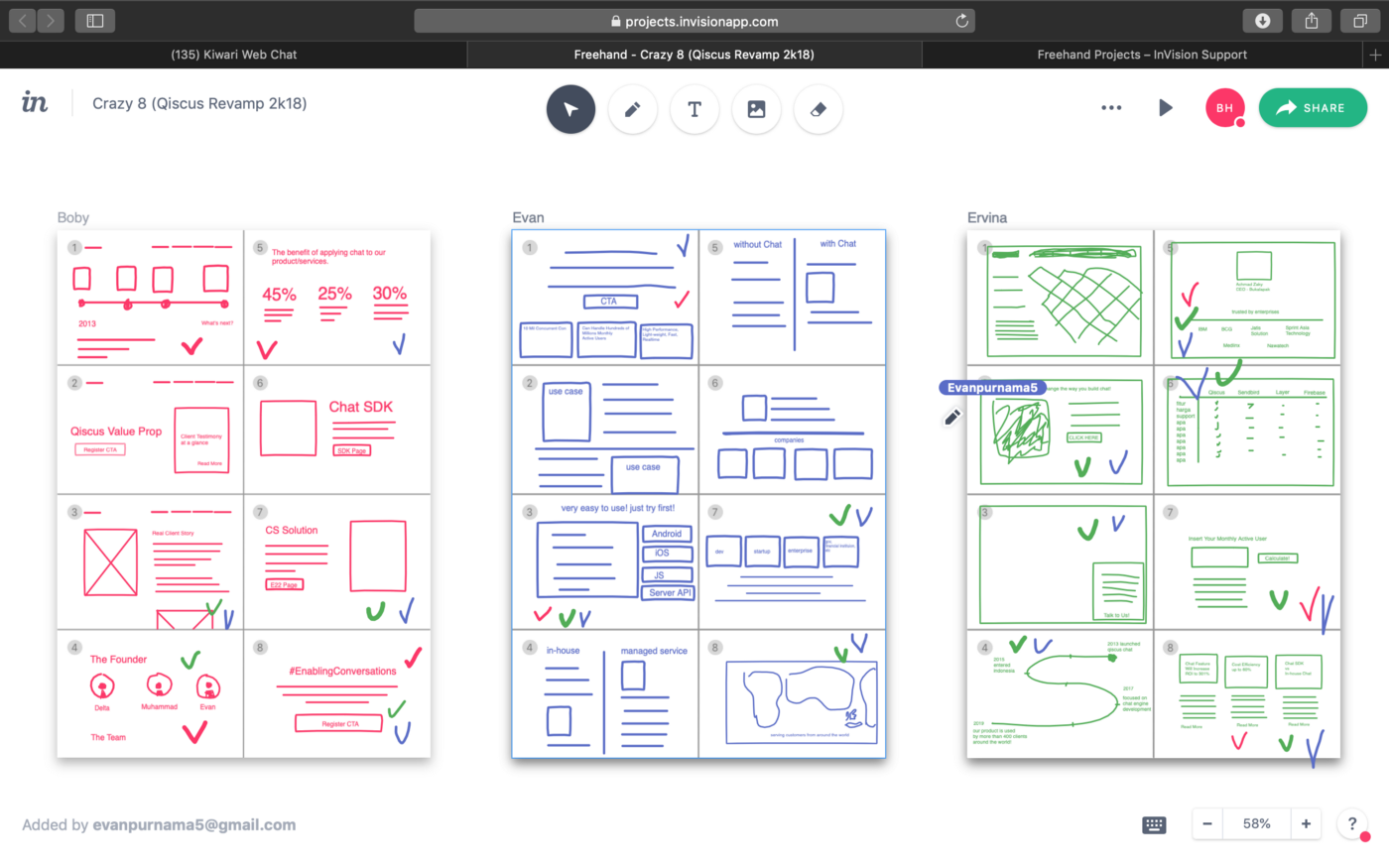
We recommend using a quick team technique like Crazy 8's:
- Create a virtual sheet divided into eight parts for each participant (you can use a Miro template).
- Set a timer for 8 minutes.
- Let participants fill in their sheets with eight quick ideas (sketching one idea per section).
- When the time runs out, everyone stops sketching.
If you name each section with a specific feature/flow/bug, you can collect ideas on how to redesign a product focused on the eight existing issues. Alternatively, you can ask the team to generate eight ideas for each job to be done. It's up to you.
After the sketching is over, analyze the collected ideas and choose those to elaborate further. Finally, you can vote on the chosen ideas with your team, discuss the final concept, and move to sketching the final redesign solution.
Step 7. Validate the concept with your stakeholders
The final concept can be presented to stakeholders through low-fi storyboards. Presenting a high-fidelity prototype may bring the feeling that there is no space for changes and that stakeholders' opinions were not considered.
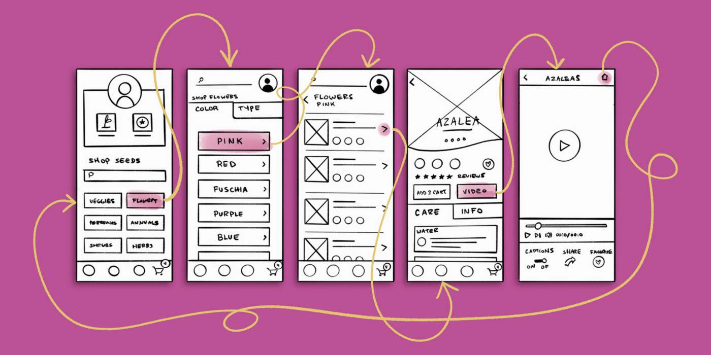
Present the low-fidelity concept storyboards, collect feedback from stakeholders, and then move to a higher level of fidelity to prepare the concept for user testing.
Step 8. Validate the concept with users
User testing before development helps save time and costs and ensures the suggested redesign meets users' expectations. Check out how to arrange and conduct user interview sessions in our UX design validation guide.
After conducting the interviews, analyze the collected feedback and modify the concept accordingly. This way, you will get a validated solution for your product redesign, ready for implementation.
Step 9. Implement the changes and release
Outline the scope of the product redesign, and estimate how long and how much resources it will take to implement the changes. Define the required team and form the delivery plan.
Make sure each implemented item is properly tested before it gets to end users. As people naturally tend to resist changes, a disappointing user experience with the updated design is unacceptable.
Also, make sure to prepare for the public release. Many teams don't present the changes to the public properly. Your target audience should be prepared for changes and aware of what to expect. Announce upcoming changes on social media, publish press releases, and conduct marketing campaigns to support the release.
Never stop with improvements
Users continuously change their habits, and competitors continually make updates, so there is always room for improvement. Track how your customers perceive the new design and reveal opportunities to improve further. Sometimes, redesigning a product involves little effort yet brings significant outcomes in terms of customer satisfaction. That is why we highly recommend conducting the continuous flow for UX design audits and upgrades to support your digital product's success in the long run.
RubyGarage's experience
At RubyGarage, we provide product redesign services for our clients. We strictly follow project requirements and do our best to improve each product's appearance, performance, and usability.
Each project is unique. Some clients request a visual revamp, while others would like to improve the product's conversion metrics. Some receive multiple complaints from customers and need to fix UI/UX bugs to enhance user satisfaction and engagement. We investigate problems and propose solutions that directly address our clients' goals. Here are a few product redesign case studies from our portfolio.
MilanStyle
MilanStyle is an online marketplace for fashion designers. Jonathan Edwards, the MilanStyle founder, requested RubyGarage to add new design features. However, the project scope went far beyond the initial request: we completely redesigned the online shopping experience.
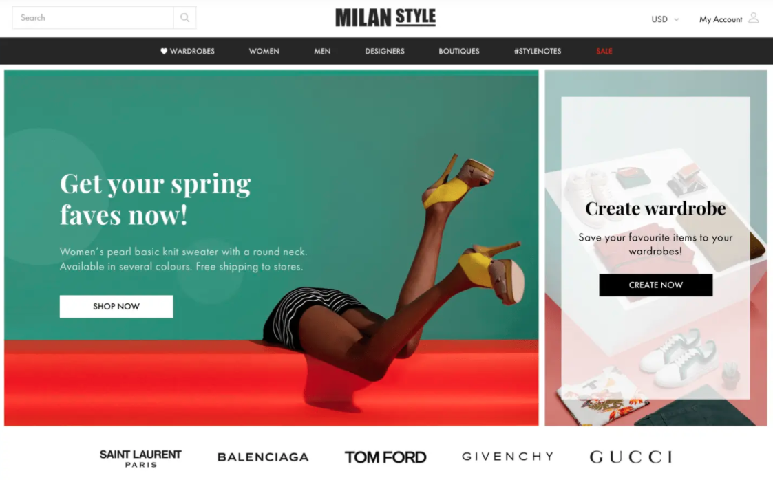
We conducted a UX design review to reveal usability issues and understand how to redesign the product's shopping experience. Then, we redesigned existing components according to our findings. We implemented multiple changes:
- Improved search functionality
- Implemented intuitive product filtering
- Simplified product card views
- Redesigned the product page to make it easier for customers to see all product details
- Implemented a new wardrobe feature to let customers view clothes collections for inspiration and share their own wardrobes with others
See the full scope of improvements we made for MilanStyle in our detailed case study.
Campsited
Campsited is a marketplace where travelers rent campsites from park owners. The product owners came to RubyGarage to extend the functionality of their online service and take the customer experience to a new level.
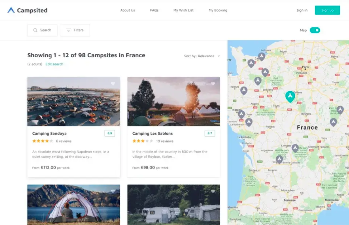
We optimized the system architecture and redesigned the UI/UX by:
- Implementing straightforward navigation for better usability
- Integrating Google Maps for handy search of nearby campsites
- Creating a more visually appealing page design to promote the brand and boost customer awareness
- Designing a user-friendly campsite catalog
We implemented numerous functional add-ons that haven't cluttered the user experience. On the contrary, we did a great job of simplifying all user flows for better and more pleasant performance. See the detailed overview of the project scope in our Campsited case study.
Medshop Express
Medshop Express is an online drugstore that has offered over a million health and beauty products since 2002. Fazelli, the founder, was unsatisfied with the platform that the website was built on and wanted to improve the site's performance, boost sales, and extend the customer base through new features and usability improvements.
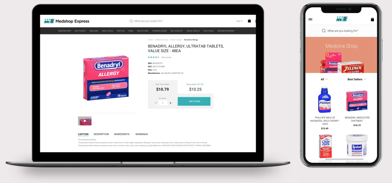
We've done a great job moving Medshop Express from a SaaS platform to a custom solution and redesigning its UI/UX to address all existing usability issues. Get more details in our Medshop Express case study.
Conclusion
Creating a completely new product design is not always the best option. Often, changes to the existing design are enough to address major customer issues and strengthen your product's competitiveness. Moreover, if a product has been in use for quite a long time, a completely new design may impact customer loyalty. On the other hand, a redesign is a cost- and time-effective approach to bring the product up to date, improve its usability, and extend functionality. We are ready to provide expert assistance in auditing your current product design, conducting usability research, and finding and implementing result-oriented product design updates.
FAQ
-
People naturally resist the changes, and it may to take some time while your customers get used to the updated product look-and-feel and appraise the improvements.
Another pitfall is that the team members can also resist to changes, when there is a working solution already in place.
-
We always identify the redesign scope based on the research and analytics, identifying what exactly has to be improved, and in what ways. Then, we validate the redesign concept with both the stakeholders and users.
-
In a broad sense, redesign makes sense when you can (or need to) increase your product value through the appropriate changes. This can be resolving critical customer issues, adding new product features, etc.


