-
Product Management
Software Testing
Technology Consulting
-
Multi-Vendor Marketplace
Online StoreCreate an online store with unique design and features at minimal cost using our MarketAge solutionCustom MarketplaceGet a unique, scalable, and cost-effective online marketplace with minimum time to marketTelemedicine SoftwareGet a cost-efficient, HIPAA-compliant telemedicine solution tailored to your facility's requirementsChat AppGet a customizable chat solution to connect users across multiple apps and platformsCustom Booking SystemImprove your business operations and expand to new markets with our appointment booking solutionVideo ConferencingAdjust our video conferencing solution for your business needsFor EnterpriseScale, automate, and improve business processes in your enterprise with our custom software solutionsFor StartupsTurn your startup ideas into viable, value-driven, and commercially successful software solutions -
-
- Case Studies
- Blog
Case Study: Drako, a Free Sticker Pack for iMessage
Apple is one of the most loved IT companies in the world. People especially like their fast, reliable and sleek mobile operating system ‒ iOS – as well as their applications like iMessage. Recently, with the release of iOS 10, the revamped version of iMessage lets third-party designers and developers create their own playful sticker packs.
Our RubyGarage team along with our design office, UGEM, couldn’t resist the temptation to make our own sticker pack for iMessage. After all, it’s the perfect opportunity to share our creativity and offer a Christmas and New Year’s present. Let’s discuss the details of our fruitful collaboration.
Why Stickers?
Today, people tend to exchange ideas via images, stickers, and drawings in addition to plain text. Celebrities are, as a rule, global trendsetters. And they like to create their own sticker packs. For example, Kim Kardashian made Kimojis so her fans can exchange her iconic facial expressions. Kylie Minogue, Kevin Hart and Ellen DeGeneres have also joined the trend, as well as entertainment corporations including Disney (Star Wars and Finding Dory emoji packs) and Marvel (stickers with popular comic book heroes). No wonder that after Apple launched their iMessage App Store it grew to more than 1200 sticker packs in just a week ‒ three times more than the number of regular applications, like games and utilities, available for iMessage.
Here at RubyGarage we’ve had the idea of creating our own sticker pack for a while. Originally, we were inspired by real stickers on our team’s laptops. Interestingly, not only would our designers customize their devices with Sketch, Dribbble, and Behance stickers, but our developers would as well. GitHub octocats, Twitter birdies, and Ruby Together gems have long distinguished our teammates from the crowd and indicated their membership in the Ruby community.
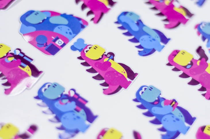
Moreover, we saw a double advantage in making a sticker pack. First, it would give us an in-house project to unite our design and iOS development teams. Second, we realized that iMessage stickers don’t have to be stuck in our phones: why not print them, make posters with funny quotes, and print T-shirts to give to our friends and colleagues? Stickers allow much space for creativity.
Meet Drako – not your typical sticker
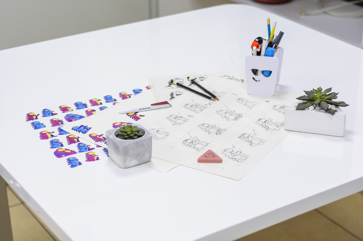
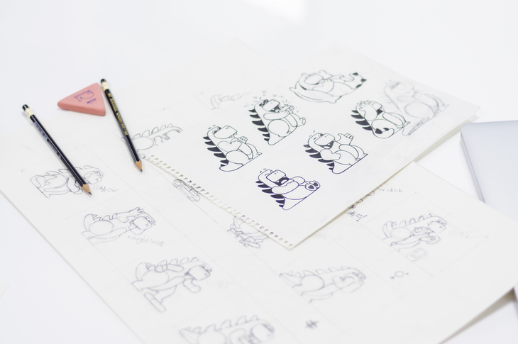
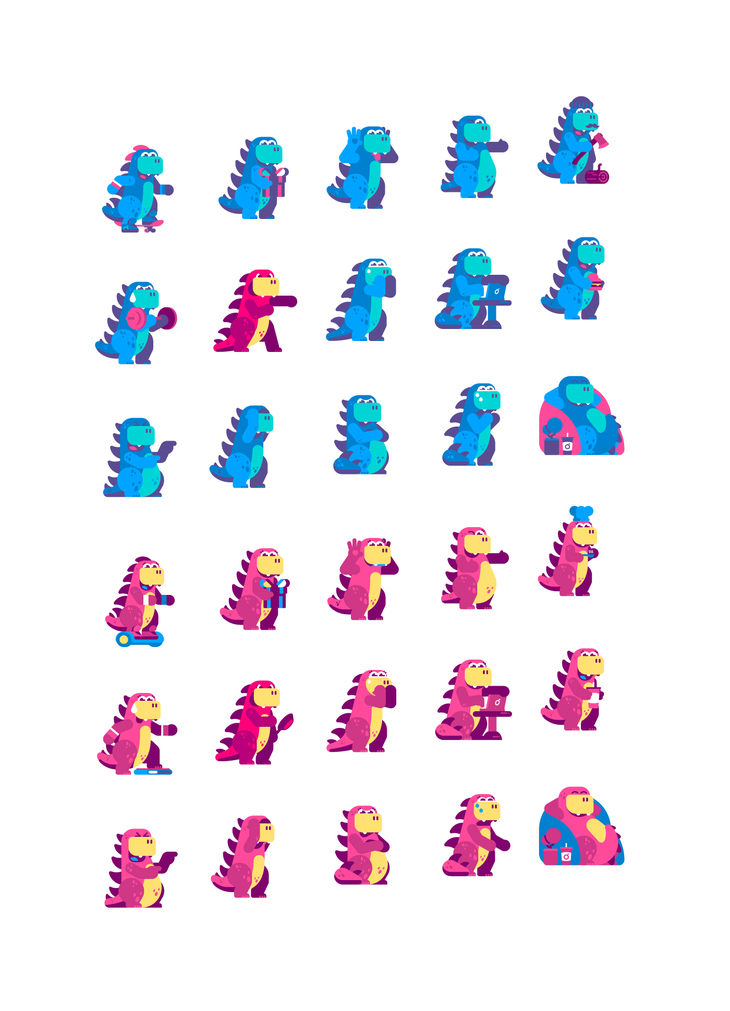
Kittens, puppies, bunnies, hearts, and unicorns – the level of cuteness goes through the roof on the App Store for iMessage. That’s why our UGEM illustrator Ildar Aleksandrov picked a dinosaur as our sticker mascot. Ildar came up with the idea to of a dinosaur during one of our brainstorming sessions with the design team. In the course of our conversation, Ildar got inspired by Godzilla – the giant monster from Japanese movies. As usual, we started by drawing some sketches.
Color Palette
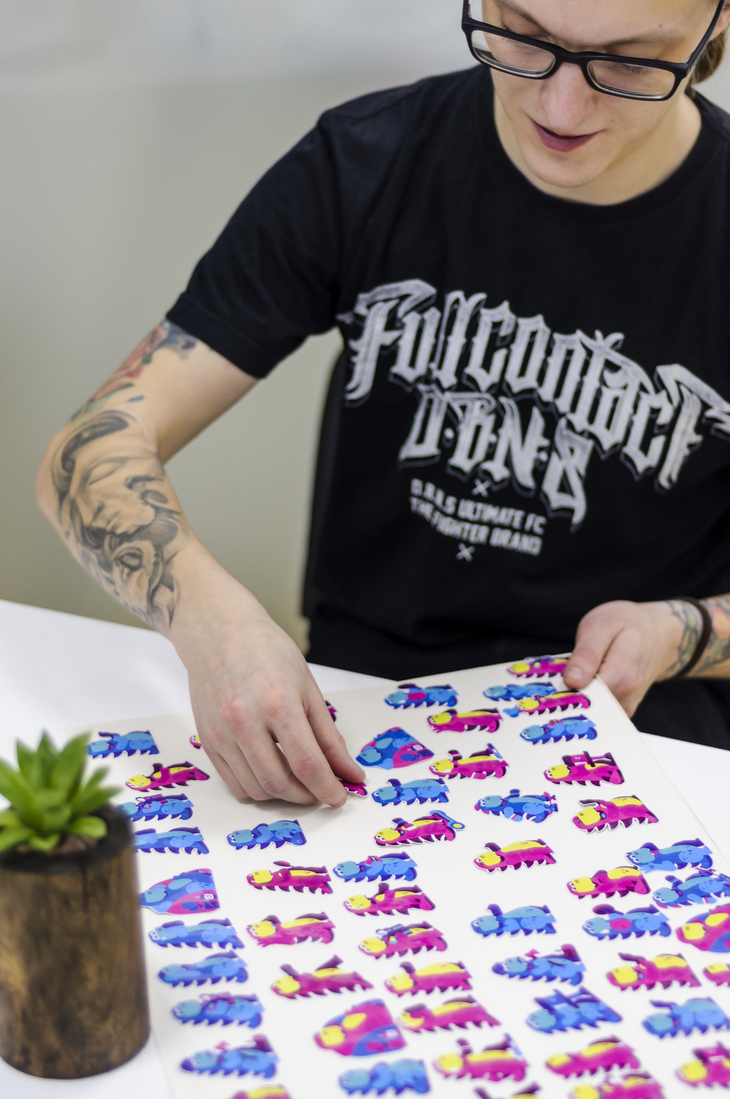
The next step was to pick a color palette. The UGEM team selected bright colors that would appeal to a large audience: pink, blue, turquoise and yellow hues. We also developed two contrasting color schemes for Drako. The first scheme is designed with prevailing blue shades, intended to express strong feelings. Another scheme is designed with shades of pink, which create a more tender mood. Each color scheme consists of six colors. We mixed colors from both color schemes to add contrast and separate objects ‒ like a skateboard or a Christmas gift ‒ that Drako interacts with. We strived to offer a variety of colors and styles for every emotion and mood.
Elements and Details
Finally, we started working in Adobe Illustrator to breathe life into our sketches. We chose a flat design for our stickers that’s based on geometrical elements ‒ circles and squares ‒ so we paid much attention to how straight lines, curves, and colors fit together. You might have noticed that the dinosaur doesn’t have any contours on its body parts like hands and legs. To make the body parts distinct, we used shapes without borders, gradients and patterns. As a result, everything in Drako’s hands – like a glass of Cola or a laptop – are visible and sharp.
Animation
Instead of creating a pack of static stickers, we added some spice by animating our stickers in Adobe After Effects. We created a ‘puppet’ ‒ a frame with flexible joints that bend and move just like a real skeleton. This kind of animation requires much time and effort, since Drako’s moves must be noticeable and easily seen even on small screens. It’s worth the effort, however, as these movements better represent Drako’s emotions, such as joy and sadness.
Wrapping Up
We had much fun working on our Drako sticker pack for iMessage. This project brought together our UGEM design team and our RubyGarage developers to make a holiday present for a worldwide community of young and creative people. By the way, our sticker pack is totally free, so don’t forget to share it with your friends! If you’re interested in more details about our designs, visit our pages on Dribbble and Behance! From today, stickers available not only on App Store, but Telegram as well!


