-
Product Management
Software Testing
Technology Consulting
-
Multi-Vendor Marketplace
Online StoreCreate an online store with unique design and features at minimal cost using our MarketAge solutionCustom MarketplaceGet a unique, scalable, and cost-effective online marketplace with minimum time to marketTelemedicine SoftwareGet a cost-efficient, HIPAA-compliant telemedicine solution tailored to your facility's requirementsChat AppGet a customizable chat solution to connect users across multiple apps and platformsCustom Booking SystemImprove your business operations and expand to new markets with our appointment booking solutionVideo ConferencingAdjust our video conferencing solution for your business needsFor EnterpriseScale, automate, and improve business processes in your enterprise with our custom software solutionsFor StartupsTurn your startup ideas into viable, value-driven, and commercially successful software solutions -
-
- Case Studies
- Blog
UI/UX Design Trends for Ecommerce 2019: How to Make a Cutting-Edge Online Store
As technology is advancing, user expectations are also taking a leap. You have to keep your finger on the pulse of ecommerce trends to have a strong digital presence. With this in mind, we’ve picked out some of the most prominent UI/UX design trends 2019.
First, let’s consider UI design trends in ecommerce.
Pure minimalism
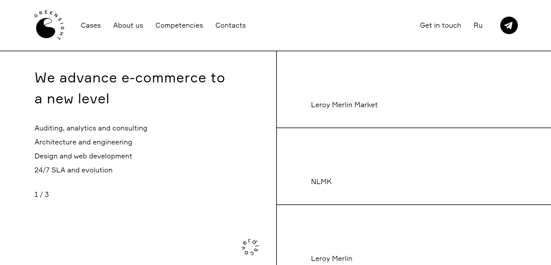
The days of wow-effect complex graphics seem to be over. They aren’t popular anymore. Minimalism is exactly what modern consumers want. While mind-blowing designs are appealing, ultimately, that’s not what people are looking for on an ecommerce website. It’s more important to thoroughly think through your navigation, content, and other critical things.
Greensight does a great job with minimalism on their website.
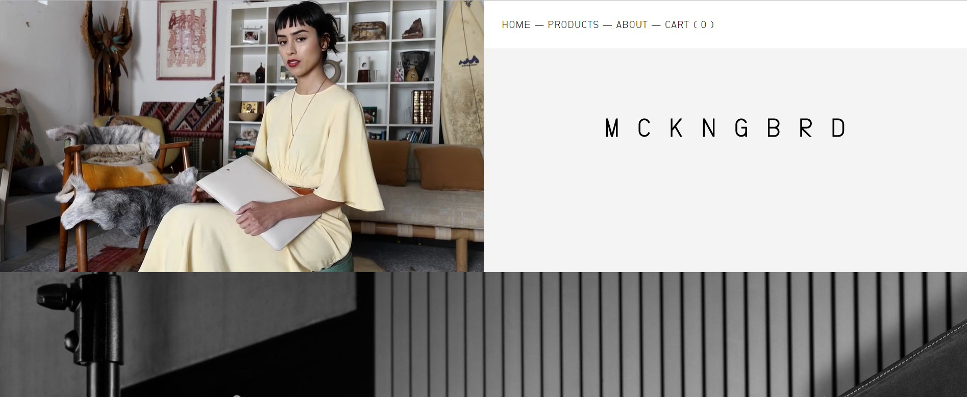
One more great example of minimalism is the website of fashion brand MCKNGBRD.
Bold headlines
Typography has a far-reaching effect on the user experience, user perception, readability, and even mood. What’s more, with an abundance of ecommerce websites, it becomes harder for companies to grab their visitors’ attention. That’s why more and more designers are resorting to bold headlines.
Here are reasons to use bold headliners:
- Attract more attention. First of all, bold headlines are great at drawing the attention of prospective online visitors.
- Emphasise things. Bold headlines allow you not only to draw your website visitors’ attention but also to highlight precisely what you want people to focus on.
- Create a clear visual hierarchy. Bold headlines allow you to demonstrate the visual hierarchy of copy on your website. Simply put, bold headlines can guide visitors when a website looks overloaded.
- Improve readability. Since bold headlines provide visual hierarchy to a website, content becomes more readable. It’s also worth mentioning that website users tend to read large-print content first.
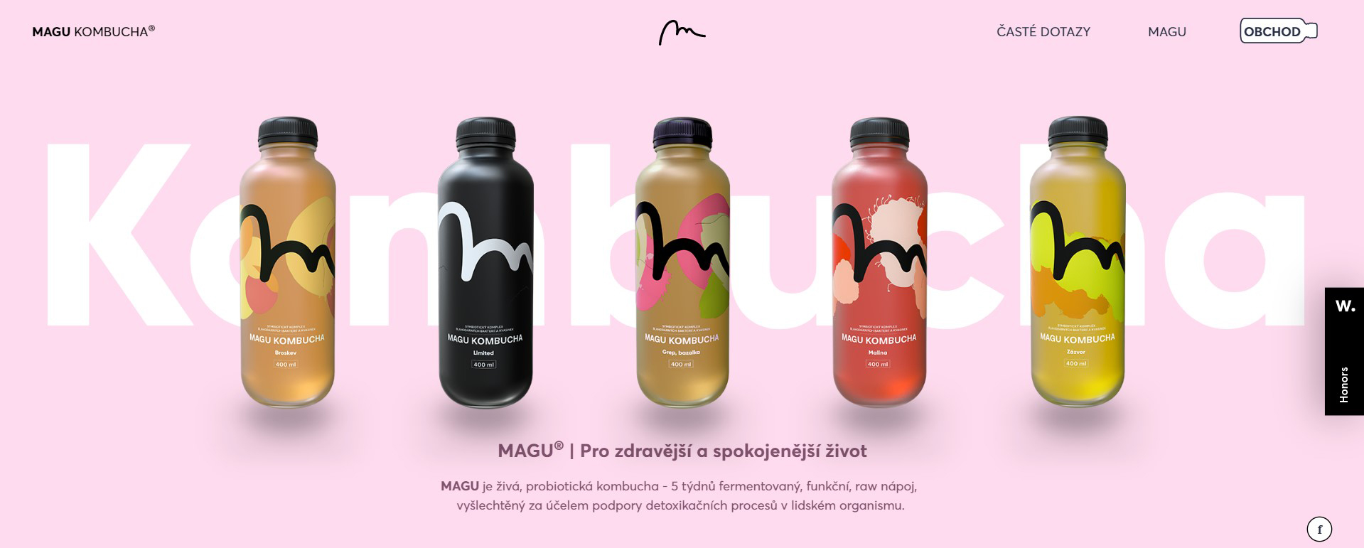
Take a look at how Magu Kombucha creates a bold headline. Note that the design is quite minimalist as well.
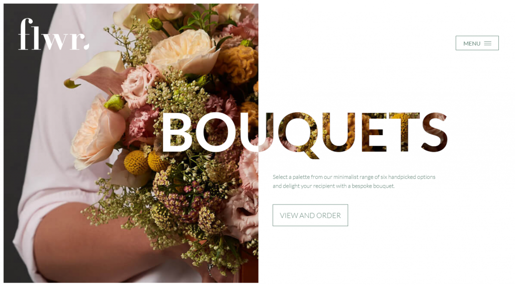
This way of getting people to stay works best when the rest of the website is minimal and clean, like that of Flwr, a company that sells floral decorations.
Visual storytelling
People don’t have the time to read nowadays. That’s why they’re more attracted to visual stories than text. As they say, a picture is worth a thousand words, which is especially true considering that visual information gets to the brain 60,000 times faster than text.
Visual storytelling works. Just take a look at the Shopbop website – especially their summer checklists and curated collections – and see how they convey their message without words, allowing visitors to get the main idea fast.
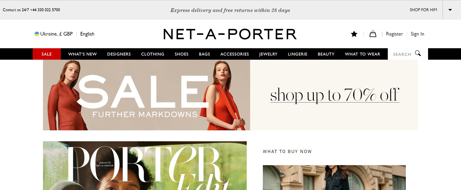
One more vivid example of visual storytelling is Net-a-Porter, whose website looks like a fashion magazine rather than an online store.
Now we’re going to talk about UX design trends in ecommerce.
Microinteractions
Microinteractions are contained product moments that revolve around a single use case.
Microinteractions are moments where the user and design interact. To be precise, these small and subtle interactions with a website – such as transition animations and confirmation messages – make the experience positive and efficient while keeping the navigation simple and intuitive.
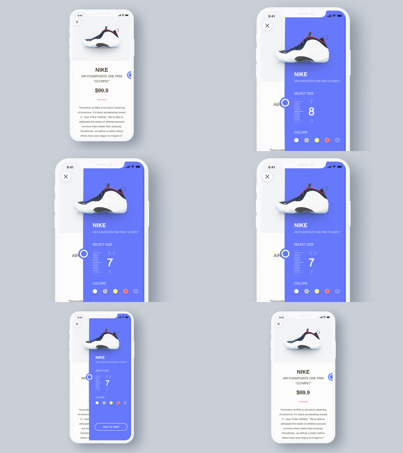
Though microinteractions aren’t a new phenomenon, in 2019 they’ll be much more popular since they bring practical benefits to the user experience. In 2019, animated buttons, scrolling visuals, toggles, and switches continue to gain momentum. Such microinteractions increase usability and help users easily navigate. For example, they show the system status (so users know what’s going on), highlight changes, keep context, visualize input, etc. Use this powerful technique to delight a user and create a welcoming and engaging moment like Femme & Fierce did.
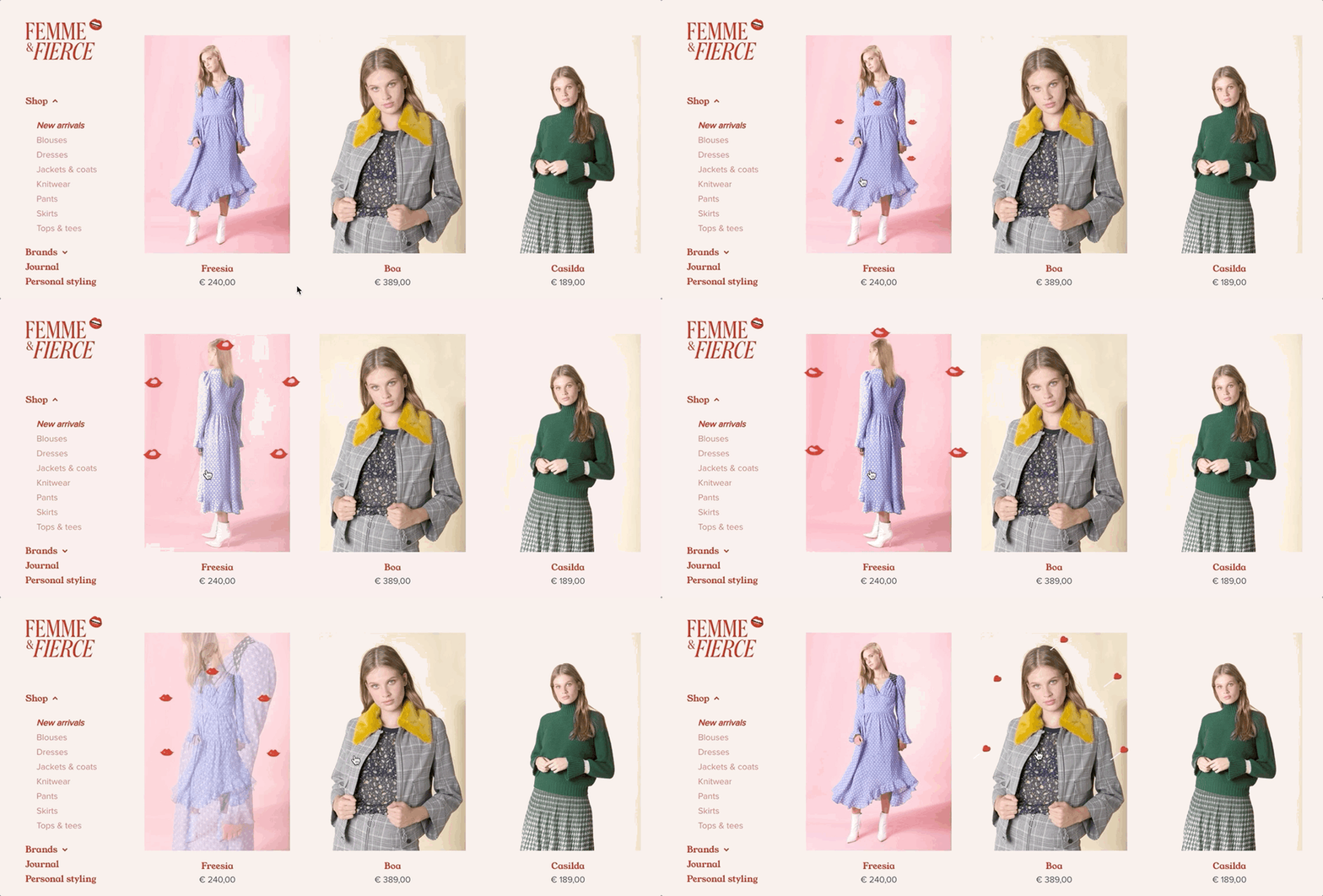
Customers love microinteractions and have come to expect them. Motion is an integral part of the interaction experience in 2019.
Mobile-first design
We’re all well aware of the rising use of mobile devices in ecommerce. Mobile commerce is expected to account for 72.9% of ecommerce sales by 2021.
Your business should be accessible to customers from and look friendly on any device. Compare how the Bryant Dental website displays on desktop and mobile.
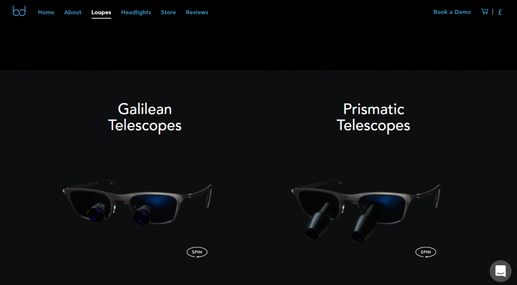
The website presents the same message and imagery but treats mobile and desktop users differently.
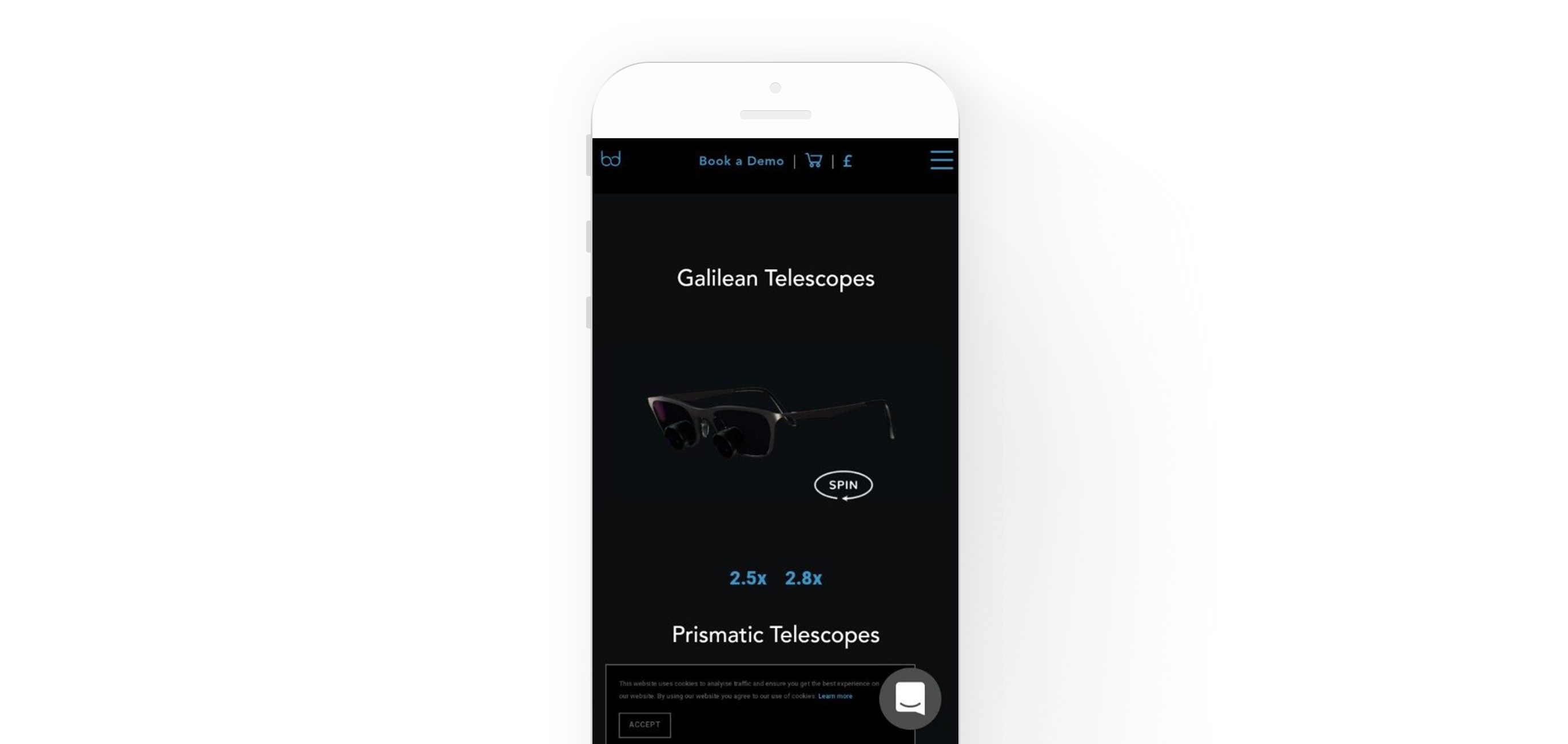
In 2019 we expect that easy-to-use dedicated apps and mobile websites will become more popular among online customers, so it’s vital that site design continues to prioritize mobile.
Efficient product showcases
According to Adam Hayes of HubSpot, 76% of companies have increased their sales thanks to videos, and 81% of customers say a video convinced them to buy a product.
In 2019, videos are dominating, so it’s time to use them. Instead of classic text blocks, implement a short video about a product or a service. This will be much more efficient.
Just take a look at how Tesla implements videos on their website. However, being going all in, make sure this is the best way to showcase your product.
One more great way to show a product from all angles is using 3D graphics. Such interactions not only allow users to have a 360-degree product view but improve the likelihood of a purchase.
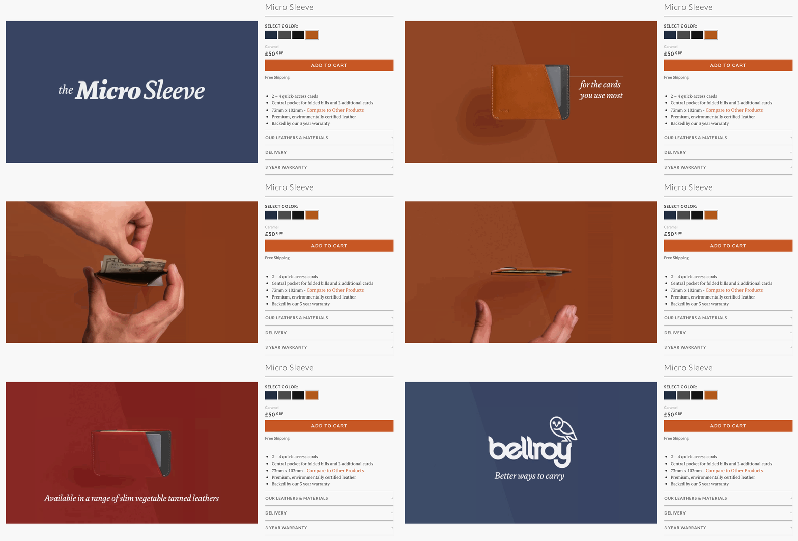
One example of this comes from Bellroy, which demonstrates excellent use of 360-degree product views.
