-
Product Management
Software Testing
Technology Consulting
-
Multi-Vendor Marketplace
Online StoreCreate an online store with unique design and features at minimal cost using our MarketAge solutionCustom MarketplaceGet a unique, scalable, and cost-effective online marketplace with minimum time to marketTelemedicine SoftwareGet a cost-efficient, HIPAA-compliant telemedicine solution tailored to your facility's requirementsChat AppGet a customizable chat solution to connect users across multiple apps and platformsCustom Booking SystemImprove your business operations and expand to new markets with our appointment booking solutionVideo ConferencingAdjust our video conferencing solution for your business needsFor EnterpriseScale, automate, and improve business processes in your enterprise with our custom software solutionsFor StartupsTurn your startup ideas into viable, value-driven, and commercially successful software solutions -
-
- Case Studies
- Blog
How to test UX Design: UX Problem Definition and Solution Validation
UX design is usually regarded as pure creativity. Through the process you can create an excellent look and feel for a product, use some fashionable UI tricks, polish all screens to work smoothly, and create a unified structure. Yet all these efforts are useless unless you match your creativity with users' needs, expectations, and values. Interfaces serve users from one side and businesses from the other.
Thorough UX validation ensures you are able to create a product that conveniently brings users what they want and what motivates them to generate profit for your business. But how do you do it?
In part 1 of our practical guide to UX validation, we uncovered the step-by-step flow to discovering existing UX problems, validating them through user interviews, and forming a list of UX problem hypotheses to be solved. In part 2 of the UX validation guide, you'll learn how to refine UI problems, generate UX solution ideas that address them, and choose the best solution to implement.
What is UX problem validation?
UX problem validation provides decision-makers with a deeply understood and precisely articulated customer problem. Furthermore, it helps them perceive the problem context from the user's point of view (descriptive research) and get insights for solutions and innovations (generative research).
Before you begin practicing problem validation, you should prepare all required templates. As we mentioned in part 1 of the UX design validation guide, we use a Miro board to organize and structure all required activities. If you follow our workflow, you may already have a UX validation workboard in Miro with completed user personas, interview results, and other items. Add the following boards to your workboard to prepare for the next steps in UX problem validation:
- Customer journey map template
- Empathy mapping board
- User personas
- Point of view card board
- Heuristic analysis board
Examples of what these steps may look like are below.
Step 1. Customer journey mapping
Customer journey mapping visualizes the story of customer interactions with a product or brand. It helps you:
- Define how people use your product
- View the user experience from the customer's perspective
- Understand the timeline of all touchpoints between a user and a product
- Better understand the user experience for different groups of customers
- Identify a more seamless experience across businesses, functional silos, and channels
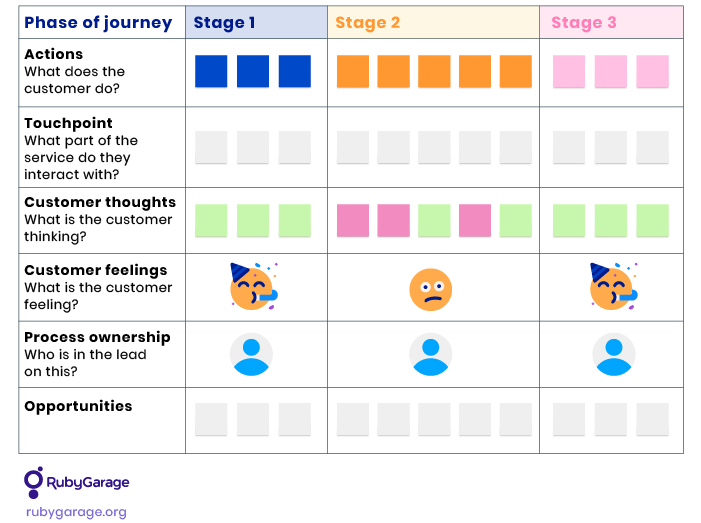
We recommend creating a general customer journey map template in Miro according to the user journey you need to analyze. Users go through multiple journeys while interacting with a product, so focus on the ones you need to analyze in your existing UX solution. You can arrange a CJM template in your Miro board in the following way:
How to conduct journey mapping?
We use customer journey mapping to reveal how each interviewed user performs a specific journey through the product's interface. Here is how to fill in a CJM workboard for the interviewee:
- Define the stages a user goes through to gain the required result. Be specific with underlining the stages of your user journey. For an ecommerce app, a user may go through the onboarding – search for a product – view product details – add to shopping cart – fill in order details – checkout journey.
- List user actions per stage, actual behaviors, and steps users take within a given stage.
- List the user's thoughts, feelings, and emotions to help reveal the customer's satisfaction, challenges, and reactions to product performance along their journey.
- Define touchpoints by highlighting all digital or physical interactions with other tools. For example, if a user needs to take their physical credit card in hand to fill in payment details in your app, add it as a touchpoint.
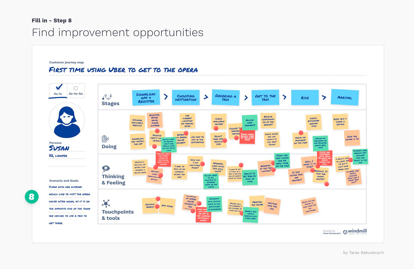
- Identify user pain points. Most UX problem validation guides recommend giving an interviewee the ability to vote for any number of actions that caused troubles. We recommend creating a separate section for pains in the CJM to determine how users feel uncomfortable or why they are not successful in achieving their goals.
- Write down ideas for improvement based on the identified pain points. Generate ideas on how to improve the situation or remove the user's pain from the journey.
While filling out the CJM for each user, go through the above steps for each CJM phase. It may help the interviewee focus on each action.
Step 2. Customer profiling
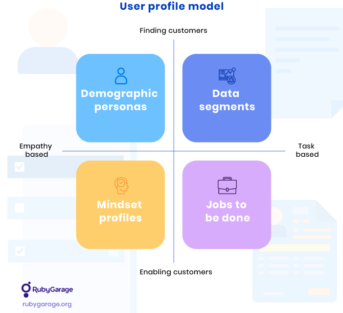
Based on analysis of customer journey maps and user interviews, define the main user types related to the researched problems. Then, depending on the project type and the identified UX problems, you can segment customers in different ways:
- Demographic segments are best used to find users with highly targeted, branded experiences. Demographic segmentation is widely used for marketing purposes.
- Data segments are suitable for identifying who is currently using the product and optimizing their experience. For instance, data segments for an ecommerce app can be visitors, purchasers, or decision-makers.
- Mindset profiles are suitable when designing products with one core function for different users. They help you identify different types of users based on how they think and what they expect to achieve within the same user journey.
- Jobs to be done is suitable when designing complex software products for different users. It helps determine why people use the product and what results they want to get.
The outcomes of customer journey mapping are documented customer journey maps and a list of user profile types related to the researched UX problems.
Step 3. Empathy mapping
An empathy map is a collaborative visualization of what we know about a particular user type. It helps systematize and understand user needs and helps in decision-making.
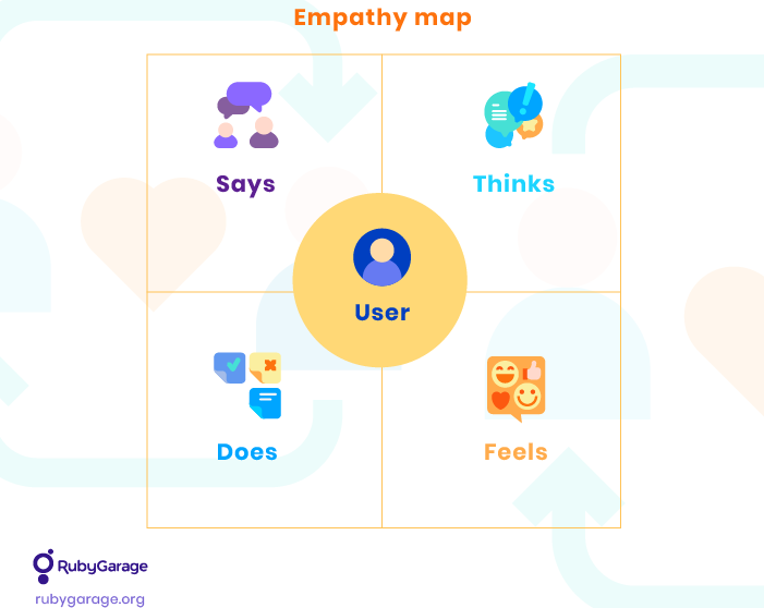
Prepare for empathy mapping
- Use the defined customer segments to divide interviewees by groups, and create an empathy map in your Miro workboard for each segment.
- Create the empathy mapping session plan (agenda), and schedule the required activities to organize the process for all participants.
- Share the plan with all participants.
Conduct an empathy mapping session
- Set the stage. Explain to the group that their task is to immerse themselves in the target personas. Participants should imagine how the target personas feel, what they think, and how they act. Review the findings made during previous steps (user interviews and customer journey maps), and introduce the personas.
- Demonstrate by doing. Before you break into subgroups, ensure the team has detached themselves from their biases and are ready to immerse themselves in their customer persona. Choose an example persona unrelated to your product or service and run through a quick role-play to get into the mood.
- Fill in empathy maps. Divide the group into pairs or trios. Assign each subgroup a persona and, depending on the number of small groups you have, allow 10 to 15 minutes for each group to fill in their empathy map. The more groups you have, the more time you should leave for sharing maps with the larger group." instead of the highlighted sentence Pay special attention to pain points. The whole point of your design validation is to improve a product or service, right? Think about what the persona hears from friends or says about the product regarding the pain they experience when using it.
- Present empathy maps. As each subgroup presents their map, encourage the entire group to raise questions or topics for discussion. What insights does the map reveal? What assumptions are we making that need to be researched? Where do we have knowledge gaps?
- Determine next steps. Did you stumble upon questions that need to be answered before moving forward? Assumptions that need to be validated? Discuss what you’ve learned from the empathy maps and how your learnings can be applied to improve your product. Assign tasks, owners, and due dates as necessary.
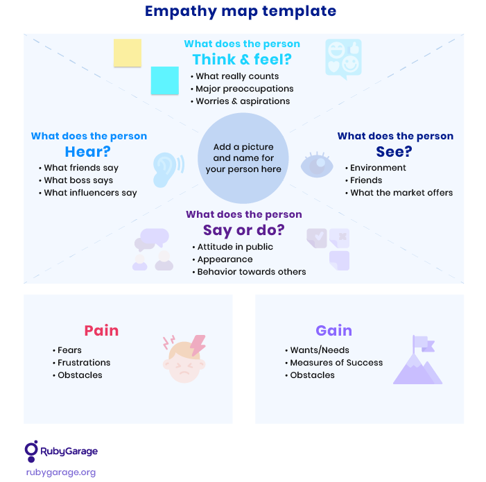
Activities after the empathy mapping session
Prepare an empathy mapping report with your conclusions from your observations. Then, fill out the after-meeting session in the agenda file and share the results with your stakeholders. The session’s outcomes include completed empathy maps, a list of proven and disproven assumptions, and ideas for further consideration.
Validated user persona development
Based on the empathy maps created, determine the average user persona(s) that could serve as a base for the following UX validation stages. Then, update your initial user personas with data collected during research.
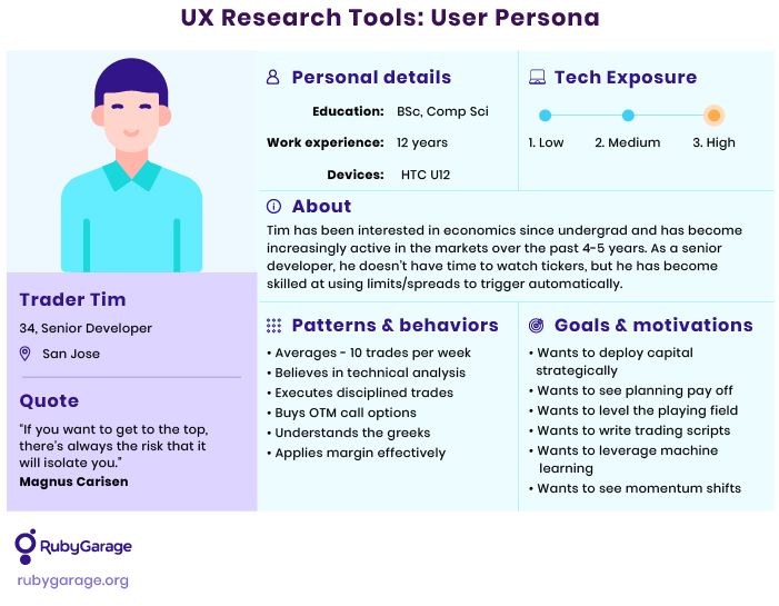
Step 4. Point of view card sorting
Card sorting is used in UX research to discover how people understand and categorize information. In a card sorting session, participants group ideas written on cards into logical categories. There are three card sorting methods:
- Open card sorting is when participants sort cards into categories and then name those categories themselves.
- Closed card sorting is when participants sort cards into predefined categories.
- Hybrid card sorting is when some categories have already been defined, but participants can create their own categories while sorting the cards.
Prepare for POVs card sorting session
To run a point of view card sorting session effectively:
- Create index cards for potential product features, listing all your ideas for improvements and essential points to collect feedback from participants.
- Choose the sorting method most appropriate for your research goal. If you still need your participants to help clarify the uncertainty in your UX problems by creating categories, choose a hybrid or open sorting method. Arrange a closed session if you have already determined your categories.
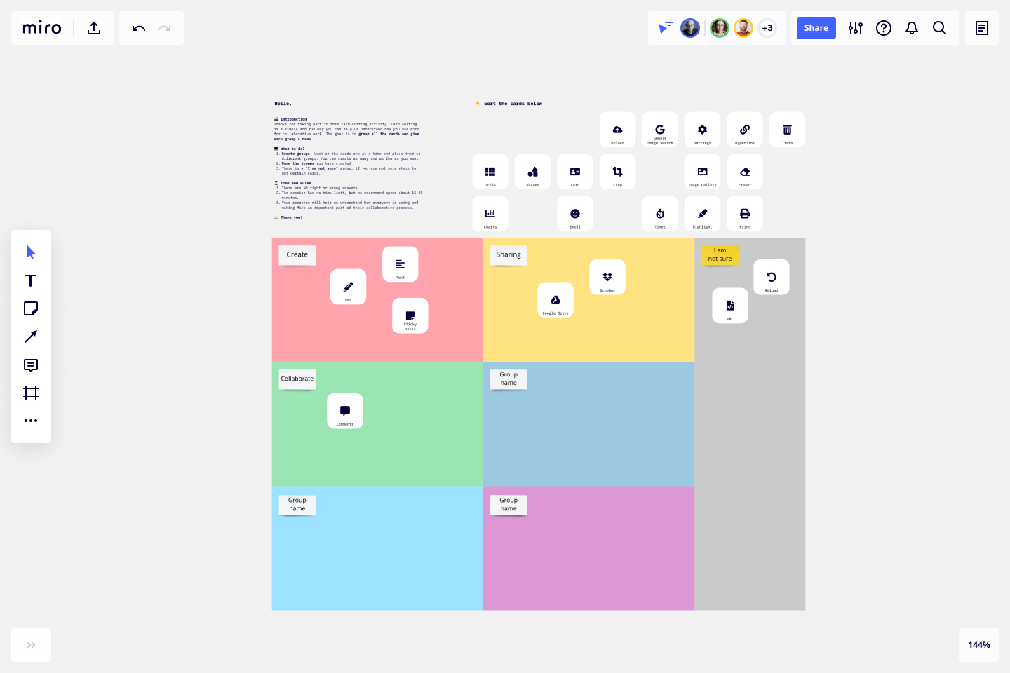
- Prepare a POV card board in your Miro workboard so that participants can easily sort cards.
Miro offers a card sorting template you can use:
Run a sorting session
- Present the sorting card board to participants and explain the premise of the activity.
- Run a sorting session with each participant. First, mix the cards and show them to the participant. Ask them to look at the cards one by one and place them into piles (either named or unnamed). The piles can differ in size, and some cards can remain unsorted if the participant is unsure of their meaning or grouping.
- If you run an open card sorting session, let the user name their card groups.
- Debrief the participant. Ask each participant to explain their choice of groups and clarify which, if any, cards were challenging to sort or could belong to more than one group.
- If needed, ask the participant to split large categories into smaller groups or combine small groups into larger categories.
- Repeat the session with each participant. We recommend using 15 to 20 participants to collect the optimal amount of data in order to reveal overlapping patterns.
- Analyze your findings and create a card sorting results report.
Step 5. Heuristic analysis
Heuristic analysis helps evaluate the usability of a website or product based on an established list of heuristics. Experts including a UI/UX designer will assess how well a product complies with these criteria to define its usability. In our UX validation flow, heuristic analysis is another step to evaluate discrepancies between business requirements, end user expectations, and the current product’s UX design.
To conduct heuristic analysis, you should:
- Establish a list of heuristics. As a rule, the team should define 5 to 10 evaluation criteria. Setting more than 10 heuristics may have no significant impact on the outcome. While you can choose any criteria that you consider essential, there are ten classic usability heuristics to start from.
-
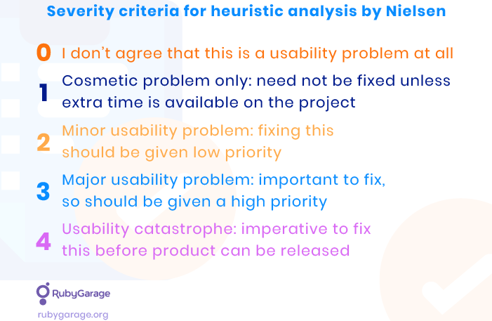
Set severity criteria. Severity is a group term that describes how frequently the problem occurs, its impact on the user, and how difficult it is to overcome. We recommend using Nielsen’s severity ranking:
- Select evaluators. We recommend conducting a heuristic analysis with 3 to 5 evaluators from product users. This will be enough to get objective outcomes from the study.
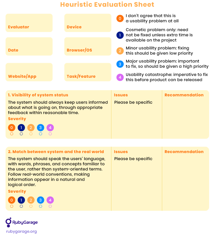
- Brief evaluators. Explain the purpose of the study and what actions are required from users. Provide evaluators with a heuristic evaluation sheet to fill out.
- Conduct the first evaluation phase. Let evaluators use the product freely, testing its features, the user experience, usability, etc.
- Conduct the second evaluation phase. Let evaluators apply chosen heuristics to the product and fill in the evaluation sheet.
- Run a debriefing session. Collect heuristic evaluation sheets and form a complete list of problems.
Step 6. UX solution validation
UX solution validation research critically assesses if the product/feature/design solves the identified problem. Solution validation research is conducted to generate and validate a solution to the problem(s) discovered during the previous steps.
1. Develop the UX validation plan
-
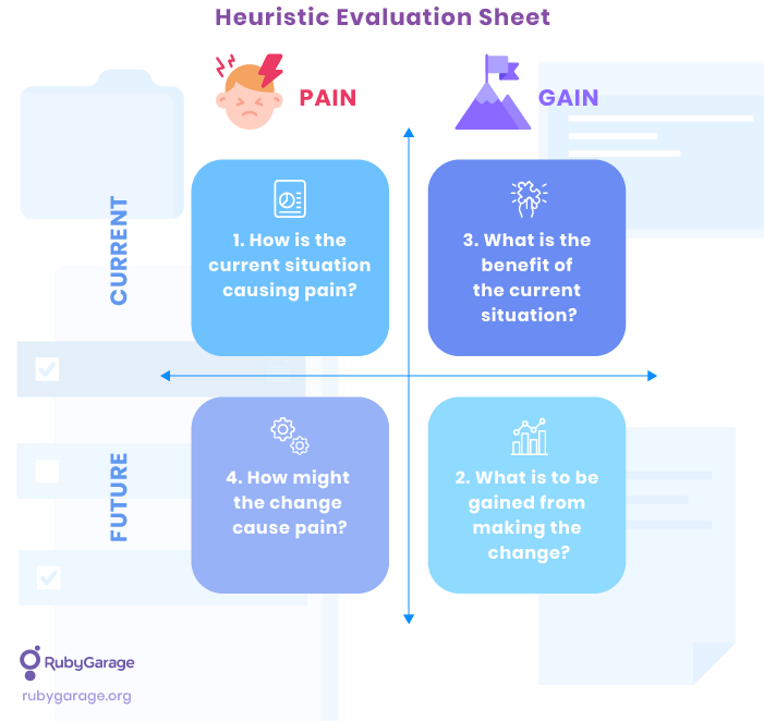
Develop a pain-gain grid to evaluate the pains and gains of the current situation as well as the pains and gains of potential changes.
- Develop problem definition statements to concisely describe the problem(s) to be solved.
- Develop customer persona(s) from previously validated user personas. Bring them up to this stage of UX validation.
- Develop a tactic planning decision tree,or a sequence of decisions from the initial user problem statement to the solution.
- Develop the script for the “How might we?” interview for experts.
- Approve the UX validation plan with the client and stakeholders.
2. Arrange required boards and documents
- Create a stakeholder map.
- Prepare a Miro board for UX solution validation sessions.
- Prepare a UX solution validation session plan and agenda.
- Share the UX validation plan and agenda with all stakeholders.
3. Conduct storyboarding session
The storyboarding session is devoted to sketching current user scenarios for each persona. You'll investigate how each user type interacts with the product and define which features and UI elements are necessary to complete the required scenarios. During the team activities, encourage stakeholders and clients to focus on users and look at the problem from the user’s perspective.
- Conduct a kick-off meeting. Introduce the team and their challenges. Present the Miro workboard and make a session introduction. Also, conduct a quick exercise to improve the team’s dynamics. It can be something like describing what you would like most in your next vacation destination.
- Develop storyboards for each persona. Storyboards are based on the user stories you elaborated during the CJM stage. Use them here and visually present the essential steps in the correct sequence. Each visual must briefly describe the persona’s actions, emotions, and thoughts. Use a storyboard template to map these elements.
- Conduct expert talks and “How might we?” statements. Discuss each storyboard with the selected experts and generate ideas for improvements in the HMW format for each revealed problem. Avoid suggesting solutions. “How might we?” statements are aimed to extract potential focuses for development instead of presenting any particular solution idea.
Put the results in the agenda after-meeting section to document valuable findings. Based on your findings, your team will prepare sketches of the solution concept that incorporates all improvements the team has identified during the session.
4. Sketch your concept
This session is devoted to sketching the UX solution concept for the identified problems and creating a final solution ready for user validation. This session aims to create a multitude of potential solutions to the defined challenges and comprises of the following exercises:
- Notes and ideas: Write down the user problem statement(s) and time participants as they write down their solution ideas. They can write their Lightning Demo samples as well — anything that comes to mind.
- Crazy 8’s: Give each participant an A4 sheet folded four times, or use a digital workboard in Miro (a sheet divided into 8 sections). Set a timer for 8 minutes to sketch 8 quick ideas to fill out each section of the sheet. After the timer runs out, everyone stops sketching.
- Concept sketching: Take a few pieces of A4 paper and create a board (or better, create a template in your Miro workboard). Start sketching a concept within the boundaries of the given surface. It can be a complete experience, a range of screens, or a single screen. Give your idea a catchy title, and add some notes with explanations on the side.
The end goal of the activities is to identify multiple potential solutions to the predefined challenges. The session must result in a final sketch concept that will be put to a vote. After choosing the final sketches, assign points to each sketch according to the following characteristics:
- Technical complexity
- Long-term revenue
- Customer value
Document the final concept sketches to optimize their format and prepare for voting.
5. Vote on sketches
This session involves preliminary voting on the UX solution sketches. Each participant looks at the presented sketches and votes on which sketches or sketch elements they like. The sketches presented in the Miro board are convenient for such activity: use the red dots to place a vote on board, and use as many votes as you want. If participants have questions, write them on sticky notes under the corresponding sketch.
6. Present the solution
In this step, participants go through all UX solution concepts once again to gain a better understanding and form a final decision:
- Participants look at the concepts again.
- Participants decide on a concept or feature they think should be prototyped and tested.
- Write the concept on a sticky note, and let participants point out why they’ve chosen it.
7. Vote on the final solution
Here, participants choose the final UX solution concept by synchronous voting. Use the dots with initials to let everyone put their votes on the Miro board. Then, add up the votes and define the final concept version to create a prototype.
8. Define the user test flow
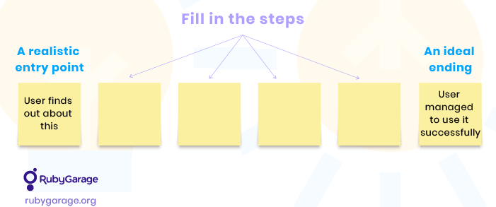
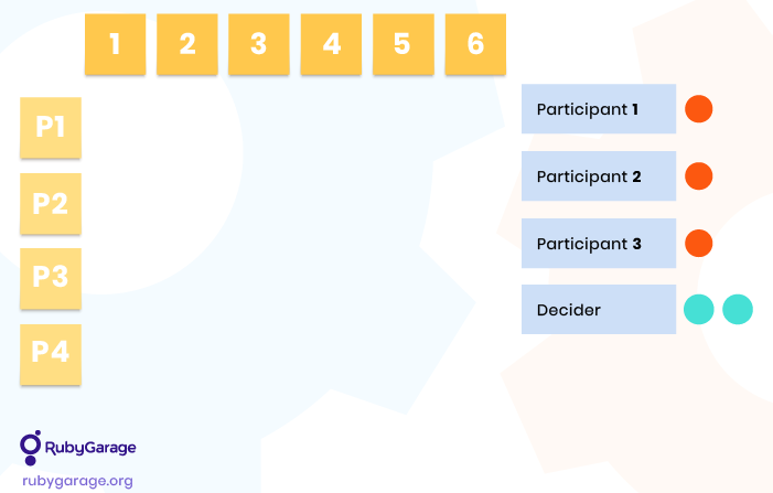
Based on the chosen UX solution concept, participants need to define a simple story (user test flow) in six steps:
- Set a realistic entry point.
- Define an ideal endpoint.
- Let participants fill in the in-between steps of the user flow individually.
- Everyone takes 20 minutes to write their version of the user test flow.
Group the resulting test flows into a user test flow matrix:
9. Storyboarding
Create a final storyboard version prepared for user testing:
- Start with an 8-box template to represent the storyboard. You can add more boxes if necessary.
- Fill in the boxes with screens/elements from your sketches.
- Start filling in the gaps to complete the storyboard.
This team activity will create a storyboard that you can turn into a prototype for user validation. First, decide what form you’d like to present for user testing, then prepare visuals for the next step. It can be a clickable prototype, a working UX design sketch, or any other format suitable for testing the solution.
Step 7. Solution validation by users
We’ve already performed user validation through interviews in part 1 of this guide. Check it out to get a detailed preparation and execution plan. Here is a brief list of activities to validate the final solution before the team begins its implementation:
- Prepare visuals for UX user validation experiments.
- Prepare the UX user testing experiment structure (the interview plan).
- Prepare the interview script (the list of questions to be asked).
- Define personas and sample quantities required for the experiment.
- Allocate users for conducting the user validation experiment (the interview).
- Prepare a feedback gathering form for participants to fill out during the interview.
- Interview each interviewee.
- Record the results.
- Document all insights and valuable observations.
- Analyze user testing experiment results and create the UX development roadmap.
If the solution concept receives positive feedback from interviewed users, the experiment is considered successful, and the team can start working on implementation. If there is negative feedback, reconsider the concept to address identified issues and repeat the user testing session once more to ensure the solution meets your customers’ needs.
Conclusion
The final result of the UX design validation workflow is a ready-made, validated solution concept and a complete UX development roadmap for its implementation. Adopting unvalidated changes and presenting them to the target audience after a public release is too risky in the existing competitive landscape. The UX design validation process helps minimize risks of failure and significant financial losses.
Whether you're developing a new product as a startup or improving an existing solution, it's essential to look at every usability problem from the customer’s point of view. The RubyGarage UX design team successfully follows this approach while working on in-house and clients’ projects, delivering solutions with maximum customer value in mind. Would you like to practice this approach in your next project? Feel free to share your ideas and let’s get started.
FAQ
-
The UX design of your product should solve specific customer problems from one side, and help reach your business goals, from the other. That is why we recommend validating the concept with the stakeholders and real customers. If you’re designing a new product, and there are no real users yet, you can recruit participants who fit your customer personas to run testing and interviews. This way, you will validate your design concept from both sides.
-
We conduct most activities in Miro dashboard. It is a digital workboard where you can map the canvases for all activities throughout the UX design validation process. Considering that currently most teams work remotely, it is highly convenient to use virtual workboards for such teamwork.
-
Investing into UX design validation brings valuable returns, including:
- Reduced risk of building the incorrect product;
- Reduced development waste;
- Higher customer satisfaction;


