-
Product Management
Software Testing
Technology Consulting
-
Multi-Vendor Marketplace
Online StoreCreate an online store with unique design and features at minimal cost using our MarketAge solutionCustom MarketplaceGet a unique, scalable, and cost-effective online marketplace with minimum time to marketTelemedicine SoftwareGet a cost-efficient, HIPAA-compliant telemedicine solution tailored to your facility's requirementsChat AppGet a customizable chat solution to connect users across multiple apps and platformsCustom Booking SystemImprove your business operations and expand to new markets with our appointment booking solutionVideo ConferencingAdjust our video conferencing solution for your business needsFor EnterpriseScale, automate, and improve business processes in your enterprise with our custom software solutionsFor StartupsTurn your startup ideas into viable, value-driven, and commercially successful software solutions -
-
- Case Studies
- Blog
Applying a Card-Based Design to User Interfaces: Best Practices
Today, people tend to switch between two or three devices throughout the day as they visit various websites. So it’s crucial for designers to create appealing interfaces and an enjoyable experience across all devices. In order to achieve interface consistency, web and mobile design trends are moving toward the card-based UI design approach. In this article, we’ve teamed up with Alexandr Martynenko, one of the leading UX designers at RubyGarage, to share best practices for applying the card design pattern in web and mobile projects.
What is card-based design?
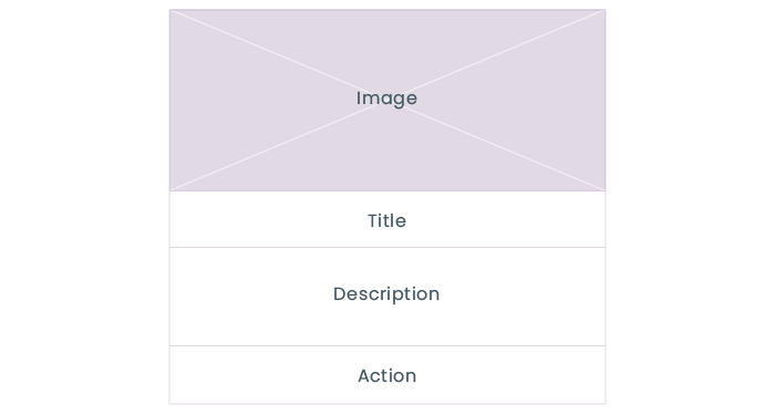
Cards are little rectangles used in interface design to outline the main idea of a product, service, or piece of information. Each card usually consists of an image, a bit of text, graphics, and a link to a page with more detailed information on the topic. Cards seem pretty simple, so what makes them so popular in UI design? The answer is that they look like real tangible cards. Before digital cards, people were used to seeing business cards and sticky notes all around them. People intuitively perceive cards as pieces of content, so they make it easy to scan information.
Card-based patterns are now more popular than ever. They’re especially beneficial for ecommerce websites and social networking sites where users scan information quickly and usually via mobile devices. Cards are successfully used by the biggest companies, including Google, Instagram, Pinterest, and Facebook. Microsoft implemented a card-based design in their Windows operating system in 2006.
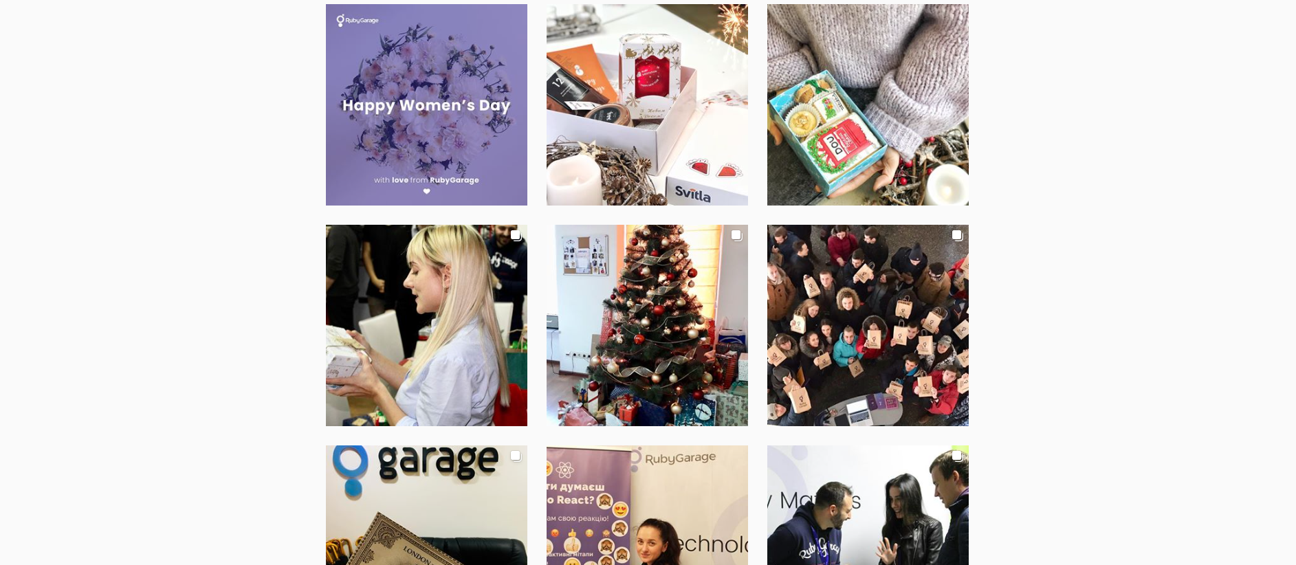
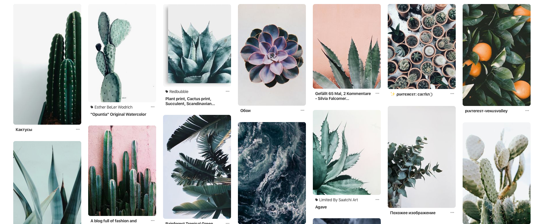
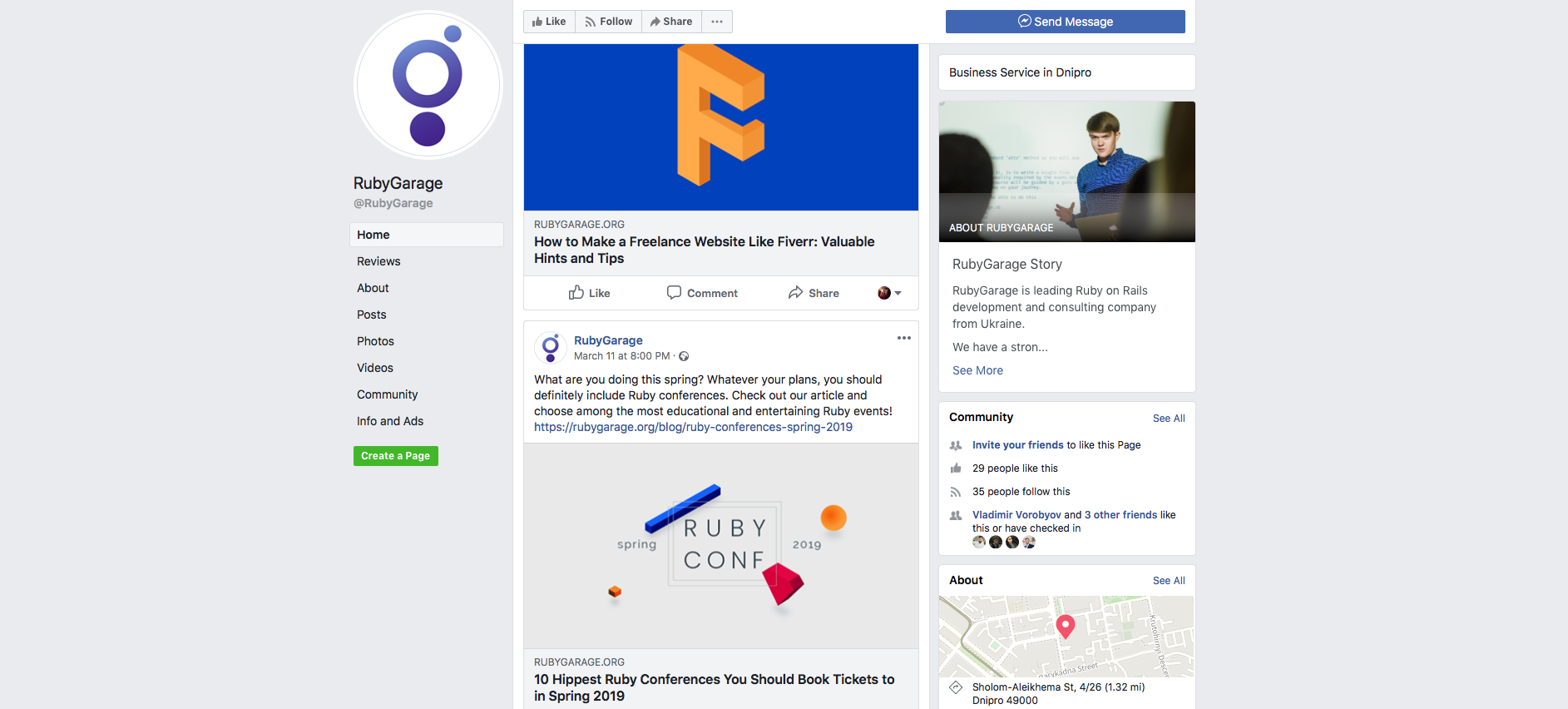
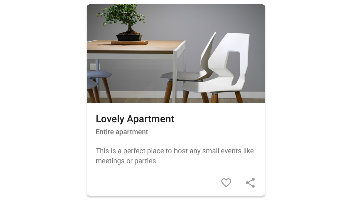
As a rule, a card consists of an image, title, description, and action. Here’s how a card looks in a wireframe:
Now that you know what card-based design is about, we can talk about the main pros and cons of this design approach.
Advantages of a card-based design
Chunking content
Cards usually have a similar structure on the page, which helps to organize content into chunks. This enhances the scannability of content, helps to avoid long unreadable texts, and allows users to save time while getting the main information. Good scannability is essential for online shops and marketplaces, as they’re content-heavy websites. Card-based web design is also a good solution for a blog like ours.
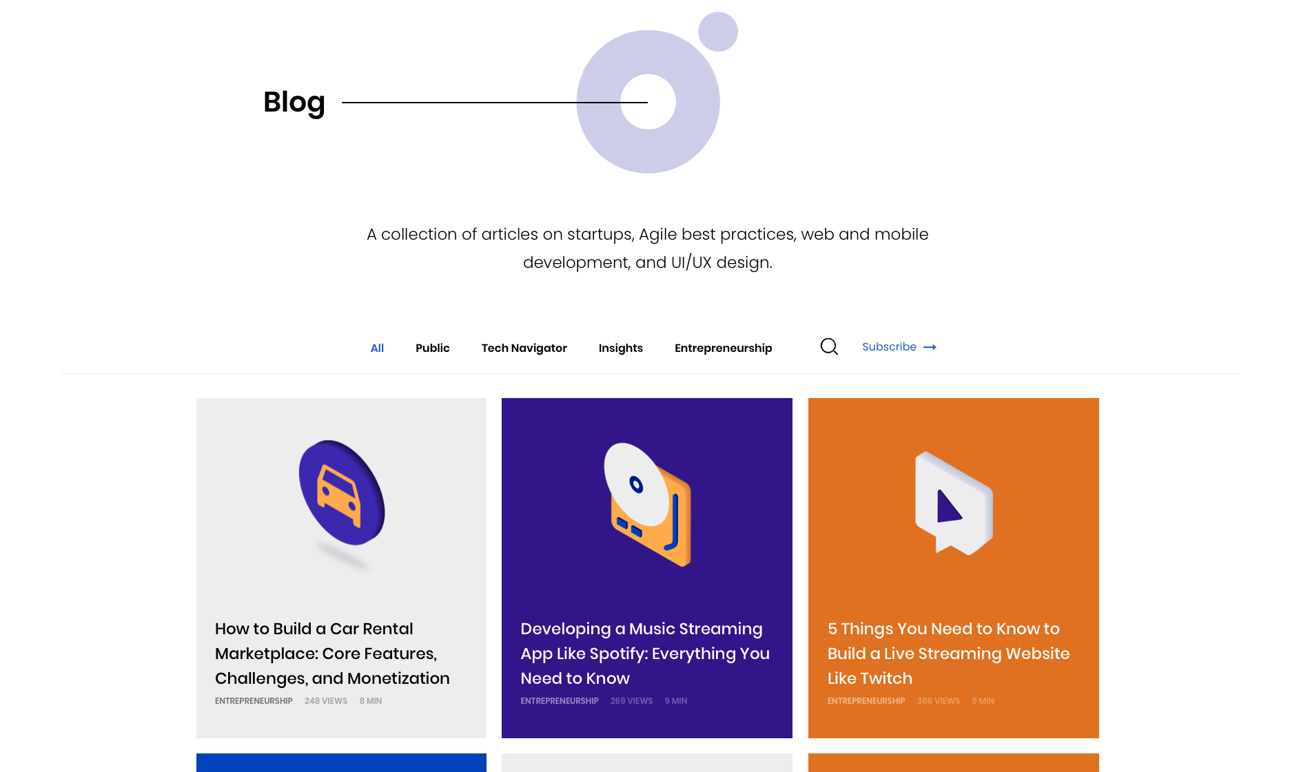
Great mobile responsiveness
As people actively use multiple devices, from phones and tablets to laptops and desktop computers, it’s necessary to create a responsive design for all screens. Cards can easily be resized and rearranged according to different screen sizes. It’s important for mobile and web pages to have the same content, as Google has started to prioritize mobile sites for indexing. Cards allow designers to build a unified aesthetic across devices and thereby create a consistent user experience.
Enhanced user experience
Card-based UI design bridges the gap between usability and interaction due to its responsiveness and consistency. Cards create an enjoyable user experience by:
- laying out information clearly
- being interactive, thereby encouraging users to stay longer on a website
- making browsing more pleasant
- relaying content to a user within three seconds, increasing user engagement
- being highly manipulable
- simplifying sharing, helping content go viral
Efficient organization
Cards divide information into meaningful sections. These sections allow designers to prioritize content into comprehensive blocks of information. This is visually stimulating for both designers and users. The card structure saves a designer time on aligning elements within the card and makes content more readable and appealing for users.
Minimalism
Minimalist interface design is one of the latest trends. More and more websites and apps are making their screens tidy, without extraneous details. Cards can easily and harmoniously fit into any minimalist design. Moreover, cards can increase content readability and highlight the delicacy of minimalism.
Disadvantages of a card-based design
Hard to stand out
Since cards have become so popular in web and mobile design, it’s getting harder to make your website stand out. Most card-based interfaces look pretty similar, and designers find it difficult to invent something distinctive. So the only thing websites can do is use appealing colors, typography, graphics, and animations to set their interfaces apart.
Not for all websites
Cards are not perfectly suited for all types and sizes of projects. For instance, for a small website with little content, a card-based design may be the wrong decision since there’s no need to divide the site into sections. A card-based design should be implemented in the right context if you want it to work efficiently.
Card-based design best practices
Using cards in interfaces requires a perfect combination of visual design and usability. Cards aren’t only about appealing UI design but also about clear interactions and user experience. Although cards look pretty simple, there are some important rules to ensure a great result. Let’s consider the best practices of applying a card-based design in your projects.
Use one piece of information per card
Remember the rule: one card – one idea. Using different cards for visualizing different pieces of information allows users to distinguish the content and find information easily. Cards can contain various elements but should refer to only one piece of information.
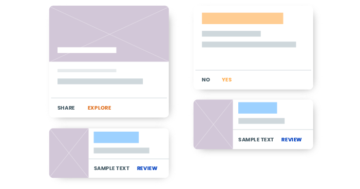
Avoid inline links
The card itself should be linked to more detailed information, so avoid using inline links in the text in order not to confuse users. When the whole card is clickable, this greatly increases the usability of the interface on both touchscreen devices and desktop computers where a mouse is used.
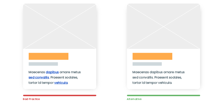
Add shadows
By adding shadows, you can create an association with tangible cards and improve overall readability. But keep in mind that shadows should be light; otherwise, they’ll adversely affect how users perceive the interface. In addition, designers can round the card’s corners to make the interface even friendlier.

Use the right typefaces
All information a card contains should be easy to read. That’s where typography comes into play. Use simple fonts, limit color schemes, and choose the right font size.
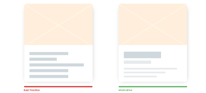
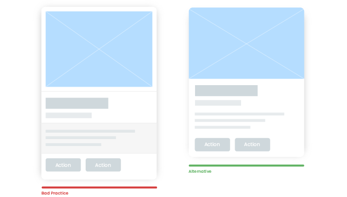
In this example, you can see how font size affects how information is perceived. The first card has the same font size for the heading, sub-heading, and the text itself. So nothing catches the user’s attention while reading. But the second card perfectly separates the eye-catching headline from the description and makes it easy to get the main idea.
Make cards minimalist
Make your cards clean and minimalist. Try to avoid excessive borders between elements.
Limit information
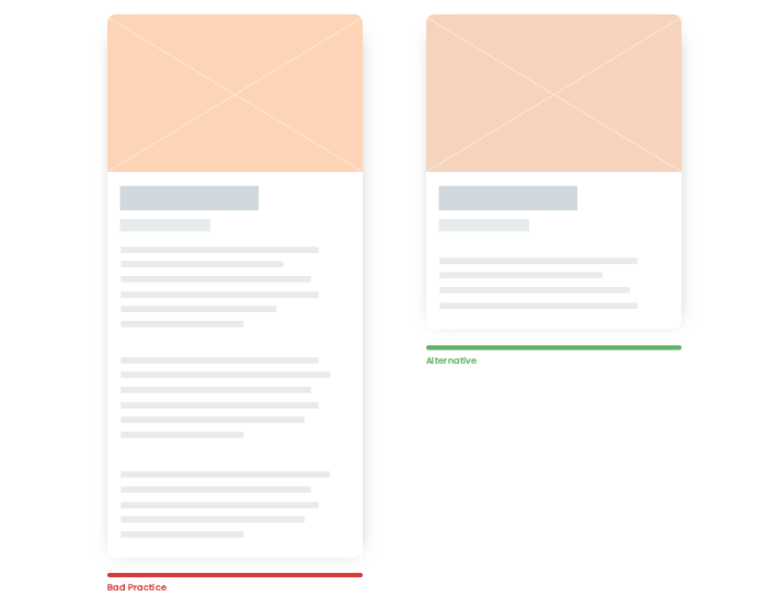
Try to not overwhelm cards with information. They should contain the minimum possible information to outline the main idea, as a card is linked to a more detailed overview. When you add too much content to a card, it becomes too long vertically or too wide horizontally and loses readability.
Use attractive images
By using images in card-based design, you increase the overall appeal and user engagement. First of all, images catch the user’s attention, only after which they proceed to the text. So choose visual components carefully, as quality visual content increases the attractiveness of the design as a whole.
Make cards active
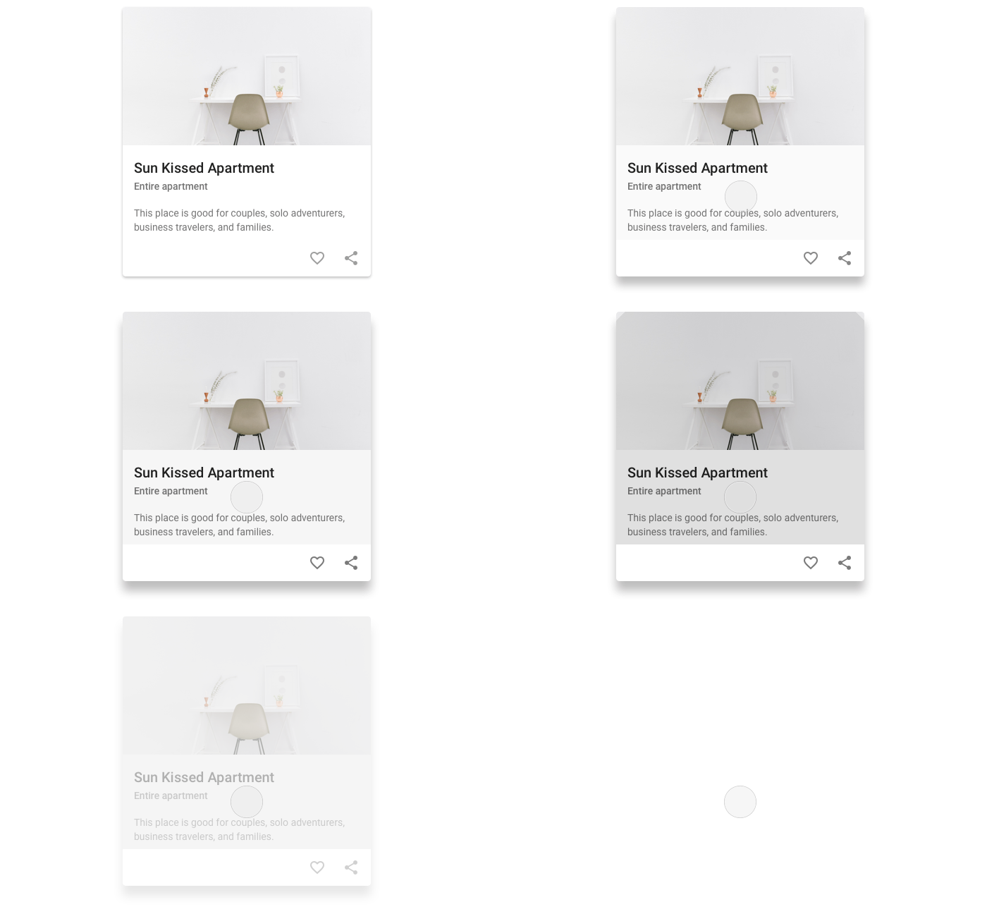
Make cards active when you hover the cursor. You can achieve this by doing the following:
- Framing cards when hovered over
- Showing a shadow
- Making an existing shadow bigger or darker
- Enlarging an image
- Revealing additional information
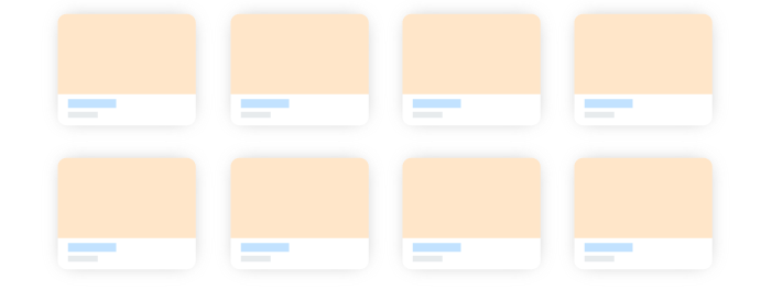
Create a standard grid
Create a standard grid with a constant interval between cards and work with different sizes and breakpoints.
Wrapping up
A card-based design is a growing trend that won’t end anytime soon and will continue increasing in popularity. The best thing about cards is that there’s no strict set of rules to follow when designing them. The only thing designers should keep in mind is simplicity, some basic card design principles, and experience. Don’t hesitate to share your ideas on this topic in the comments below!


