-
Product Management
Software Testing
Technology Consulting
-
Multi-Vendor Marketplace
Online StoreCreate an online store with unique design and features at minimal cost using our MarketAge solutionCustom MarketplaceGet a unique, scalable, and cost-effective online marketplace with minimum time to marketTelemedicine SoftwareGet a cost-efficient, HIPAA-compliant telemedicine solution tailored to your facility's requirementsChat AppGet a customizable chat solution to connect users across multiple apps and platformsCustom Booking SystemImprove your business operations and expand to new markets with our appointment booking solutionVideo ConferencingAdjust our video conferencing solution for your business needsFor EnterpriseScale, automate, and improve business processes in your enterprise with our custom software solutionsFor StartupsTurn your startup ideas into viable, value-driven, and commercially successful software solutions -
-
- Case Studies
- Blog
Practical Guidelines for Effective Dashboard Design
Data visualization plays an important role in any business. There are various ways to visualize data: in tables, graphs, reports, and so on. But it’s often difficult for businesses and individuals to understand how to visualize data so that everyone can read it easily. Effective dashboard design helps businesses visualize any sort of data.
Modern web design has moved on to finding the balance between appealing interfaces and user-friendly experiences. The same balance should be found when visualizing data on dashboards.
As every business differs, information design on dashboards should differ too. There’s no one-size-fits-all solution to visualizing information on dashboards, but this article provides common recommendations that will help designers achieve their best while creating an effective dashboard.
Interface design
Page structure
Page structure, diagram placement, and the amount of information on the page plays an important role in data visualization. Here are some structural tips to make any dashboard easy to understand.
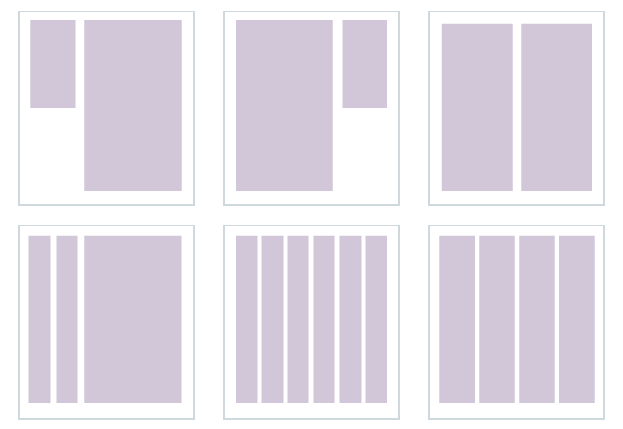
#1 Use grids for the page structure
Designers typically use grids in web design. A grid is a two-dimensional structure that serves as a framework to align content. This way the designer can set up a good page structure that’s clean and organized. Using grids in dashboard design to better text readability due to perfect alignment of information. It can also improve efficiency by speeding up the design process, as there’s no need to reposition the content until you’re satisfied.
#2 Keep users’ attention on the page
Humans are visual creatures who subconsciously make judgments based on visual cues. According to Rareform New Media, 48 percent of users consider the design of data on a company’s website to be a top determinant of the credibility of the business.
As a rule, designers strive to place the most important information on the part of the page people pay attention to first. Internet users tend to scan a page as shown in the picture below.
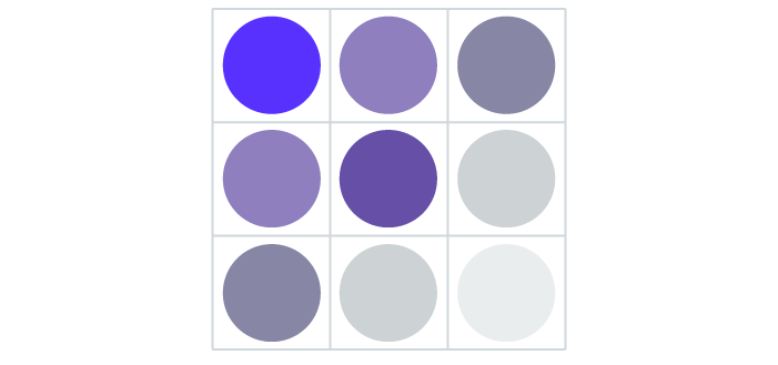
Users generally start scanning a web page from the top left side and continue to focus their attention down to the bottom left side. The center of the page takes half of the user’s overall attention, while the lower right side is almost ignored.
#3 Leave white space
While looking at the page, users see not only objects but also white space. White space refers to the parts of the page left unmarked or empty. In web design, this is space between images, columns, graphics, and other elements that are used to maximize the user experience and deliver a clear message.
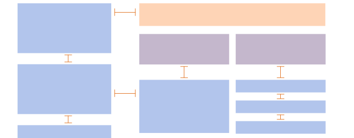
White space is an important element when creating dashboard design for the following reasons:
- White space increases content legibility by separating blocks of information, which adds up to a better overall user experience.
- White space gives direction and emphasis to what’s most important on the page.
- According to research by Human Factor International, good use of white space increases comprehension by almost 20%.
If there’s no white space between elements on the dashboard, users may skip the most important information and lose interest altogether.
Colors to Use in Dashboard Design
Imagine that someone gifted you a car. You probably would be extremely excited and happy, right? But what if this car were painted in your least favorite color?
You might not be so excited then, right? That’s because colors have meaning.
Colors matter a lot when visualizing information on dashboards. Color can attract a user’s attention to the most valuable information or can distract the user’s attention. For instance, increasing color brightness can attach particular importance to content. Using the same colors for different pieces of information placed in different parts of the page can clarify that this information is similar or corresponds to the same topic. If we go deeper into the meaning of color in web design, it can form a user’s impression of the interface and evoke particular emotions.
Colors can be prioritized. For example, earth tones are perfect for common visualization on dashboards while unnatural colors are good for notifications and highlighting essential content. The image below shows more about these colors.

Colors for data visualization
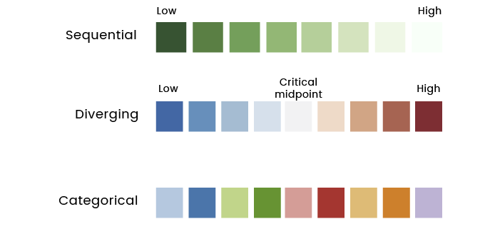
When you use colors in graphics or tables to represent data, there are three types of color schemes to consider:
- Sequential for displaying values from low to high
- Diverging for ordered values with a critical midpoint
- Categorical for values (data) from separate groups that need contrasting colors
Typography
As most of you may know, there are two types of typefaces: serif and sans-serif. Serif typefaces include Times New Roman, Clarendon, Lucida, Georgia, and Century. Sans-serif typefaces include Proxima Nova, Helvetica, Avenir, and Tahoma.

It’s important to understand which font best suits a particular situation, as font plays an essential role in data visualization. For example, sans-serif fonts look better on low-resolution displays and when text is small and narrow. To avoid confusion when choosing the font for your dashboard design, follow these rules:
#1 Highlight the text
Fonts can impact the meaning of content greatly. For example, look at the following text:
“Good design makes the product useful.” — Dieter Rams
“Good design makes the product useful.” — Dieter Rams
Italic font creates a sense of emphasis and urgency, while the bold font is urgent and loud. When a sentence contains bold text, a reader tends to look at it first. Here’s a detailed explanation:

#2 Font structure
Most of the text on the page can be divided into four categories:
- Body — clear, readable content
- Headers — main section names
- Notes — additional information that the user should know
- Emphasis — information that attracts the reader’s attention
Take a look at the recommended parameters for each of these text categories:
| Text category | Purpose | Size | Typeface | Color | Style |
|---|---|---|---|---|---|
| Body | A clear readable text | 12-16pt | Sans-serif (Arial, Tahoma, Verdana); Serif (Georgia, Times New Roman) | Natural | Normal (not Bold, not Italic) |
| Header | To divide text into sections | 150–200% of the body text | Same as the body text | Natural | Roman, bold, or italic |
| Notes | To add tips for the user | 85% of the body text | Same as the body text | Not bright, low-contrast | Roman (not bold, not italic) |
| Emphasis | To highlight the main features | Same as the body text | Same as the body text | Bright, contrasting colors | Bold or italic |
By following these simple rules, your dashboard will be legible and clear to the reader.
Icons
Icons are essential in interface dashboard design too. They’re meaningful and can be associated with some information or action. That’s why it’s important to know how to choose the right icons for dashboards.
Don’t use icons with lots of details, as they show up poorly on small displays. If such icons are used to visualize data, it prevents users from being able to view and compare information.
Icons that are used for pictograms should be clear, minimalist, understandable, and cause the right associations. In addition, it’s best to create icons in one style.
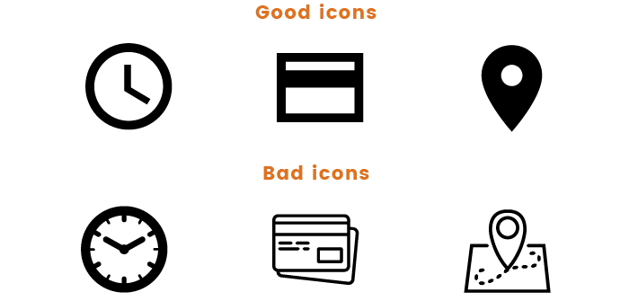
Don’t use different versions of icons to display the same type of information. Instead, use one icon with different shades.
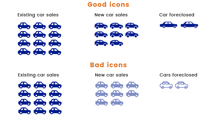
The perfect icon for visualizing data on dashboards is simple, symmetric, clearly visible even on small displays, and fits in a square.
Data visualization
Diagrams and tables are used for visualizing the most vital data on dashboards. They help to display information so that every user can easily understand it.
Choosing the right diagram
There are two main types of data: categorical and numerical. When choosing the diagram type, consider the data type first. A diagram should be easy to understand and give a clear understanding of the information provided.
Some things can easily be perceived visually, such as the length of a line or the position of an object in two-dimensional space. But there are also things that can be perceived wrongly by the human eye, such as width, area, color intensity, radial distance, and so on. In order not to confuse people, use lines and columns in dashboards instead of pie charts and three-dimensional diagrams that are harder to comprehend.
Design rules for diagrams and tables
Look at the following rules and tips that will help you create a great diagram and table for your dashboard.
#1 Data color
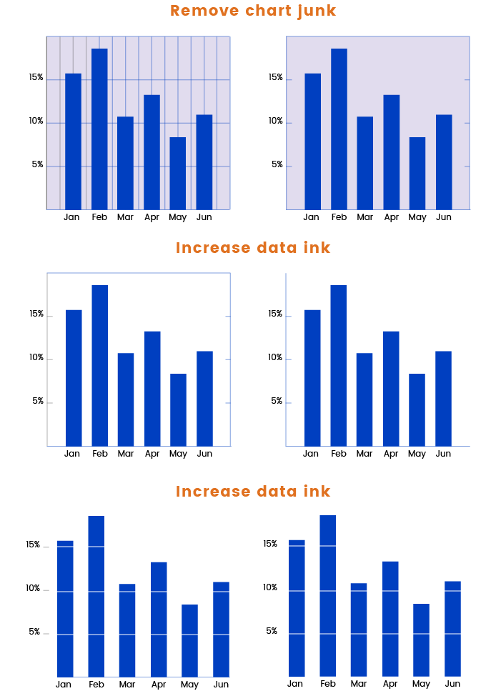
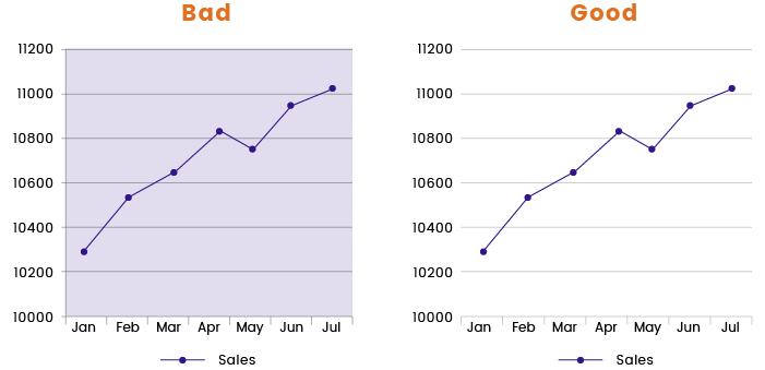
When creating a diagram, try to increase the ratio of data to colors. Colors that are used well can enhance and clarify the information on the diagram, while colors that are used poorly can muddle and confuse. Below, you can find some visual tips on how to make your diagram legible.
#2 Contrast
Try to create the maximum possible contrast between data and the background of your diagram. A white background gives the appearance of paper, which makes it easier to choose a color that both displays and prints well. A white background gives a stable surface to focus on.
#3 Chart lines and 3D
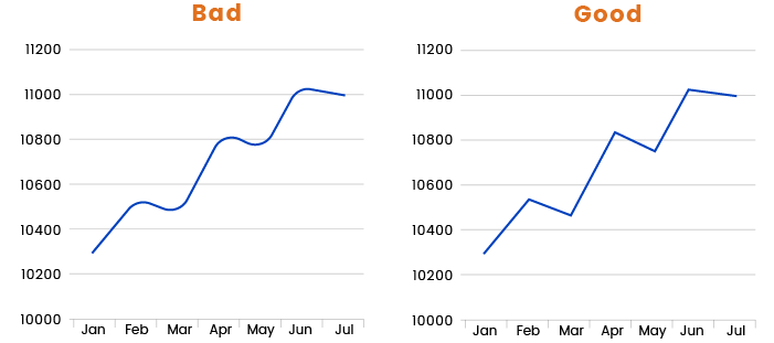
Avoid smoothing the chart line on a diagram, as this makes it really hard for the reader to mentally place the points on this line.
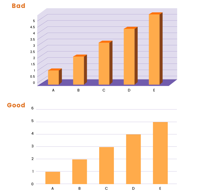
The same issue arises with 3D space diagrams, which are useless and hard to read.
#4 Gradients
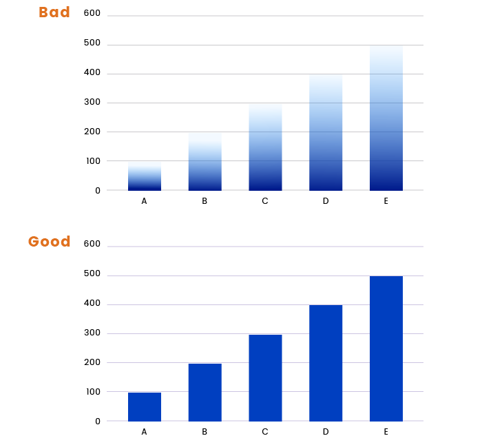
The best advice about gradients is to use flat colors and minimal gradients. Make sure that the user is able to clearly see the end point of the column. When the gradient disappears by the end, it’s almost impossible to see the height of the column.
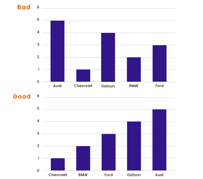
#5 Data sorting
Sort data according to its value. This way your diagram will be properly structured, understandable, and readable.
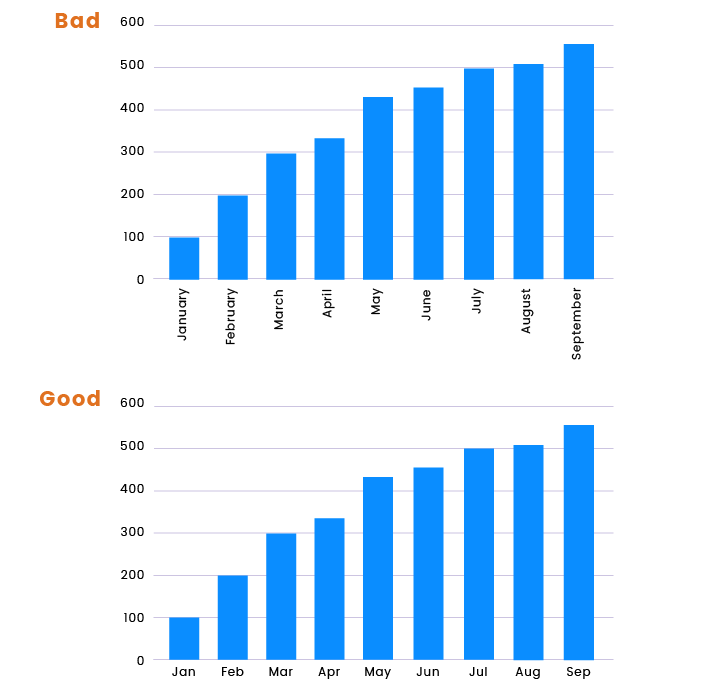
#5 Labels
If possible, avoid vertical labels, as they’re difficult to read and it’s much more difficult for the user to focus on statistics.
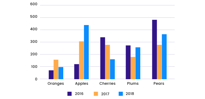
#6 Color options
Use different colors and shades on diagrams to show dissimilar data, as in the example below.
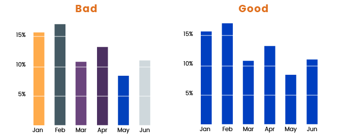
But try not to use different colors for the same type of data, as this creates visual noise.
Tables
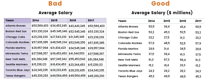
Tables in information visualization allow users to search through data and compare it conveniently. A data table is an efficient tool for comparative analysis of categorical objects. Let’s consider a few short tips on creating an easy-to-read table for your dashboard design:
- Avoid using excessive grid lines
- Use zebra striping to separate table rows
- Use white space to separate parts of the table
- Avoid using long numbers
- Use consistent distance between columns and rows to create horizontal and vertical rhythm
Effective dashboard design is both an art and a science. By sticking to the tips and recommendations given in this article, you’ll be able to create easy-to-use and legible dashboards with organized visual structures.


