-
Product Management
Software Testing
Technology Consulting
-
Multi-Vendor Marketplace
Online StoreCreate an online store with unique design and features at minimal cost using our MarketAge solutionCustom MarketplaceGet a unique, scalable, and cost-effective online marketplace with minimum time to marketTelemedicine SoftwareGet a cost-efficient, HIPAA-compliant telemedicine solution tailored to your facility's requirementsChat AppGet a customizable chat solution to connect users across multiple apps and platformsCustom Booking SystemImprove your business operations and expand to new markets with our appointment booking solutionVideo ConferencingAdjust our video conferencing solution for your business needsFor EnterpriseScale, automate, and improve business processes in your enterprise with our custom software solutionsFor StartupsTurn your startup ideas into viable, value-driven, and commercially successful software solutions -
-
- Case Studies
- Blog
12 Website Problems Which Prevent Visitors from Buying
Have you ever wondered why visitors leave your website without buying?
The products and services you're offering are of good quality, but something still turns visitors away.
There are numerous website usability problems that can stand in the way of a successful sale. Even the tiniest details like load time or absence of a certain product filter can tarnish your website's UX and turn off customers.
What are the most critical problems with online shopping that make visitors leave and never come back?
In this post we’ll be looking into website issues that customers may encounter before they even add anything to the shopping cart as well as mistakes you need to avoid during the checkout process.
Why Don't People Buy from Your Website?
In order for your customers to purchase something from your online store, you need to ensure that their experience is smooth from start to finish. There are a lot of things that can go wrong even before visitors reach the checkout.
Let’s go over several website features and problems that you need to deal with in order to increase sales.
Complicated site navigation
Effective site navigation is critical for website success. Navigation plays a crucial role in overall UX results. In addition, it directly affects website’s user-friendliness and boosts traffic.
It’s important that navigation and search bars are located on top or to the left side of the main page. Don't try to be creative at this step; standard placement ensures that people find what they’re looking for and are able to browse content seamlessly.
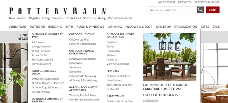
If your website contains multiple product categories, consider making your navigation clickable with:
- Dropdowns – appear when the cursor hovers over the main category label
- Mega menus – dropdowns that also contain text or images
- Flyout menus – horizontal version of a dropdown menu
Another helpful feature would be to provide shortcuts to sections frequently visited by customers, such as account settings and shopping cart, in the top right corner.
The Pottery Barn furniture store offers an extensive mega menu navigation as well as helpful shortcuts.
Unattractive website layout
“Don't judge a book by its cover” doesn't apply to ecommerce. If your online store seems unappealing to customers, they’re likely to leave without making a purchase. Your design must be clean and compact – keep text on landing pages and main pages to a minimum.
It also goes without saying that the layout of your online store must be appropriate to the types of products you’re selling and should cater to your target audience. It would be weird to see pink dominating an online auto parts store, just as chrome black would seem rather uninviting for a baby clothing website.
Notice how the website of fashion retailer DSTLD is sleek and to the point.

Limited product info
Having detailed product descriptions on your website helps customers make informed decisions about whether to buy. And the better these descriptions are presented, the higher the conversion rate. Make sure that the information provided about each item is unique to your store; don’t copy descriptions from other websites!
Also, don’t forget to let customers leave feedback. Feedback boosts your store’s reliability and often plays a deciding role in a sale.
In order to maximize the allure and comfort of the product page, consider the following:
- Detailed item descriptions
- High-quality pictures
- 360-degree product images
- Size and color charts
- Item availability
- Customer reviews
- Related products section
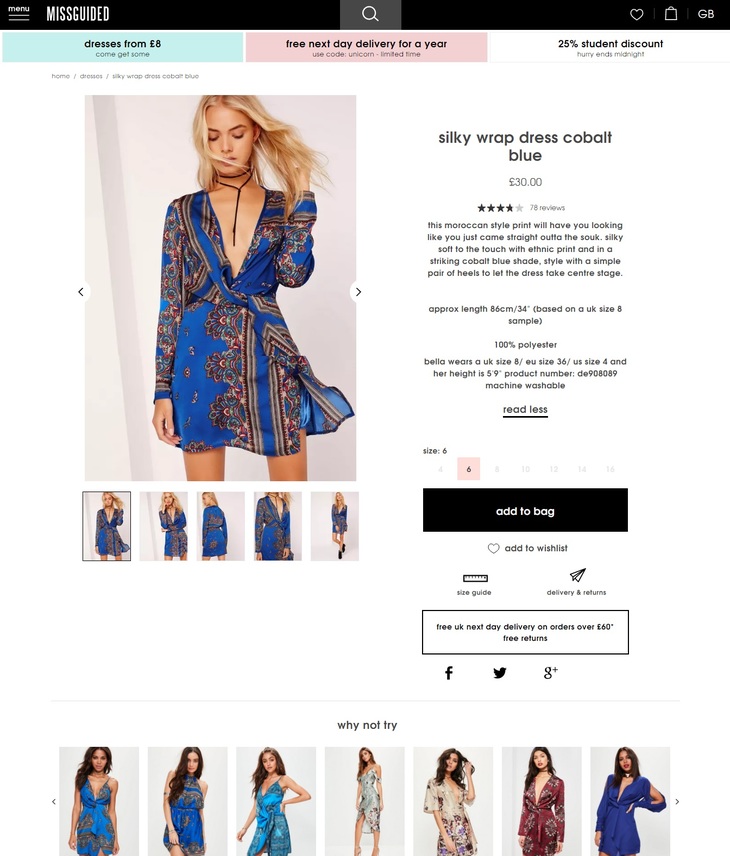
As a good example of detailed product page, take a look at a Missguided’s product page: the description of each product is brief but thorough, it includes a video and multiple images, and there’s a list of suggested items at the bottom.
Insufficient filter display
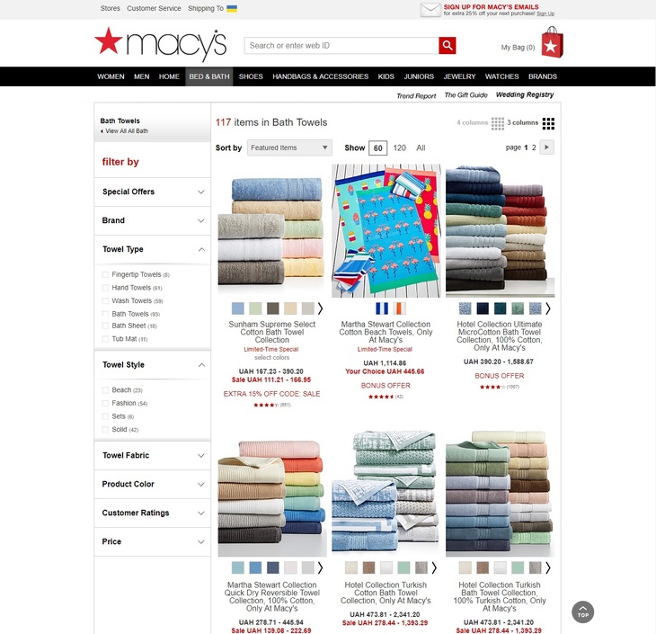
Another UX essential is a variety of filters. Even if customers are unsure what they’re looking for, they at least have preferences. Offering the opportunity to personalize search results increases the chances of customers finding the item they want.
In the case of clothing and footwear websites, filters may include size, color, brand, season, gender, occasion, and so on. Online music stores and bookstores might let you browse content by genre, artist, and country.
Take a look at the variety of filters that the Macy’s department store offers for sheets and bedding. The website lets visitors customize their search by categories they might not have thought of themselves.
Disappointing page load time
We all know how frustrating it can be when a page is loading for too long; this is one of the most common and critical website problems. According to a survey by Akamai, half of internet users expect a page to load in under 2 seconds, and are prone to leave if it takes 3 seconds. In addition, 79 percent of customers who experience problems with a website's speed will not return for another purchase, while 64 percent are likely to buy from another online store.
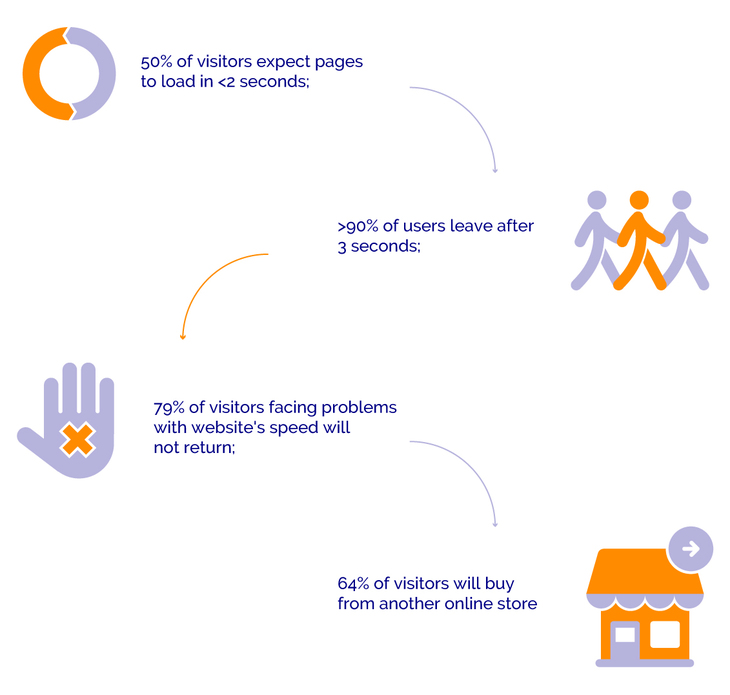
Don’t be alarmed. There are many ways to significantly improve your website’s speed by optimizing the client side, which contains everything a user sees on the screen. Here are several solutions that can help you improve your average page load times:
- Analyze your website's speed with online tools such as Google's Page Speed Online, Google Webmaster Tools, and the Google Analytics Plugin by Yoast, which is available for WordPress sites.
- Optimize the size of images with the "Save for Web" option in graphics programs like Photoshop or Fireworks.
- Compress your files and JavaScript, CSS, and HTML documents with Gzip. This can help pages load three to four times faster.
- Try Content Delivery Networks (CDNs) like Amazon CloudFront and CacheFly to gain faster access to a server that is close to the physical location of the user.
- Set up your CSS and Javascript in external files so the browser loads them once instead of having to do so every time someone visits a given page of your website.
If you want to go even further, consider seeking out professional help and improving the server side of your website.
Poor customer support
High quality UX relies on active communication between customers and an ecommerce website. Before committing to a purchase, a customer will want to get acquainted with your store's shipping and return policies.
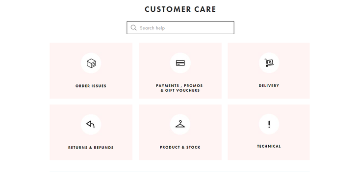
It’s important to set up shipping, returns, payment, frequently asked questions (FAQ), and customer service pages. These pages prove that on online store is credible and provide solutions for its visitors.
And of course, ensuring strong customer support will increase conversion rates. Popular fashion retailer Asos covers every possible issue their clients might have on their customer care page.
Buggy website
When we discussed issues with page load time, we established that today’s customers expect ecommerce websites to have uninterrupted flow. However, there might be a more deep-rooted issue behind loading speeds that will ultimately result in a website crashing.
If your website exhibits any of the following characteristics, your sales are guaranteed to suffer:
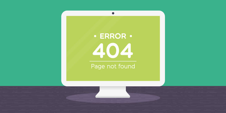
- 404 not found error
- Malware warnings
- Broken links
- Files containing no data
- Failed DNS lookup (Please try again later)
- No Cascading Style Sheets (CSS)
In order to deal with these issues, you’re going to need a strong technical team that will monitor and tackle them as soon as they appear. Additionally, visitors must be able to contact support immediately if they encounter a problem. That way you can detect issues early on and customers won’t have to wait for the eventual solution.
Website Problems That Lead to Shopping Cart Abandonment
After browsing your online store, a customer has finally made up her mind and reached the checkout. Way to go! But it’s not over yet. According to research by the Baymard Institute, there are numerous reasons for shopping cart abandonment. At this stage, we need to determine how to reduce the possibility of that happening.
Obligatory and difficult registration
Imagine that your customer has added items to her cart and is excited to complete the checkout process when suddenly there’s an obligatory registration. This step may take a long time: entering personal information, confirming an email address, and maybe even verifying a telephone number.
You can optimize the registration process by decreasing the number of necessary steps. Keep registration short by requesting just an email, password, and username. All further information such as names and shipping addresses can be added in the profile later whenever the customer feels like doing so. As an alternative, you can offer sign-in using social logins such as Facebook and Twitter.
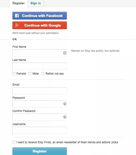
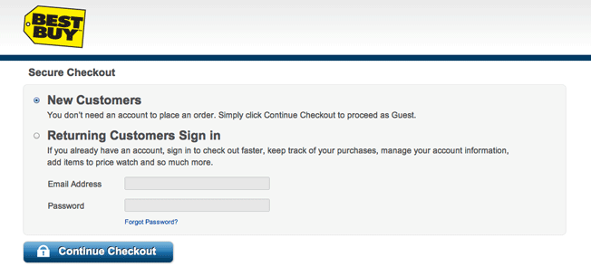
You can avoid registration altogether by offering guest checkout. For example, American electronics retailer Best Buy offers a choice between signing in as a returning customer or proceeding as a guest. This way customers can place an order without having to create an account. If you want to see people coming back, try initiating follow-up emails in which you offer a discount or free shipping on the second purchase.
Too many steps in the checkout process
Lengthy registration on ecommerce websites is not the only lurking threat contributing to cart abandonment. Customers are simply not going to deal with never-ending questionnaires. It’s common for online shopping to be impulsive, and multiple steps cancel out spontaneity, which may cause you to lose customers.
Follow these rules to simplify checkout and get visitors in and out of the process quickly and painlessly:
- Don't require billing information before shipping address, as it makes you seem desperate and screams that you require money immediately.Make sure visitors put down the information needed for them to receive the order and then introduce payment options
- Remove any distractions that can take customers out of the checkout process, such as a navigation bar
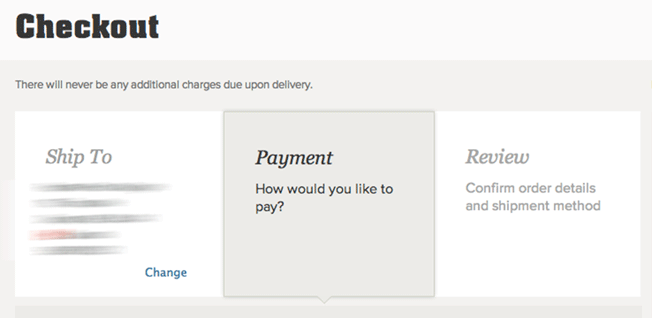
- Limit checkout to three steps: shipping and billing, payment, and review and order placement
- Include a visual progress indicator so customers can know how many steps are left and what they’ve already done.
Incomplete display of selected items and additional fees
Most likely, customers will remember what they’ve put in the shopping cart, but it doesn’t hurt to include an order summary containing thumbnails and information about items.
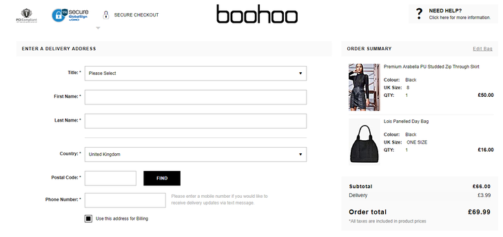
British fashion retailer Boohoo displays all in-cart items on the right side of the screen along with order total including shipping. That's another thing – online stores often hold back on presenting shipping fees, preferring to add them at the end during the payment step. Let your buyers know shipping rates before they start filling out other information.
Including delivery fees on the checkout page lets customers see the grand total and decide whether to proceed. Imagine having to go through all the steps only to find out that you can't afford additional shipping fees; sounds frustrating, doesn’t it?
Customers are presented with limited payment options
When your customers finally reach the payment step, you want to make sure they can get it over with as quickly as possible. This is usually the least pleasurable part of you customer's experience with your online store, so you don't want any bumps on the road to a successful sale.
Credit card payment is the most common option, but today there are more ways to complete online purchases. There are a wide variety of conventional online payment platforms such as PayPal, Stripe, and Braintree, so you can choose the one most suitable for you. At the same time, Apple Pay and Google Wallet are gaining popularity especially among the younger demographic.
Make sure to cover all available payment methods, as this will reduce the chances of your customers leaving shopping carts.

No apparent guarantee of security
Another substantial reason for shopping cart abandonment is the absence of security. Your customers are trusting you with their personal information and credit card details. According to a survey conducted by Statista, 17 percent of customers will not complete a purchase if they’re concerned about security. Include SSL certificates and badges close to the transaction form.
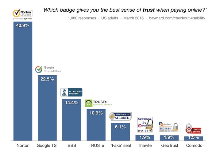
In addition, make sure that you’re using recognizable logos, since there is a different level of trust with different security sites, as was determined by a survey conducted by the Baymard Institute.
It can be difficult remembering to cover every possible problem that might turn off your potential customers. It’s okay to miss a thing here and there from time to time, but what’s important is your desire to create a smooth and pleasurable shopping experience for your online store’s visitors.
RubyGarage is always available to help you make your ecommerce website the best it can be.


