-
Product Management
Software Testing
Technology Consulting
-
Multi-Vendor Marketplace
Online StoreCreate an online store with unique design and features at minimal cost using our MarketAge solutionCustom MarketplaceGet a unique, scalable, and cost-effective online marketplace with minimum time to marketTelemedicine SoftwareGet a cost-efficient, HIPAA-compliant telemedicine solution tailored to your facility's requirementsChat AppGet a customizable chat solution to connect users across multiple apps and platformsCustom Booking SystemImprove your business operations and expand to new markets with our appointment booking solutionVideo ConferencingAdjust our video conferencing solution for your business needsFor EnterpriseScale, automate, and improve business processes in your enterprise with our custom software solutionsFor StartupsTurn your startup ideas into viable, value-driven, and commercially successful software solutions -
-
- Case Studies
- Blog
How Much Does It Cost to Design a Mobile App: Native vs Custom design?
When you want to estimate the cost of your mobile app design, you need to know how many screens there will be, decide if you want native or custom design, and take into account many other variables. To give you a general understanding of app design cost, we’ve estimated the cost to design three popular products: Uber Eats, eBay, and Booking.com. For each app, we calculated the cost for a set of screens for a minimum viable product (for both custom and native development) to figure out what it takes to design a similar app.
First of all, let’s make sure we have a clear idea of what custom and native UI design means.
What is native design?
Every mobile platform has a set of guidelines that describe how elements in an app should look, where they should be located, and how they should interact with each other.
A native UI strictly follows these guidelines. Platform guidelines allow designers to create interfaces that look and feel like part of the operating system. This design approach has its pros and cons.
Pros of native design
- Familiarity. By using elements familiar to users, you can be sure there will be practically no learning curve.
- Rapid development. A designer can use templates and ready-made examples instead of designing everything from scratch.
- Reduced mobile design cost. Native design takes less time than custom and therefore the app design costs less.
Cons of native design
- Lack of visual appeal. Native design is more difficult to brand, and it can’t amaze users with incredible details and a unique experience.
- Limited feature set. Native design is limited by the feature set supported by the device.
Here’s an example of a native design concept of a banking app from Behance.
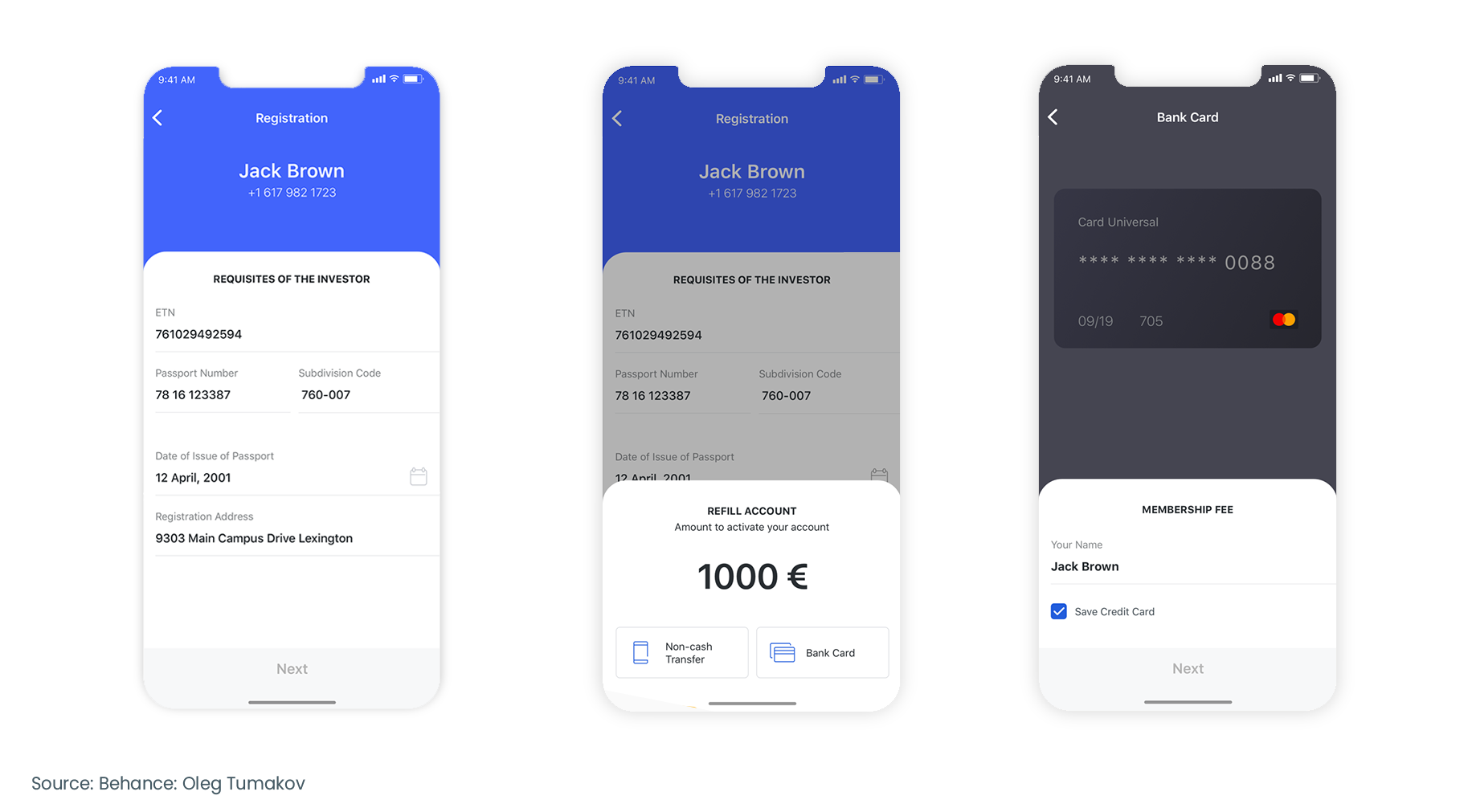
This design was created according to Apple’s Human Interface Guidelines. All elements are strict and laconic and look familiar at first glance.
What is custom design?
A custom UI is designed from scratch. It may follow some native UI guidelines, or it may be something completely different. Designers can use unique styles and illustrations to attract attention. Custom UIs are best suited for entertainment and branded apps.
Pros of custom design
- Enhanced user experience. Having all the modern design approaches at their disposal, designers can create unique experiences that only your app provides.
- Differentiation. With custom design, you can create a unique, branded interface that stands out from millions of other applications.
Cons of custom design
- Higher mobile app design cost. Designers need more time to create a unique UI that meets all the requirements of clients and end users.
- Graphic design skills required. Custom design requires a lot of illustrations. Make sure that the vendor you’re hiring is capable of delivering the results you expect.
- Operating system-standard elements may need to be replicated. When designing an app, all elements have to be created in one style. That’s why you may have to redesign such elements as the keyboard to make it match the overall look of the app.
Here is a screen showing a custom design concept for a banking app.
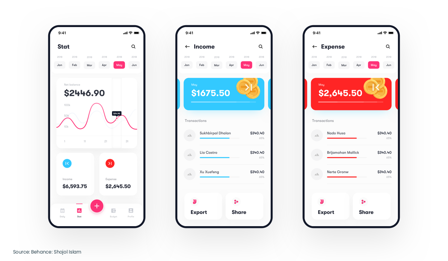
Custom design is typically more appealing and unique. Custom designs feature graphical elements and non-typical UI components compared with native design.
Now it’s time to find out how much it costs to create native and custom design for a minimum viable product (MVP) of an app like Uber Eats.
How much does it cost to design an app like Uber Eats?
Launched in 2014, the Uber Eats app is now ranked #3 in the App Store in the United States in the Food and Drink category. In 2021, Uber Eats revenue reached $8.3 billion, near 73 percent more than a year before.
Uber Eats is a worldwide on-demand food delivery app. No wonder so many entrepreneurs want to use its business model. Let’s check out what screens you need to design a minimum viable product of an app like Uber Eats and how long it will take for custom and native design.
Screens for Uber Eats MVP:
- Authorization. This is the screen where users enter their login and password to get access to the system.
- User profile. Users can create an account with the help of their email or a social media account.
- Restaurant search and filtering. This screen allows users to see nearby restaurants and filter them.
- Restaurant screen. This screen displays detailed information about a restaurant, along with its menu.
- Order complete screen. Users can check selected items, order cost, delivery address, and other order details.
- Notifications screen. Users get notified about order fulfillment, discounts, and special offers (if there are any).
- Splash screen. This is the first screen a user sees when opening your app. It should be laconic and branded.
- App settings. Users can choose what notifications they want to get, delete or activate their account, and change their password.
- Account settings. Users can set the delivery address, change their personal information, and set payment preferences.
- Onboarding wizard. This screen shows users how to use the app.
Here’s our estimate for screen design of an Uber Eats MVP.
| Screens | Estimate for native design (in hours) | Estimate for custom design (in hours) |
|---|---|---|
| Authorization | 12 | 24 |
| User profile | 6 | 12 |
| Restaurant search and filtering | 40 | 60 |
| Restaurant screen | 40 | 60 |
| Order complete screen | 12 | 16 |
| Order complete screen | 8 | 12 |
| Splash screen | 6 | 12 |
| App settings | 16 | 20 |
| Account settings | 24 | 28 |
| Account settings | 12 | 32 |
Alongside designing screens, some technical tasks also influence the duration of the design process.
| Technical tasks | Estimate (in hours) |
|---|---|
| Sitemaps | 16 |
| Moodboard & concept | 32 |
| Platform navigation layout | 8 |
| Library of components | 40 |
| Style guide | 16 |
| UX texts | 24 |
Therefore, The final estimate for native design is 312 hours and 412 hours for custom design.
How much does it cost to design an app like Booking.com?
Booking.com started as a marketplace for travelers and accommodation owners that allowed both parties to connect online. Today, it’s the most visited travel booking platform worldwide that offers a wide range of services, from accommodation to car rentals and flights. In 2021, Booking.com generated $11 billion in revenue. That’s 61 percent more than the year before.
Below are the must-have screens for a booking app:
- Authorization. This screen is necessary for all apps that deal with users’ personal information. Authorization is the first step to secure your app.
- Personal profile. This screen should be simple and require minimal information. Use social account registration to simplify this process for users.
- Hotel search and filtering. Filters are important for a booking app. The more filters there are, the easier it is for a user to choose.
- Listing screen. Users can view photos and detailed information about accommodation listings, including location, price, and amenities.
- A booking complete screen allows users to see details of their reservation including price, dates, and address.
- Hotels ratings are necessary to grow trust in your app and hotels.
- Notifications. Users can get reminders about upcoming reservations and details of their bookings.
- App settings. Users can change the currency, language, and notification preferences with this screen.
- Account settings. Users can add or delete credit card information, choose payment preferences, and add information about the way they prefer to travel.
- Chat is a great way to reduce communication silos between users and accommodation owners.
- An onboarding wizard is an effective tool to create a great user experience from the very beginning of the user journey.
- Splash screen. This is needed to greet your users.
Here’s our calculation for designing a booking app:
| Screens | Estimate for native design (in hours) | Estimate for custom design (in hours) |
|---|---|---|
| Authorization | 12 | 24 |
| Personal profile | 6 | 12 |
| Hotel search and filtering | 40 | 60 |
| Apartment screen | 40 | 60 |
| Booking complete screen | 12 | 16 |
| Hotel rating | 12 | 16 |
| Notifications | 8 | 12 |
| Splash screen | 6 | 12 |
| App Settings | 16 | 20 |
| Account settings | 24 | 28 |
| Chat | 24 | 32 |
| Onboarding wizard | 12 | 32 |
Similar to Uber Eats, technical tasks for Booking.com design require 136 hours. Taking this into account, you need 348 hours to create native design for Booking.com and 460 hours for custom design.
How much does it cost to design an app like eBay?
eBay is the #2 ranked platform in the Ecommerce and Shopping category for traffic and engagement. In 2021, eBay brought in $10.4 billion in revenue, which is 17% more than in 2020.
If you want to create a similar product, check out the screens you need to design for this type of app:
- Authorization screen. This screen directly influences the number of registered users. That’s why you need to make sure that registration takes as little time as possible.
- User profile. Users don’t like to share their personal information. Explain what data you need from them, why, and how you’ll treat it to build trust.
- Product search and filtering. Allow users to find what they’re looking for in the shortest possible time.
- Product view screen. This screen shows the name of a product, its price, characteristics, a short description, photos, and payment options.
- A payment complete screen shows the total price and other purchase details.
- A product rating screen shows how other customers have rated a product. This information helps users make a well-considered choice.
- Notifications are necessary to keep in touch with your app users and keep them updated on their order status.
- App settings. Users can choose a country, region, and language and contact support from this screen.
- Account settings. Users can change their personal information, delete their account, and change payment, communication, and subscription preferences.
- Chat helps users communicate directly with sellers much faster than via email.
- Onboarding wizard
- Splash screen
Check out how long it will take to design an MVP of an app like eBay.
| Screens | Estimate for native design (in hours) | Estimate for custom design (in hours) |
|---|---|---|
| Authorization | 12 | 24 |
| User profile | 6 | 12 |
| Product search and filtering | 40 | 60 |
| Product view screen | 40 | 60 |
| Payment complete screen | 12 | 16 |
| Product ratings | 12 | 16 |
| Notifications | 8 | 12 |
| Splash screen | 6 | 12 |
| App Settings | 16 | 20 |
| Account settings | 24 | 28 |
| Chat | 24 | 32 |
| Onboarding wizard | 12 | 32 |
Together with the time required for technical tasks (136 hours), native design of an eBay MVP takes 348 hours. For custom design, you need 460 hours.
Mobile app design price by region
To calculate the final cost of your app design, take into account your vendor’s hourly rate. The hourly rate depends on the region where the vendor is located and factors such as the level of experience and whether you’re working with a company or a freelancer.
We’ve compared the average hourly rates for user interface design services in Eastern and Western Europe, Asia, the US, and Canada to help you find the best option for your budget. Let’s consider each region in detail.
Eastern Europe
Clients from Western Europe choose companies from Central and Eastern Europe because of the close time zone, geographical proximity, and great development services. Customers from the US also like Eastern Europe due to the price/quality ratio. When working with Eastern European design agencies, American clients often comment on benefits such as professionalism, reliability, and great English language skills.
Government support as well as a large number of technical universities contribute to the constant growth of the software development industry in these countries.
According to PayScale, the average rate of user interface designers in Eastern European countries varies from $20 to $53 an hour.
Western Europe
Countries in Western Europe are famous for their high level of technical education. These countries are favored by US clients because of the cultural similarities and high level of expertise. Western European countries host a moderate number of software development companies with highly qualified software engineers. However, there are concerns connected with a huge talent shortage due to an aging population and long and tiring procedures for hiring expats.
The average rate for user interface design services in Western Europe ranges from $40 to $65 an hour.
Asia
Software development makes up the lion’s share of the business market in Asia. The industry offers a huge pool of developers at a moderate price. But while this region is rich in software developers and engineers, it has far fewer designers to offer.
The average hourly rate of a user interface designer in Asia varies between $10 and $40.
The US and Canada
The US is the country with the highest hourly rates for software development services due to extremely high prices for education and a shortage of specialists. Canada is the #1 outsourcing destination for US companies due to lower prices, an insignificant time difference, and proximity.
The average hourly rate for UI design in the US and Canada varies from $40 to $120.
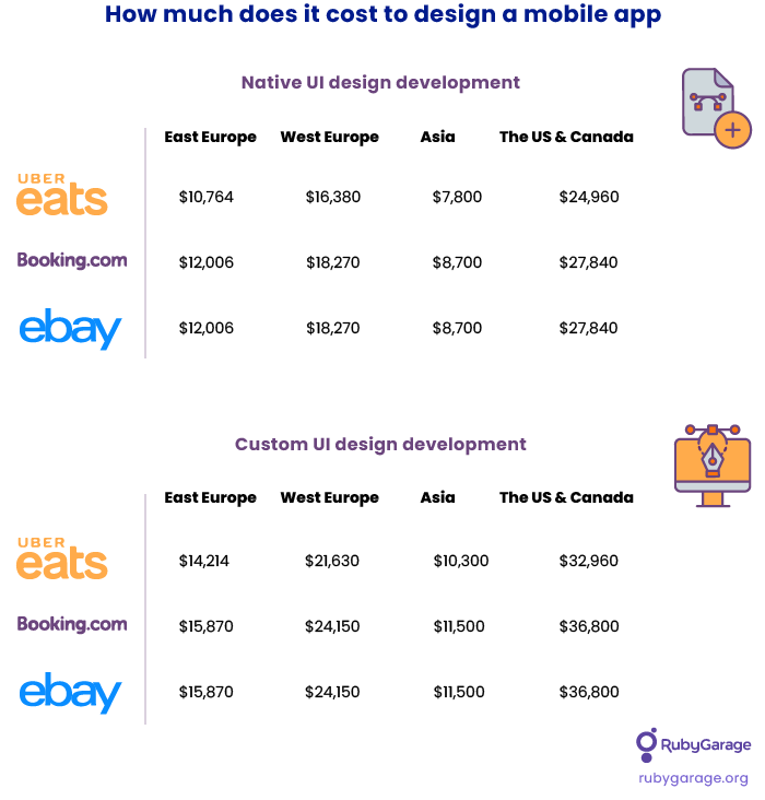
Based on this data, the average cost of native and custom design of MVP apps like Uber Eats, Booking.com, and eBay in these regions will be as follows.
The Bottom line
Low mobile app design costs can be appealing. However, we recommend you take into account a vendor’s experience, check their portfolio, and read feedback from clients. This way, you can secure yourself from an unreliable design vendor. Always aim for a fair price-quality balance based on your budget and requirements.


