-
Product Management
Software Testing
Technology Consulting
-
Multi-Vendor Marketplace
Online StoreCreate an online store with unique design and features at minimal cost using our MarketAge solutionCustom MarketplaceGet a unique, scalable, and cost-effective online marketplace with minimum time to marketTelemedicine SoftwareGet a cost-efficient, HIPAA-compliant telemedicine solution tailored to your facility's requirementsChat AppGet a customizable chat solution to connect users across multiple apps and platformsCustom Booking SystemImprove your business operations and expand to new markets with our appointment booking solutionVideo ConferencingAdjust our video conferencing solution for your business needsFor EnterpriseScale, automate, and improve business processes in your enterprise with our custom software solutionsFor StartupsTurn your startup ideas into viable, value-driven, and commercially successful software solutions -
-
- Case Studies
- Blog
4 Proven Tips on How to Increase the Conversion Rate on Your Ecommerce Website
Every aspect of marketing is entirely useless unless it produces conversions.
It doesn’t matter how much website traffic you have if visitors don’t convert. Conversion shows the real state of affairs in your business: the higher the conversion rate, the more revenue you get. If you want to know why it’s so important to track your current conversion rate, what conversion rate is good for your ecommerce website, and what approaches work to optimize it, keep on reading!
What is a conversion for an ecommerce website?
First of all, let’s consider what the term conversion rate means. The conversion rate is the percentage of all your website visitors who take a desired action.

Most ecommerce website owners believe there’s only one conversion metric they have to measure: online sales. However, adding a product to a shopping cart or a wish list, signing up for emails, and sharing on social media can also be considered conversions, as can any other KPI your business finds valuable.
What is considered a good conversion rate? WordStream claims that the average landing page conversion rate in 2019 is 3.48 percent for mobile devices and 0.72 percent on the display network.
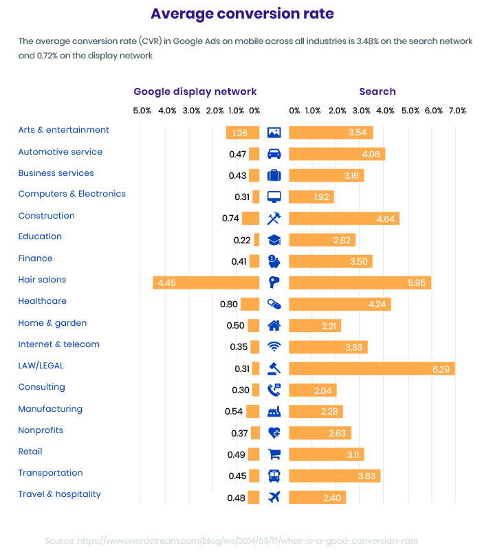
According to the Ecommerce KPI 2019 report from Wolfgang Digital, the average conversion rate in the retail industry in 2019 reached 1.7 percent.
Now, when you know what your goal is, you need to find out your current conversion rate. You also need to check how visitors behave on your ecommerce website before you get into tips and approaches to increase conversion rate. Here’s how you can do that.
Analyze your existing website
Information is the oil of the 21st century, and analytics is the combustion engine.
Collect data
Here are metrics and analytics that allow marketers and UX designers to make data-driven decisions:
Rate of sale
The rate of sale (or sell-through rate) is the difference between the number of items you get from suppliers and the number of items you sell.
To calculate the rate of sale, add the number of items you’ve sold to the number of items you still have on hand. Then divide the number of items sold by the number you’ve just calculated to find the rate of sale for a given period.
What is a good rate of sale? The ideal number is somewhere in the middle. If you have a very low rate of sale, it means you’re not selling products as quickly as you could and are paying more for their storage. On the other hand, if your rate of sale is too high, you might lose customers due to lack of products.
By analyzing the rate of sale, you can see if there’s a problem with your supply and sales; however, this metric can’t help you solve an existing problem.
User behavior flow
User behaviour flow shows you the path a user takes once they land on your website. If your visitors leave the site on the first page, your conversion rate will remain low.
Heat maps
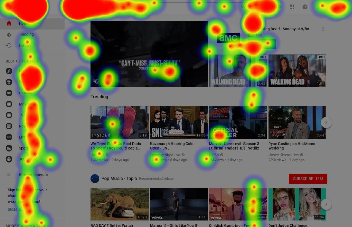
These maps allow you to identify the content and elements users interact with most on your website (and those they ignore). Heat maps can also help you identify obstacles users meet on their path.
Confetti maps
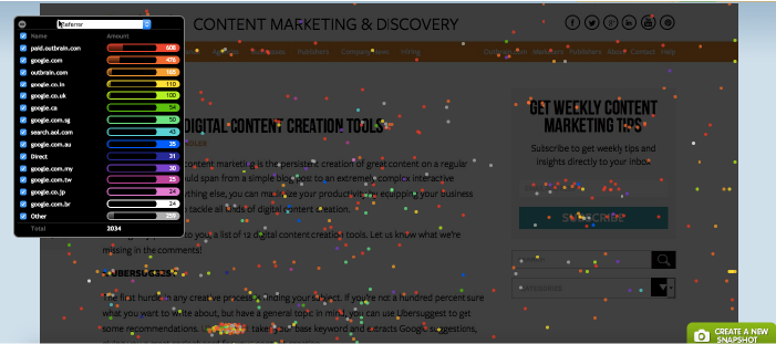
These maps display where users come to your website from and what content they interact with most.
Scroll maps
Scroll maps help you identify content that interests users the most and measure the time they spend with it.

Audit the user experience on your website
A UX audit lets you detect usability issues visitors encounter when using your website. Make sure your site’s UX follows common design principles and best practices. Analyze how visitors behave on your website and create a list of everything that stops them from converting.
This in-depth analysis will allow you to make a list and prioritize improvements to increase your conversion rate.
Now that you have all the data in hand, you can proceed to improving your website.
Make improvements to your website
Consider the following tips to optimize the user experience on your ecommerce store and encourage the conversion rate growth:
Step 1. Decrease cart abandonment
Cart abandonment costs you a fortune! The global cart abandonment rate is more than 75 percent. Below is a checklist that will help you find out if there’s anything you can do to decrease the cart abandonment rate on your website:
- The checkout process on my website is fast, simple, and intuitive. Allow guests to purchase without registering – or at least make your registration form short, with as few fields as possible. Keep users in touch with the current stat: explain why you’re collecting information users need to input as well as tell customers how you’ll store it and process it. You can also create a progress bar on your website to show users their status during registration/checkout. Another good practice is to add a date picker or dropdown instead of making users type in dates. In this way, you minimize the risk of human error and make the checkout flow more convenient for users.
- Customers can choose from multiple convenient payment options on my website. Adding reliable payment gateways and the opportunity to pay by credit and debit card as well as e-wallets improves the customer experience.
- I know how to get shoppers back once they’ve abandoned carts. It’s easier to return a customer than to attract a new one. Remind your would-be buyers about the items they want via email or remarketing on social networks. You can also provide some perks like free shipping or a discount to convince visitors to complete a purchase.
Step 2. Improve the user experience
If a UX review revealed bottlenecks on your website, now it’s time to fix them.
- Change the flow. Remove everything on your website that distract users. Confetti maps, scroll maps, and heat maps can show you where obstacles are.
- Improve website speed. If a website takes more than three seconds to load, 53 percent of mobile users will leave. Use tools like Google’s PageSpeed Insights to get a detailed report on your website speed along with a list of changes that can improve this metric.
- Keep your design up-to-date. A majority of shoppers are guided by their emotions, which is why the visual part of your online store is important. Check out our article about the latest UI/UX trends for ecommerce websites to find out what drives users to make online purchases in 2019.
Step 3. Add trust guarantees
Trust is a great basis for long-term relationships with customers. Customers want to be sure they’re purchasing from a trustworthy store that follows industry security standards. How can you do that? Follow our tips below.
- Encourage customers to leave product reviews. Reviews from other customers give would-be buyers insights about a product and allow them to make more data-driven decisions.
- Provide clear money-back guarantees. Add information about money-back guarantees and a detailed description of your refund procedure in the FAQ section of your site and on the order completion page to be sure customers will notice it. Check that all the conditions are clear and customer-oriented.
- Set up easy returns. Videos and detailed instructions help make the return process clear and hassle-free. You can also minimize customers’ efforts by adding a prefilled form with the return address to every parcel (like Poshmark and Zappos do) so buyers can make returns without wasting time.
Test your ideas
Even small changes to the user experience and user interface on your web store can have a huge impact. This is why you should test your website all the time.
Tweak and test UI elements
In 1999, Amazon changed its Order button to 1-Click Order and started a brand-new era of hassle-free online shopping. This change, which seemed insignificant at first, allowed Amazon to become a leader in the ecommerce industry.
By tweaking and testing the UI elements listed below, you can find out where and why customers leave your website and do something about it.
Call to action buttons
The main rule of creating call to action (CTA) buttons is the more visible, the better. Use colors for your CTA buttons that contrast with the general colors of your website and make your CTA buttons bigger than all other elements, with larger letters. Your CTA buttons need to stand out from other elements and the background.
Keep the design of your CTA elements simple. You may use an icon (arrow, shopping cart), but it’s better to avoid images and complex elements. A recent study on high-conversion CTA buttons conducted by Midas Media revealed that simpler designs perform much better than elements with more elaborate designs.
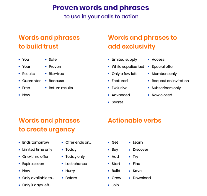
Make call to action elements personal by using “you” and “your” with strong action verbs to encourage your visitors to perform an action.
Here’s a list of the most powerful words you can use to craft your call to action buttons.
Checkout and registration forms
If you ask users to fill in a form, try to minimize the number of fields. You can explain why you need the information you’re asking for and explain how you’ll process and store it.
Make sure that all fields are clear and that users can figure out what they’re being asked for. For instance, if you ask for an address, clarify that it should be a billing address. You can add an example of a possible answer in the field itself. This placeholder text will disappear when a user starts typing.
Product description
In a brick and mortar store, customers have a chance to touch products, look at them closely, and try them on. When shopping online, customers want to find out as much as possible from images and videos. Provide customers with high-quality photo and video reviews of products.
Add a product description section to answer the most common questions, such as about materials, colors, sizes, and characteristics.
Allow buyers to leave feedback on the product page. You can also allow buyers to add their videos and photos in feedback to build trust in the products you sell.
The tips we’ve described above follow the UI best practices for ecommerce websites. These are recommendations but not rules, so you can experiment with your ideas and test them. Track the behavior of your website visitors to find out what combination of elements works best for your website conversion rate.
Perform A/B testing
When it comes to sales, there’s no single formula that works for everyone. You can apply all the best practices and fail because of your niche, the types of goods you sell, or your business location. That’s why testing is so important so you can experiment with different ideas and find your success formula.
Testing allows you to make decisions based on collected data and build a marketing strategy that works for your business. A/B testing, in particular, allows you to check which piece of content performs better. Here are some A/B testing best practices you can employ for your web store:
- Form a hypothesis first. A/B testing allows you to test a hypothesis and prove or disprove it. But don’t try to create a hypothesis based on A/B testing results. Every round of testing should have a particular goal and well-defined elements to test; otherwise, it’s guesswork.
- Test only strategically significant pages. These can be the most visited pages, like the home page, contact page, and about page, or pages that bring the most conversions.
- Show tested pages to a large number of people. If you stop testing too early, the results of the test may be unreliable. To find out the right number of people to show tested pages to, you can use different calculators where you enter your conversion rate and the percentage increase you’d like to get to calculate the number of visitors you need for meaningful A/B testing.
- Complete tests before changing anything. When you get your first test results that excite you, you may want to start improving your website straightaway. However, if you interrupt the test before you planned or make any adjustments to a tested page, you compromise the test results and won’t be able to prove or disprove the hypothesis you were testing.
If performed correctly, A/B testing can not only optimize the conversion rate on your ecommerce store but also improve the UX of your website, reduce the bounce rate, and increase user engagement.
Summing up
The conversion rate is not a constant. You need to make regular optimizations and updates to your ecommerce website to increase your conversion rate.
Don’t forget to subscribe to our blog to get more useful advice for your business.
FAQ
-
The conversion rate is the percentage of all your website visitors who take a desired action.
-
According to the report from Wolfgang Digital, the average conversion rate in the retail industry in 2019 reached 1.7 percent.
-
- Analyze your existing website — collect information on your current rate of sale and user engagement with the help of such tools as heat, confetti, and scroll maps. Conduct a user experience audit of your website to check if it corresponds to design best practices.
- Make improvements to your website — Optimize the website to decrease cart abandonment, improve the user experience and gain users’ trust.
- Test your ideas — Make changes to user interface elements like on your ecommerce website and test how it influences the conversion rate. Perform A/B testing to identify what works best in your niche.
If you’re looking for a team to help you identify the bottlenecks in your ecommerce website performance and user experience, contact RubyGarage for an in-depth analysis.


