-
Product Management
Software Testing
Technology Consulting
-
Multi-Vendor Marketplace
Online StoreCreate an online store with unique design and features at minimal cost using our MarketAge solutionCustom MarketplaceGet a unique, scalable, and cost-effective online marketplace with minimum time to marketTelemedicine SoftwareGet a cost-efficient, HIPAA-compliant telemedicine solution tailored to your facility's requirementsChat AppGet a customizable chat solution to connect users across multiple apps and platformsCustom Booking SystemImprove your business operations and expand to new markets with our appointment booking solutionVideo ConferencingAdjust our video conferencing solution for your business needsFor EnterpriseScale, automate, and improve business processes in your enterprise with our custom software solutionsFor StartupsTurn your startup ideas into viable, value-driven, and commercially successful software solutions -
-
- Case Studies
- Blog
How Quality UI/UX Design Solves Top Marketplace Issues
Today’s marketplaces need to be more than just platforms for transactions. To build a successful marketplace like Amazon, eBay, or Airbnb, you need an effective business strategy, thorough technical preparation, and of course quality UI/UX design.
The complexity of building a marketplace stems from several factors: the difficulty of cooperating with two types of users, the need to find a solution to the chicken and egg problem, the need to prove the trustworthiness of the website and sellers, and the demand for an optimized user journey and great customer service.
To address all these marketplace challenges, we can look to UI/UX design. Here are some typical marketplace issues and ways to solve them.
Typical marketplace issues
#1 Lack of customer trust toward sellers
Building the trust of customers is essential to any online business. But today, it’s a big problem for marketplaces to establish credibility and make customers trust sellers. Lack of trust between sellers and buyers decreases marketplace ratings and, as a result, decreases total revenue. Lack of trust can stem from several factors:
- Low-quality product images. Poor product images deter users. Small or unclear pictures can hurt the customer experience and affect customers’ buying decisions. Providing only one quality product image is also not enough to satisfy customers. Customers want to see a product from different angles, in each color, and with all details or they won’t be comfortable making a purchase.
- Poor product descriptions. Product descriptions are no less important than product images. Spec sheets are difficult to read. When product information is extremely brief, customers may not trust the seller.
- No store or physical address. If a marketplace doesn’t provide detailed contact information, this can turn away users.
- No clear shipping or return policies. Users want to be sure they’ll get the product they pay for and want to know on what terms they can return it if they don’t. If there’s no information on a marketplace’s return policy, customers won’t feel safe buying.
- No ratings and reviews. Some marketplaces don’t allow users to upload their own images of products they’ve bought or leave comments. That means customers don’t have the opportunity to see more realistic images. Lack of a seller rating system also has a negative effect on customers’ buying decisions. Rating systems with stars, for example, can both encourage sellers and assure customers.
#2 Sub-optimal user journey
The user journey includes every experience that users have with a marketplace. It helps designers understand customer satisfaction and engagement with the website. The problem is that people are all different and it’s difficult to predict what will create a positive experience for everyone. But we know for sure what makes customers unsatisfied with any online business.
If a customer decides to purchase any product from a website, they want to complete this purchase with minimal effort. Usually, customers can’t achieve their goals quickly because of too many clicks, too many steps in the checkout process, pop-up windows, and so on.
#3 Lack of optimization for the target audience
Once a marketplace is created, how can you get people to use it? What’s the persona of your average buyer and who should your marketplace target?
When a marketplace isn’t optimized for its target audience, it will probably fail.
These are four major issues that prevent marketplaces from being successful. But there are UI/UX design solutions that can easily cope with them.
UI/UX design solutions
#1 Provide quality product images and clear descriptions
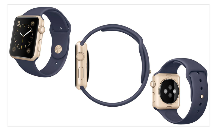
As a designer, you can heighten the in-store experience by including large and clear product pictures. If the manufacturer doesn’t provide quality photos, a photographer can take pictures just for the marketplace. Any product on a marketplace should contain multiple images to let customers see it from different angles with all details and in all colors. This can help people with their buying decisions. By including four or five images, you can remove doubts and make customers feel confident about the purchase.
Don’t neglect videos on the website, as they grab much more attention than photos. When buying online, the main risk for customers is that they won’t get what they saw in the picture. To give a more realistic feel for products, provide marketplace customers with short videos.
Moreover, videos prompt buyers to spend more time on the page. The average time that a shopper devotes to a page is just six seconds, but if your UX is powerful you can persuade shoppers to spend much more time. This is when videos can be helpful. Unfortunately, a video is a rather rare feature for marketplace product descriptions because of its cost and complexity, but it’s worth consideration.
A to scale option also makes sense as it allows customers to judge the size of a product. The best design decision here is to show products relative to the surrounding environment, humans, or other objects whose sizes are known to the marketplace audience.
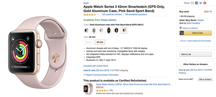
It’s necessary to provide detailed product information to gain customers’ trust. This includes information about a product’s features, benefits, ingredients or materials, measurements, and other specifications. Make sure that this information is presented in an interesting way so that users want to buy the product. Product descriptions should be structured with headlines, bulleted lists, and other visual cues for good readability.
#2 Create a trusting environment
Bad customer service can discourage users from shopping on a website. It’s okay if small mistakes happen, but long response times and poor customer service are unacceptable. Customer service determines a website’s reputation and credibility. Well-designed customer support pages can guarantee a better user experience and higher conversion rate.
Pages like Shipping, Delivery, Refund Policy, Payments, and Customer Service should be easily accessible. For greater transparency, don’t hide these pages in menus but rather place them on the website so customers can easily find them.
One more important thing is to establish a marketplace’s presence on social media. You can create a corporate design for social network pages and place social icons on the website. This will increase trust in the marketplace. For example, Etsy has a perfect reputation as they provide the information about company’s history, policies, investors, careers, social media presence etc.
When it comes to customers’ trust toward sellers, a marketplace can implement seller ratings or a reputation system to control products or services sellers provide and increase reliability for customers. A UX designer can make this system easy-to-use by creating a clear interface and buttons. For example, Uber has created a driver rating system to both encourage drivers to offer enjoyable and safe rides and make passengers feel more trust toward drivers. In addition, Uber has designed an intuitive and minimalist interface to make rating drivers and passengers easier than ever.
The last piece of advice for creating a trusting environment is to state store policies. Give these policies a separate area on the website that’s easily accessible or include store policies in an FAQ section.
#3 Make the customer journey satisfying
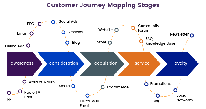
An efficient customer journey should motivate the user to go further on the website and stay engaged with the marketplace. As a designer, you can use a Customer Journey Map (CJM) to understand the needs of users. A CJM is a powerful tool that gives an overview of the customer experience, what questions customers have, how they move through the sales funnel, and what they’re trying to achieve. As a result of creating a CJP, designers can get valuable insights and analytics to enhance the customer experience. Look at all stages of customer journey mapping and how it works in the picture below.
Usability testing is also an important part of user journey optimization. Usability testing evaluates how easy a website is to use. During usability testing, users are asked to complete tasks in order to see whether they experience any confusion or problems. Usability testing offers several benefits:
- It provides direct feedback from the target audience, which helps you improve the interactive experience
- It highlights potential problems before launch
- It helps marketplace owners improve the customer experience and gain a competitive advantage
- It helps businesses focus on features that really matter>
There’s also one more technology that helps designers improve the customer journey. Eye movement tracking technology analyzes a user’s eye movements across the UI layout. Eye tracking provides data about what keeps users interested and how their reading flow can be optimized with the help of design.
#4 Focus on your target audience
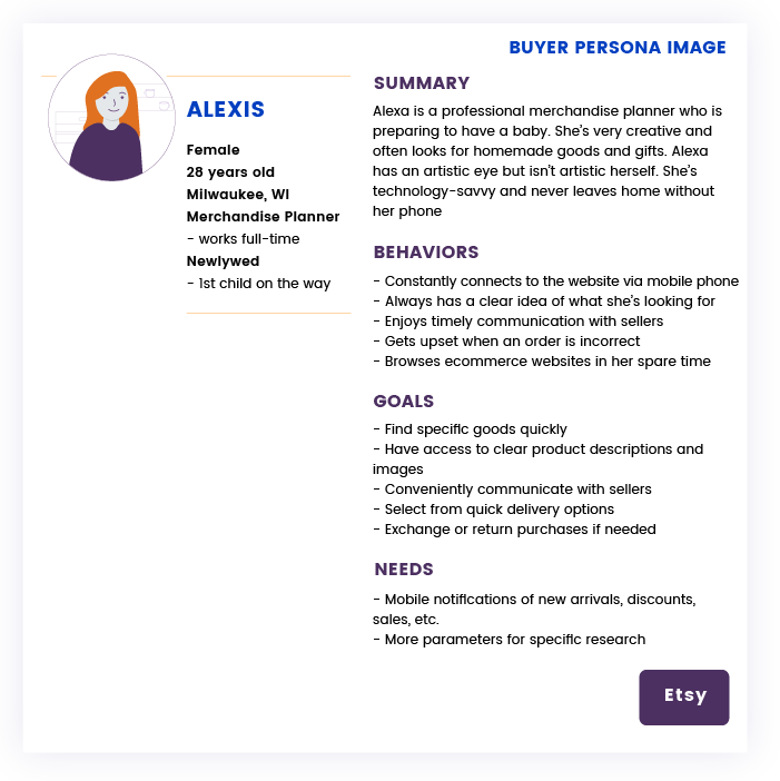
Marketplaces should first of all focus on users who buy products. Personas help designers to create products with a specific user in mind. Archetypical users, or personas, represent the needs of larger groups. Typically, the description of a persona includes the following:
- Age
- Gender
- Occupation
- Hobbies
- Preferences/dislikes
- Other details that are relevant to the specific product
The purpose of describing all these details is to understand the mindset and preferences of a user and what they hope to accomplish. These details allow the design team to define why a user behaves in a certain way. Personas place more attention on a user’s goals and let designers focus on particular types of customers.
For example, Etsy is a peer-to-peer marketplace focused on handmade, vintage, and unique goods. So we can assume that the majority of buyers there are handmade and art lovers and probably mostly women. These insights help designers to build better user experiences for their target audience.
Feel free to start a discussion in the comments below and share your experience in designing a great marketplace!


