-
Product Management
Software Testing
Technology Consulting
-
Multi-Vendor Marketplace
Online StoreCreate an online store with unique design and features at minimal cost using our MarketAge solutionCustom MarketplaceGet a unique, scalable, and cost-effective online marketplace with minimum time to marketTelemedicine SoftwareGet a cost-efficient, HIPAA-compliant telemedicine solution tailored to your facility's requirementsChat AppGet a customizable chat solution to connect users across multiple apps and platformsCustom Booking SystemImprove your business operations and expand to new markets with our appointment booking solutionVideo ConferencingAdjust our video conferencing solution for your business needsFor EnterpriseScale, automate, and improve business processes in your enterprise with our custom software solutionsFor StartupsTurn your startup ideas into viable, value-driven, and commercially successful software solutions -
-
- Case Studies
- Blog
A Guide to Human-Centered Design Methodology and Process
Have you ever wondered how UX designers come up with intuitive, intelligible interfaces that present users with enjoyable experiences? Obviously, great design requires much effort, concentration, and the right strategy.
Human-centered design is a methodology for devising successful design solutions. According to this methodology, UX designers focus on end-users from the very beginning of product creation and have users testing each iteration of a product. As a result, end-users get a product that satisfies their needs.
In this post, we’re going to take a closer look at the nature of human-centered design and see how this methodology fits into the product development process.
Three Principles of Human-Centered Design
Human-centered design does not simply force you to consider the needs and wants of product users first. The question is how you can satisfy those needs in both functional and emotionally meaningful ways. There are three general principles of human-centered design:
- Collaboration. Great minds create great ideas when they work together.
- Empathy. You can’t create a product for people if you don’t deeply understand their motivations.
- Experimentation. It’s only through conversations, experiments (checking hypotheses), and learning that a great product is born.
These principles have changed the way we look at our business goals and have offered more creative ways to achieve them. If you're stuck on some problem, just look at it from the human perspective:
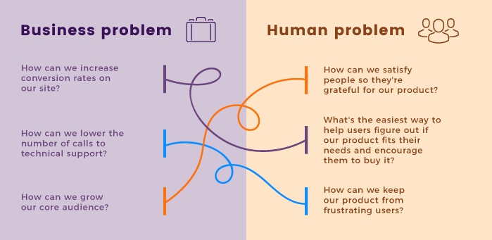
Human-centered design can be used anywhere: in making web products, creating spaces, designing government services, improving banking systems, and so on. But in the IT industry it is probably demanded most. If we take the need for flawless functionality as a given, then it is the design (i.e. the ease of use) that becomes the ultimate advantage of a product over its competitors.
A Three-Step Approach to Human-Centered Design
The general approach to human-centered design is the same for any context, and can be reduced to three basic steps:
- Discover. If you have a challenge, first discover ways you can approach it and find people to talk to about the matter.
- Ideate. Once you have enough information to solve the problem, use your creativity to think up solutions.
- Prototype. Turn your ideas (based on real feedback!) into tangible designs.
Human-Centered Design in the Workflow of a Web Development Company
What does this approach look like in the usual workflow of a web development company? Here’s an explanation.
Personas
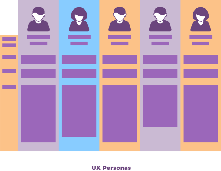
A UX designer is responsible for creating the whole user experience for a product, and creates personas. A persona is a fictional character that represents a typical member of a target audience. Before creating personas, we do research and collect data about people and their behavior.
The term “target audience” is often used to unite different groups of people. For instance, the target audience of an internet activity monitoring tool can be both system operators in big corporations and parents who care about their children.
Human-centered design allows having a few personas to represent either different kinds of users (system operators and parents) or different characteristics of users (parents with laptops and parents with smartphones) within the target audience.
In the end, personas help you focus on images of final users, make calculated decisions regarding required functionality, and avoid making products with lots of great yet unnecessary features.
Scenarios
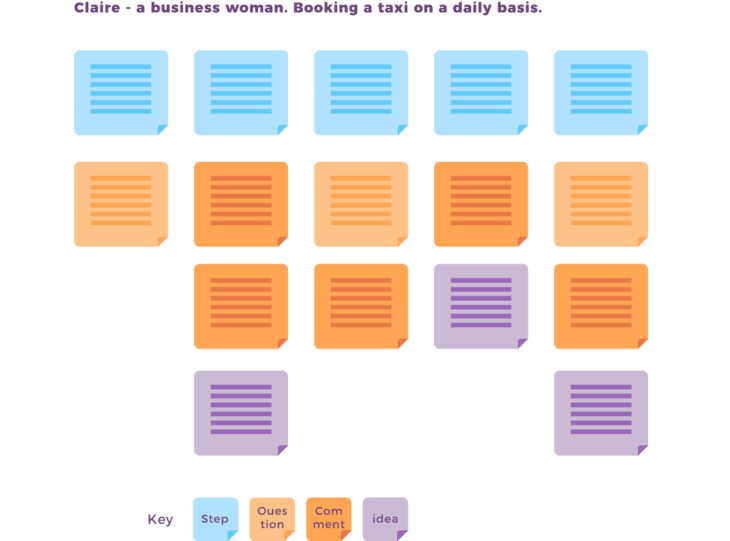
Different scenarios are written to define how a persona will use a product. Scenarios explain the context in which the product is used and allow you to consider additional details like user goals and the reasons why they visit your website or a mobile app. Having such specific information allows you to build scenarios in which you future product will be used. Usually, several scenarios are developed:
- The best case, when everything is going simply great in the life of the persona.
- The average case, when everything is going just fine and the persona’s mood is neutral.
- The worst case, when everything is going wrong and the persona is upset or aggressive.
Such scenarios are great because they organize information in the form of stories, are easy to understand, and allow you to notice important details about how the user interacts with the final product.
Often, common solutions simply won’t work due to the specific context in which they’re used, and so the UX designer must come up with a better solution. For instance, if you’re creating an online learning tool and want to verify a user’s identity for a certificate, it’s better to record typing patterns than to request a current photo if the user is on a desktop.
Use Cases
Once you have scenarios on your desk, it’s time to figure out how personas will use the final product within the previously defined scenarios. Such interactions are called use cases and essentially are lists of events that happen within scenarios.
Instead of explaining each function separately, you can write use cases to avoid technical details and focus on making interactions as easy, understandable, and usual as possible, while at the same time making them fit the scenario and correspond to the selected persona’s needs.
While use cases aim to figure out how users achieve set goals, they also help designers decompose big tasks into smaller ones and then address them one by one. For instance, if you’re designing the way users sell their old stuff on a marketplace, you’ll probably start with the “user logs into the system” action, knowing that later you can go back to it and design how exactly that logging in happens.
Prototypes
Finally, all these use cases are implemented into a working prototype, which is a test sample that requires minimum effort yet looks like the final product as much as possible.
With human-centered design, prototypes are done with minimal effort and with only one goal: to perform user tests and check hypotheses.
Prototypes can be realized in any way, for instance as paper blueprints or computer images. Many online solutions let you create visual prototypes that look and act just like real software. They lack most of the functionality, but offer a visual representation of the information that is expected to be shown by that software.

User Testing
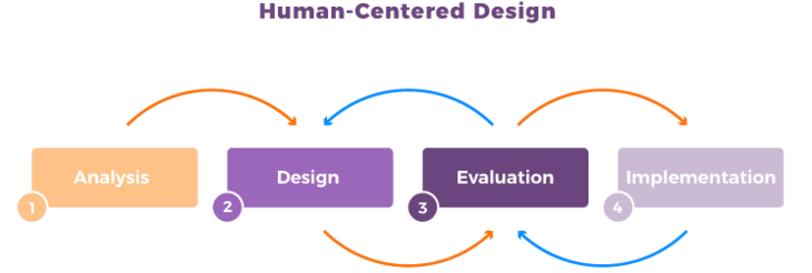
A prototype is then used for user testing and checking hypotheses: Are the designs correct? Are users acting as planned? Are they having any troubles using the product? and so on. If all hypotheses are correct, the whole team proceeds to the implementation stage. Otherwise, the UX designer goes back to the previous stages and improves personas, scenarios, and use cases in order to make a better prototype for user testing.
As you can see, such an approach considers the smallest details of user interactions, checks all hypotheses, and guarantees that the final product will correspond to user expectations even before the whole team starts implementing it.
Of course, when we say “the final product” we mean the final version of the current iteration. Once an iteration is over, everything starts again if the plan is to give the product new functionality and make it even more attractive for potential users.
Other Stages of the Product Creation Workflow
Human-centered design affects the other stages of the product creation workflow: research, design, implementation, and post-analysis. If you’d like to find out more about the development workflow at RubyGarage, take a look at our blog post on that topic.
Research
When a client reaches out to us for the first time with an idea, we usually start by doing research. Are there any competing products? Why are they successful? How can we make the client’s future product outstanding, notable, and profitable?
These questions seem obvious from the business perspective, i.e. when you’re interested in bringing to market a great and successful product that you’ll be proud of. However, another reason for asking these questions is to study humans. Why do people use these products? How do they use them? Are they satisfied with the experience offered and why? Answering these and many more questions allows you to understand how to make a human-centered, successful product.
Design
After all necessary research has been conducted, all information gathered, and all details agreed with the client, it’s time to design the product’s architecture. A human-centered approach affects all processes in the design stage.
In addition to that, our UX designer brings out new wireframes every 2 to 3 days and then the team (and sometimes the client) takes a look at them to see if they correspond to product requirements and user expectations and if it’s comfortable to use a product with such a design. If possible, improvements are suggested. Such feedback can bring a great number of fresh and reasonable ideas to make the design better, and is the only way to raise the chances that the product will be liked by users.
Implementation and Post-Analysis
When the design is finally ready and approved, it’s time to implement it in code. However, this doesn’t mean that the project’s UX designer isn’t needed anymore. Being ready to changes means adapting on the fly, which in our industry means that web product creation is never finished. As soon as any software is released, it’s time to plan how it can be better, how the next version will look, and how new functionality will affect the design of the product.
Moreover, while functionality is an important aspect of any product, humans change their preferences over time and often seek new designs, new experiences, and new ways to interact with products. Simply recall how mobile interfaces have changed over the last few years: first, you had buttons designed for tapping; then swipes were introduced for richer navigation, and recently Apple presented Force Touch technology, expanding the ways to interact with visual interfaces even further.
A great UX designer is always looking for how to further improve the ways humans interact with products and to make people more satisfied by simplifying ease of use. This can be done either by analyzing feedback and user reviews or by gathering specific statistics and metrics such as time spent using a product, conversion rates, popularity of different interaction patterns, and others.
Making experiments such as changing the general flow of a site, adjusting the ways a specific problem can be solved by users, or even switching the color of a button can yield extremely effective data, and this is another part of the UX designer workflow based on human-oriented design.
Human-centered design proves that building a successful product depends on insightful research (personas, scenarios, use cases, customer journey maps, user testing, and more) and a conscious approach that lies in understanding how your end-users feel and behave.
Human-centered design is a successful practice employed by many IT companies including RubyGarage. Don’t forget to check out our Behance and Dribbble portfolios!


