-
Product Management
Software Testing
Technology Consulting
-
Multi-Vendor Marketplace
Online StoreCreate an online store with unique design and features at minimal cost using our MarketAge solutionCustom MarketplaceGet a unique, scalable, and cost-effective online marketplace with minimum time to marketTelemedicine SoftwareGet a cost-efficient, HIPAA-compliant telemedicine solution tailored to your facility's requirementsChat AppGet a customizable chat solution to connect users across multiple apps and platformsCustom Booking SystemImprove your business operations and expand to new markets with our appointment booking solutionVideo ConferencingAdjust our video conferencing solution for your business needsFor EnterpriseScale, automate, and improve business processes in your enterprise with our custom software solutionsFor StartupsTurn your startup ideas into viable, value-driven, and commercially successful software solutions -
-
- Case Studies
- Blog
8 Types of Mobile App Animations That Enhance the User Experience
In mobile interfaces, great mobile app animation feels natural to users and works for the good of the app’s UX. Interface animations in mobile apps can give instant feedback on users’ interactions, help users navigate, or simply get users engaged. In this article, we dig into eight types of mobile app animations and figure out how they enhance the user experience.
#1 Splash screen animations
A splash screen is the screen a user sees right after opening an app. Usually, it contains the logo of the company or app. Users expect apps to load instantly, but with complex mobile apps, this isn’t always possible. Since the splash screen doesn’t have any functional elements, it serves only as a form of entertainment. Splash screen animations can distract users and make the load time appear shorter than it is. Moreover, your splash screen forms the first impression after a user downloads your app.
The perfect splash screen animation:
- is 1–3 seconds long
- is fluid
- makes a great first impression and strengthens your brand identity
- informs users that the app is loading and working
- engages users and gets their attention
- makes an app look like it’s running fast
- tells users they’re running the latest version of the app
Cab on Tap has made a perfect transition from the splash screen to the main interface with an integrated logo.
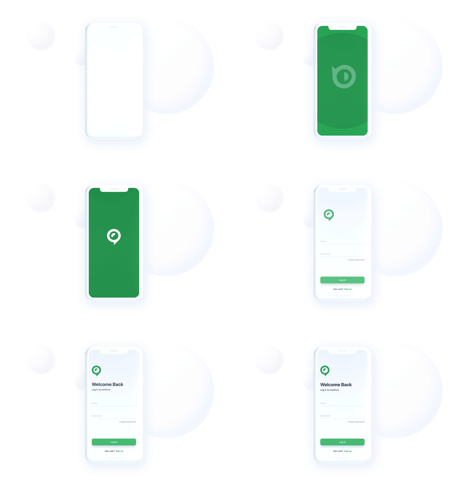
The animated element provides a seamless loading experience, making it look like the splash screen doesn’t even exist. At the same time, it provides a smooth transition to the login page.
#2 Feedback animations
A feedback animation tells users they’re on the right path and that an action has either succeeded or failed. It’s important to show the user that the app responds to their actions so they don’t ask themselves, Have I pressed the OK button? Feedback animations make the user journey comfortable and the user experience positive. You can achieve a great UX with the help of animated pop-up notifications, buttons and ticks, color and size changes, field backlights, etc.
The perfect feedback animation:
- is obvious and clear to all users
- imitates the interaction between the user and the device
- is visual, with as little text as possible
A feedback animation is a must for ecommerce platforms. For instance, you can visualize changes to the size and color of an item, making the online shopping experience feel real.
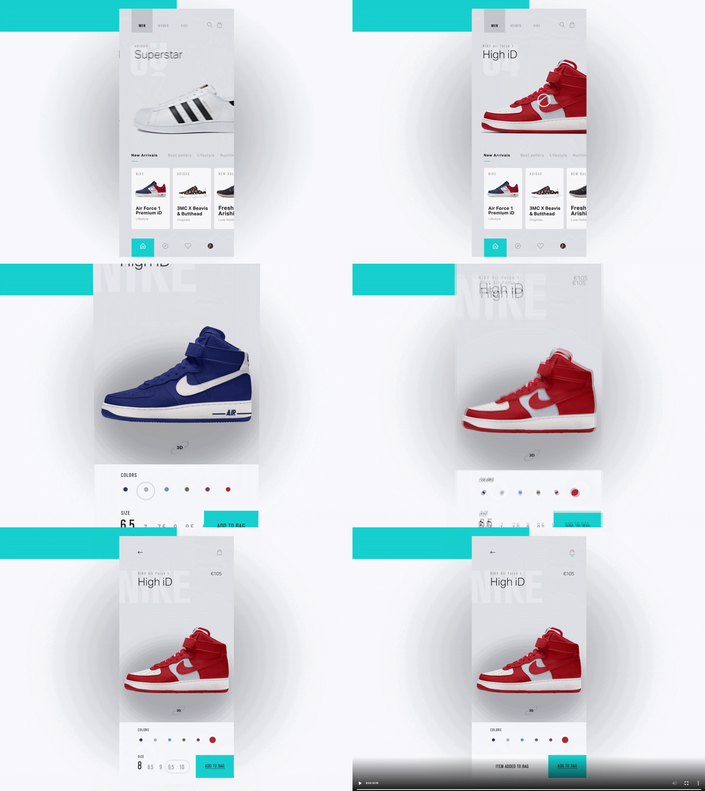
In this concept, you can see how every interaction with the model and color is displayed on the item. It’s much more pleasant to do online shopping with such a UX.
#3 Onboarding animations
When a user downloads your app, they anticipate the UX will be intuitive or they’ll at least be shown some hints on how to navigate. Users expect to see pop-up instructions on how to use the main features of your app. You should use the onboarding stage to make a good impression that will persuade users to keep using your app. It’s important to demonstrate how convenient your app is at the start.
The perfect onboarding animation:
- provides a quick tour of the app
- highlights the app’s main features
- shows how to use the app and what to do next
- is easy to understand
This outstanding onboarding animation incorporates pure design with a comprehensive walkthrough. The transition is natural and demonstrates how app components interact.
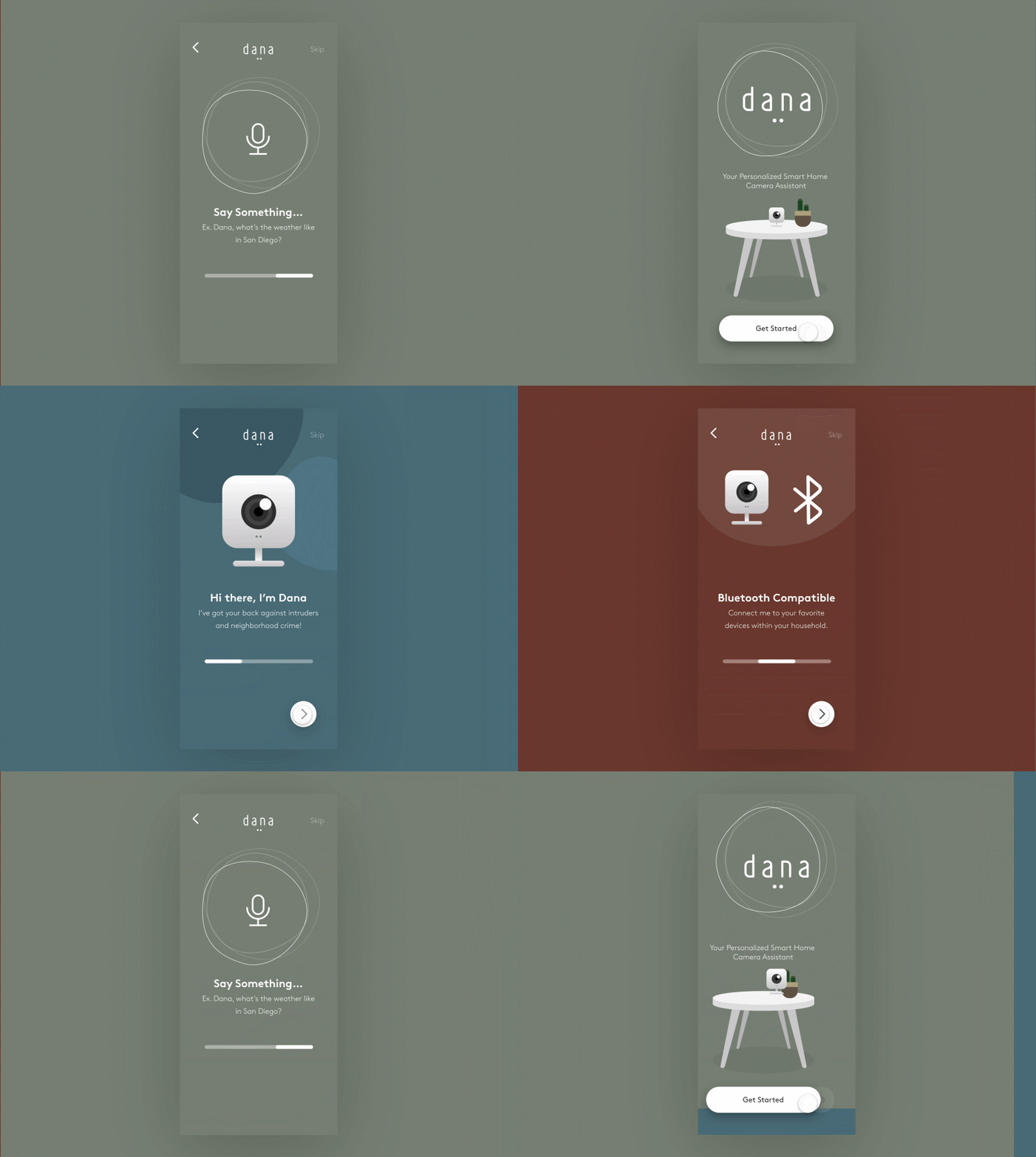
The animation highlights the app’s main features with a brief description, making the onboarding visual and telling a story. The app uses familiar icons, which makes the walkthrough immediately understandable.
#4 Navigation animations
The minimalist trend has led to plain designs that hide almost all navigation elements. A lot of apps have a complex hierarchy that users don’t see. You can present hidden elements with the help of mobile app animations. The way you arrange those elements in the animation can make even the most complicated in-app navigation clear and make the UI intuitive. By animating key elements, you can show users where to find the features they need.
The perfect navigation animation:
- transports users between the navigational context smoothly
- facilitates transitions inside the app
- uses familiar icons rather than text
An app can hide its wide functionality behind a user’s gestures. Pinterest, for example, doesn’t reveal options until you tap and hold a post in the feed. Below, you can see a Pinterest-like hidden menu. In this mobile app animation, the designer used a circular menu to hide three main options to interact with the screen.
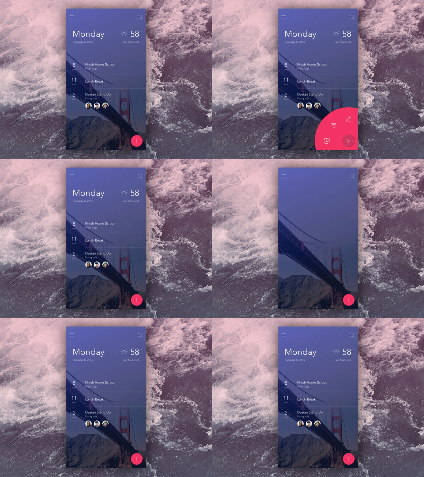
This is a perfect use of the tap-and-hold expandable menu, hiding multiple options behind one tap. The app animation reveals a bright circle, attracting the eye to the additional options.
#5 Animated progress indicators
It’s common that some in-app actions take some time. While the app is connecting to the server or performing other time-consuming activities, it may look like it’s stuck. To avoid this, it’s a good idea to use a progress status animation so the user sees the app is running. Users are familiar with such animations; they usually see them when a file is downloading or data is being processed. With the help of progress animations, you’ll inform your users that the app is running smoothly and how much longer they need to wait.
The perfect animated progress indicator:
- informs users about the progress
- entertains or calms users while they wait
- is original and has a high chance of becoming a viral feature, like the offline dinosaur in Google Chrome
One of the crucial principles in UX design is informing your users about the system’s status. If you can’t shorten the waiting time, make it fun for your users to wait. This animation hits all the goals.
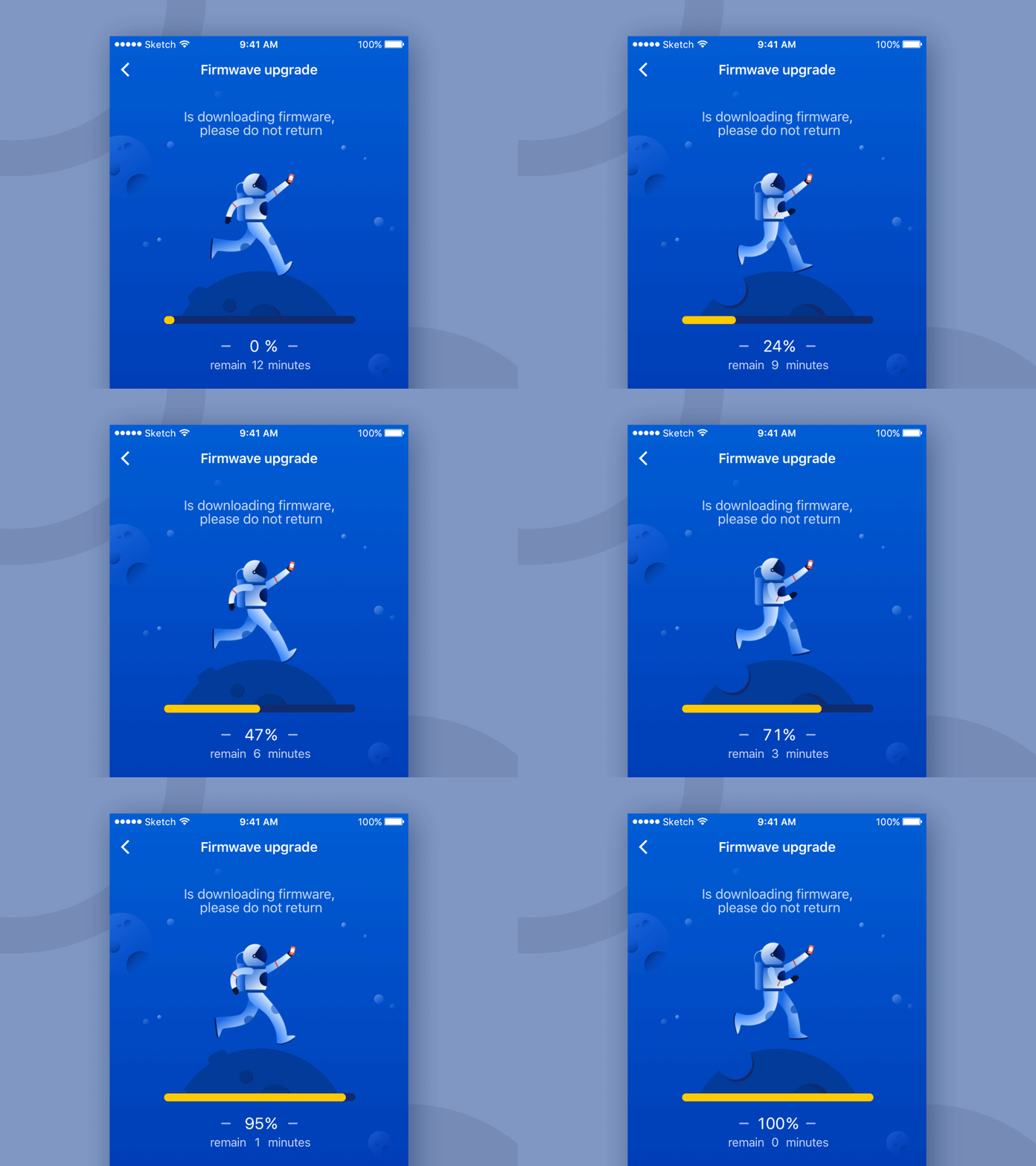
This animation is informative, telling the remaining time and amount of work done, but also enjoyable and memorable. Who would be bored or irritated by something like this?
#6 Visual hints
Whenever the user sees a preview of an element in the app, it’s time to make it alive and add some animation. Pop-up tabs can appear in a smooth, natural way, not disturbing the user’s perception of the app flow. Sometimes, icons without captions confuse users, which is why it makes sense to add pop-up captions with the help of mobile app animations. Hints are especially important if your app is gesture-driven and users might be confused by the interface without buttons or interactive elements.
The perfect visual hint:
- explains how to use the app
- is basic and clear
- appears on demand
The dating app Tinder made a breakthrough with the swipe action. To teach users how to interact with the app, the developers not only added like/dislike buttons in the bar but made the swipes alive and informative.

It’s easy to understand the app’s gesture language thanks to the LIKE and NOPE stickers that appear on a photo after swiping left or right.
#7 Animated transitions
Animated transitions in apps are not new. They make interactions smooth, add an element of fun to the interface, and make an app memorable. For usability reasons, such animations often resemble interactions in the real world: for instance, when you turn book pages in a reading app, they flip as if they were real. Transition animations are important for users so they can see the path of their journey and don’t wonder how they ended up somewhere. Moreover, animated transitions between elements make the layout light, so the app interface looks more appealing and not overloaded.
The perfect animated transition:
- smooths the path from one screen to the next
- visualizes changes in the app
- highlights connections between elements
- is fluid and feels natural to the user
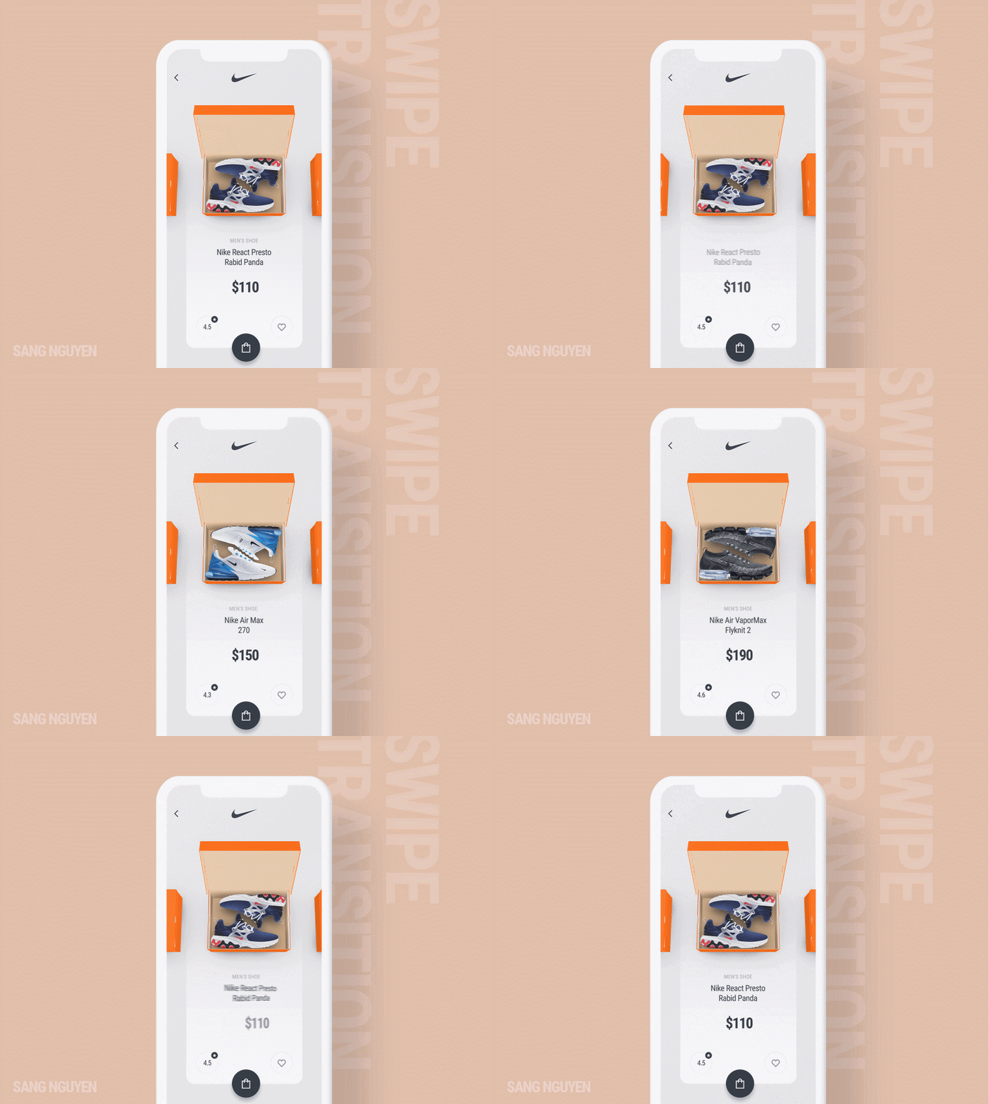
In this example, you can see how real the search in the app feels due to smooth transitions between options and branded orange Nike boxes.
#8 Marketing animations
One more way to increase your brand awareness and catch users’ attention is to apply animations to your branding. For instance, you can bring your mascot to life and place it on the splash screen, animate your logo and use it in a progress bar, or incorporate your motto into an image. Marketing animations serve two purposes: to grab attention and entertain.
The perfect marketing animation:
- is bright and catchy
- is memorable
- boosts your brand awareness
- appeals to the target audience
- can serve as a distractor when content is loading
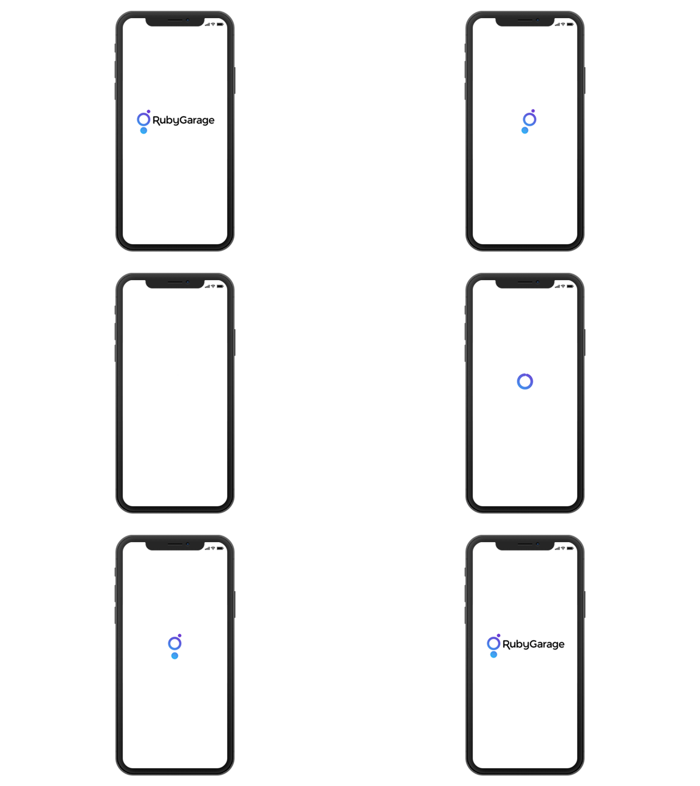
No extra words are needed when you take a look at this animated logo. This animation achieves all the goals mentioned above.
Final words
Great animations make a mobile app feel complete and flawless. They boost the usability of your app and make it appealing to users. Mobile app animations are vital to creating a top-notch product with an intuitive UX. The more scrupulous you are with the elements of your app, the more your users will enjoy it. Users’ expectations are always growing, and UX designers have to predict them in order to provide impeccable interactions that clearly show how the app works.


